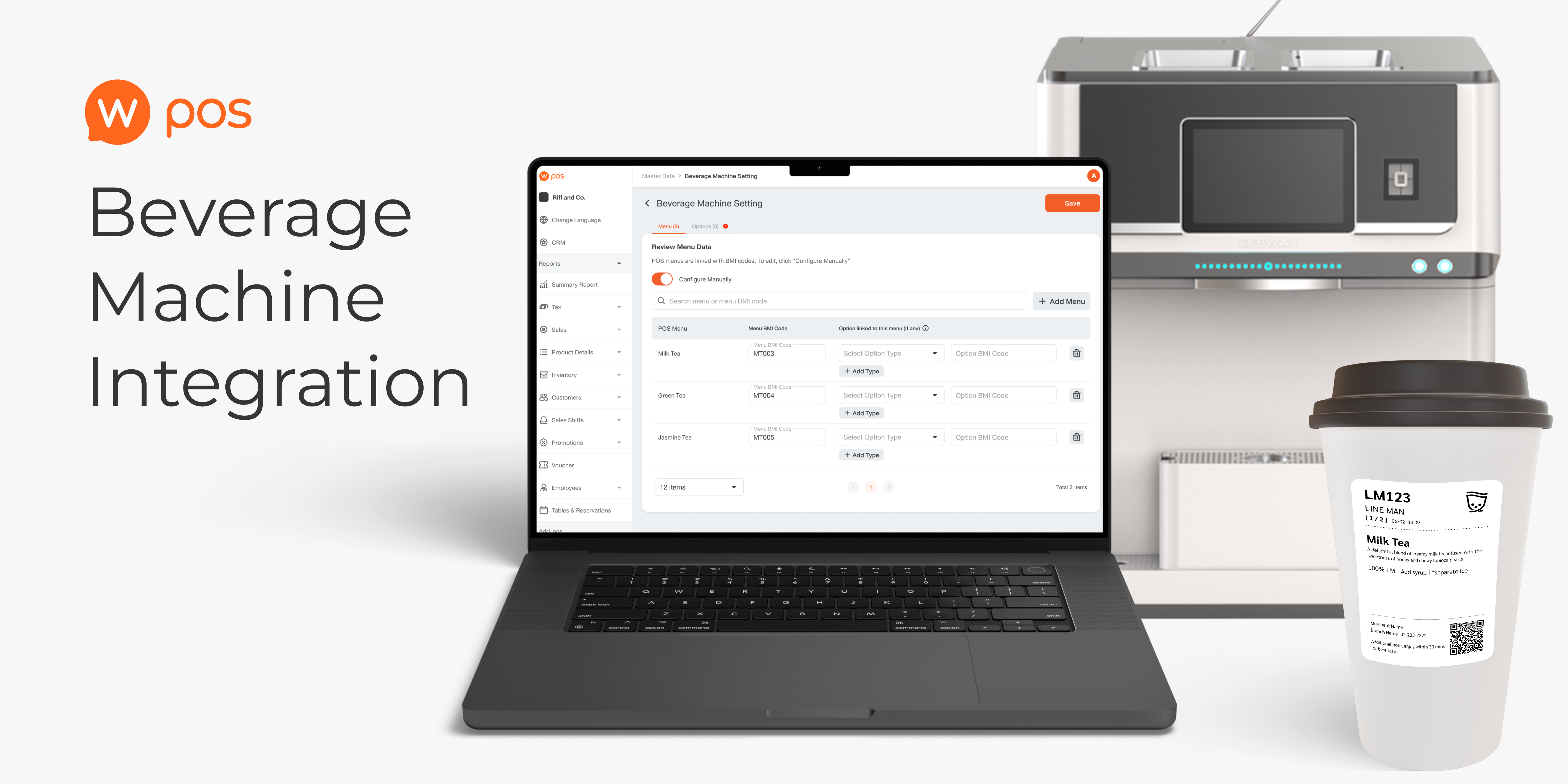

An integration feature with a third-party beverage machine system aiming for chain quick-service restaurant acquisition. This case study demonstrates how I was closely involved in technical discussions, reducing setup effort from 100+ manual actions to a single upload flow.
waiting for launch
However, 3 out of 9 interviewees didn’t actually match the criteria due to miscommunication.
We didn’t do the user interview due to limitation of time, which I regret not doing so since we lose chance to gain more insight
DISCOVERY AND DEFINE
A beverage machine helps reduce storefront staff effort and time in preparing drinks. Some merchants want to start using it, and we see this as an opportunity to retain top chain merchants, as well as close deals with other chain restaurants by launching an integration feature.
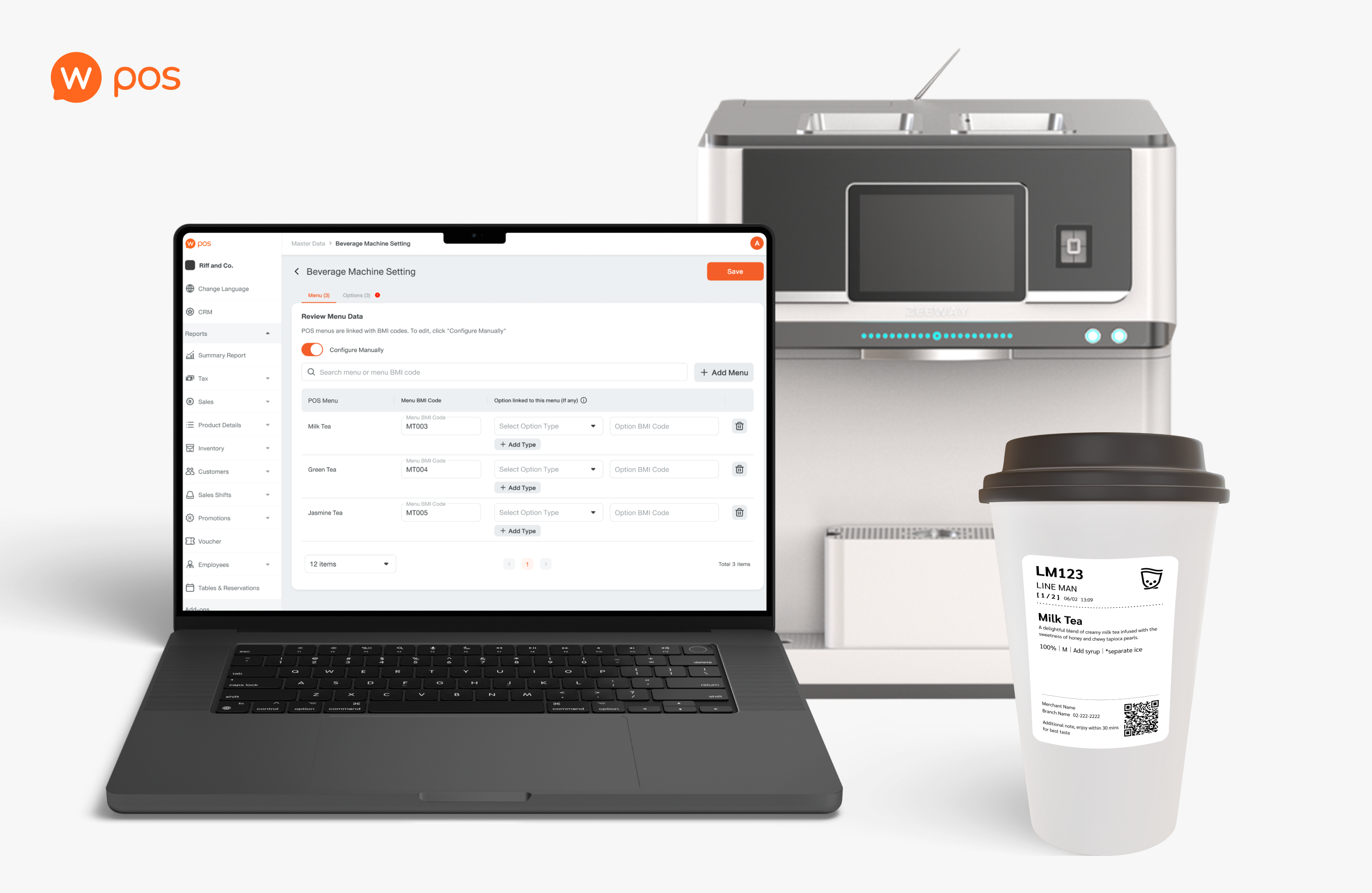
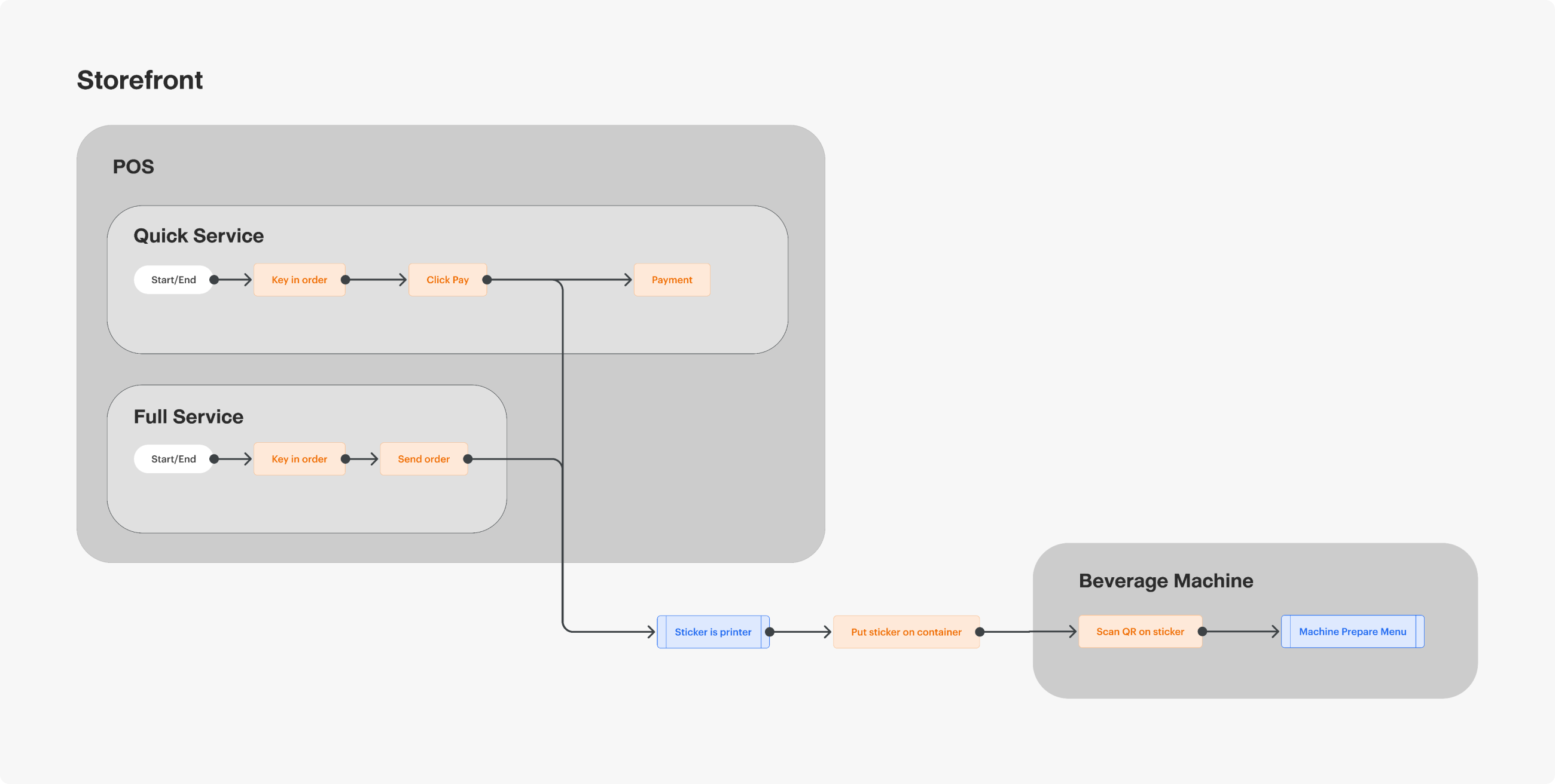
By integrating our POS with the machine, when staff key in an order into the POS, a sticker will be printed with a QR code on it. Staff then scan the QR code with the beverage machine, and the machine will start preparing the order.
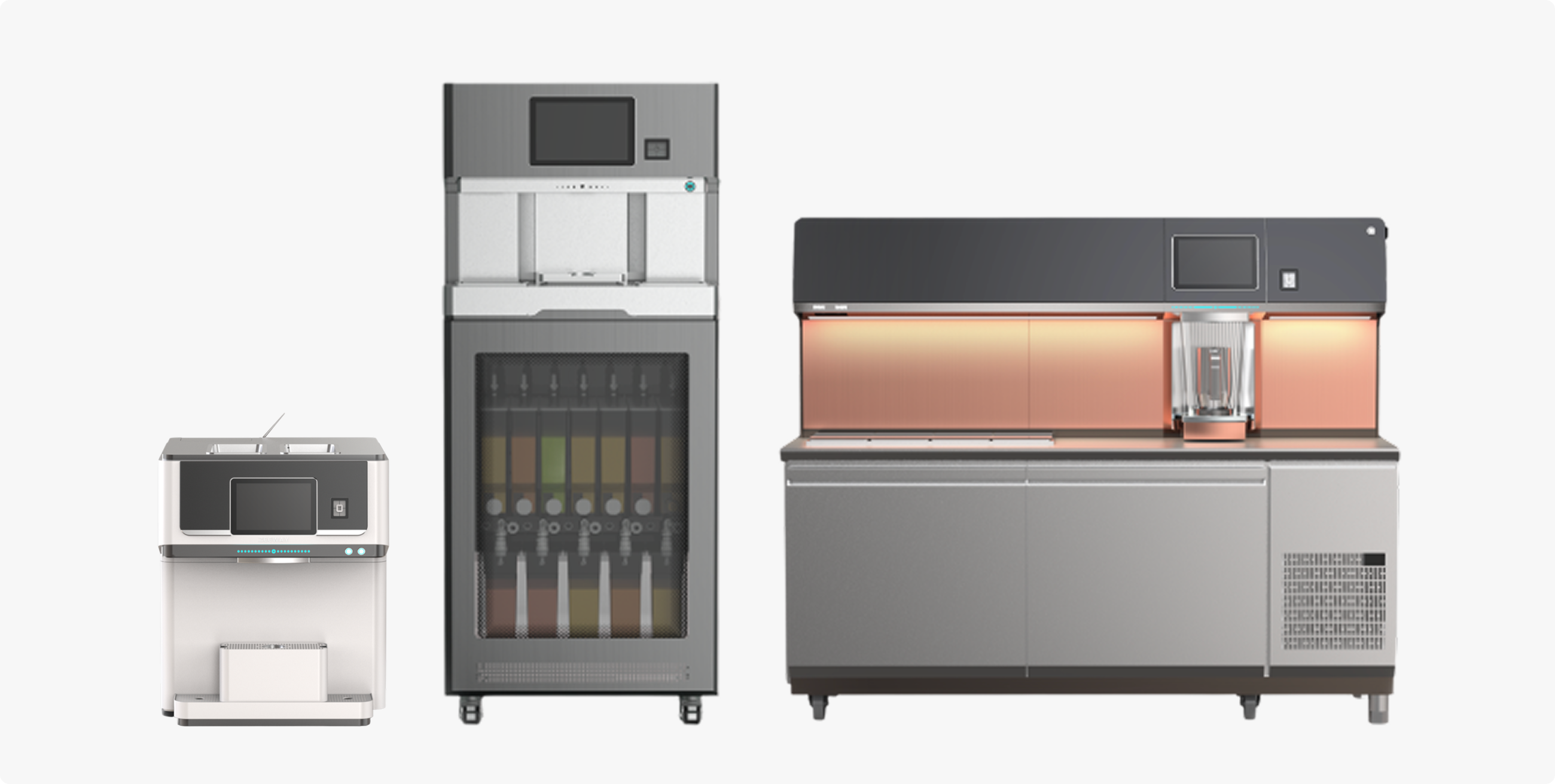
1. Design the configuration flow for Web Owner. The merchant must map the POS menu and options to the beverage machine settings.
2. Design a sticker layout containing a QR code and item details.
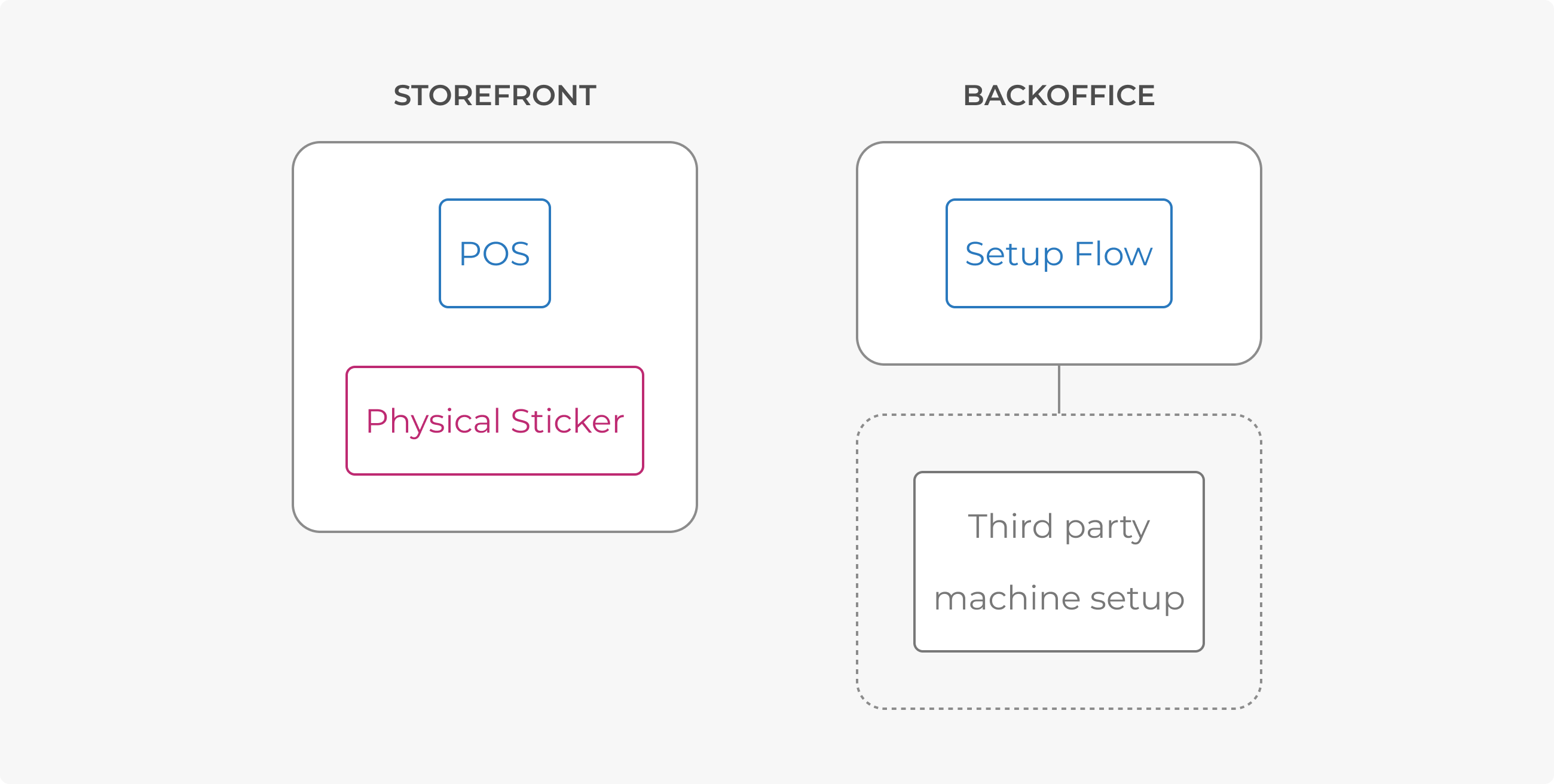
One issue to keep in mind was that we cannot adjust anything on a third-party platform that users need to use for setup.
IDEATION
I was involved in the technical ideation process, which can help make the flow more user-friendly. First, the user must set up the system so that the machine recognises the POS item.
The POS prints a QR code when receiving an order. Staff can scan the code at the machine, which then reads the code and maps it to the item in its system, and finally prepares the drink.
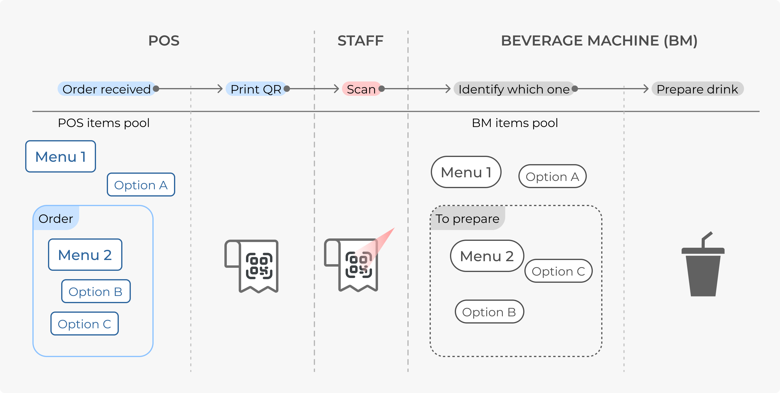
To make this work, merchants need to have equivalent item data on both the POS and Beverage Machine system. The machine requires all menus to have a “Fixed-type option”, which includes sweetness, ice, and size.
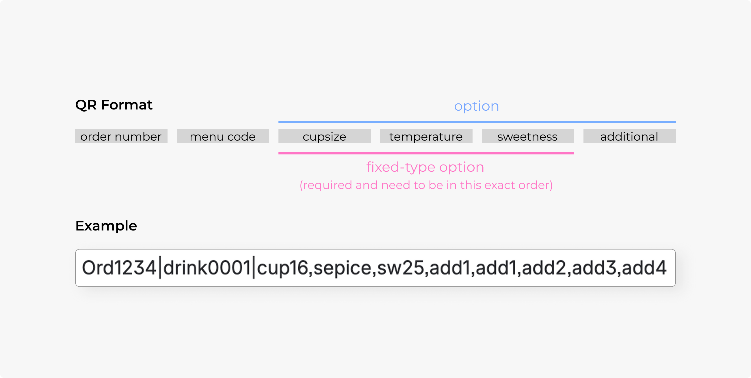
To let the machine recognise the correct item, the engineers suggested that the user assign a tag to an option on the POS. This is because the QR code's text must follow a fixed sequence (size > temperature > sweetness), or else the machine will not read it.
At first I came up with a “preset” concept. One store would create multiple presets for multiple types of drinks; for example, a yogurt preset and a coffee preset. These two had different recipes. Users had to manually map POS options to machine type first, then added the menu to the preset.
However, the preset idea might not be valid for all types of restaurants, and it was very hard to understand the “option type mapping” concept.
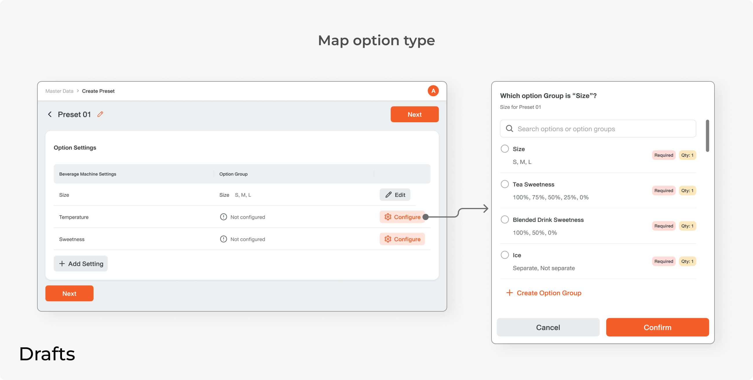
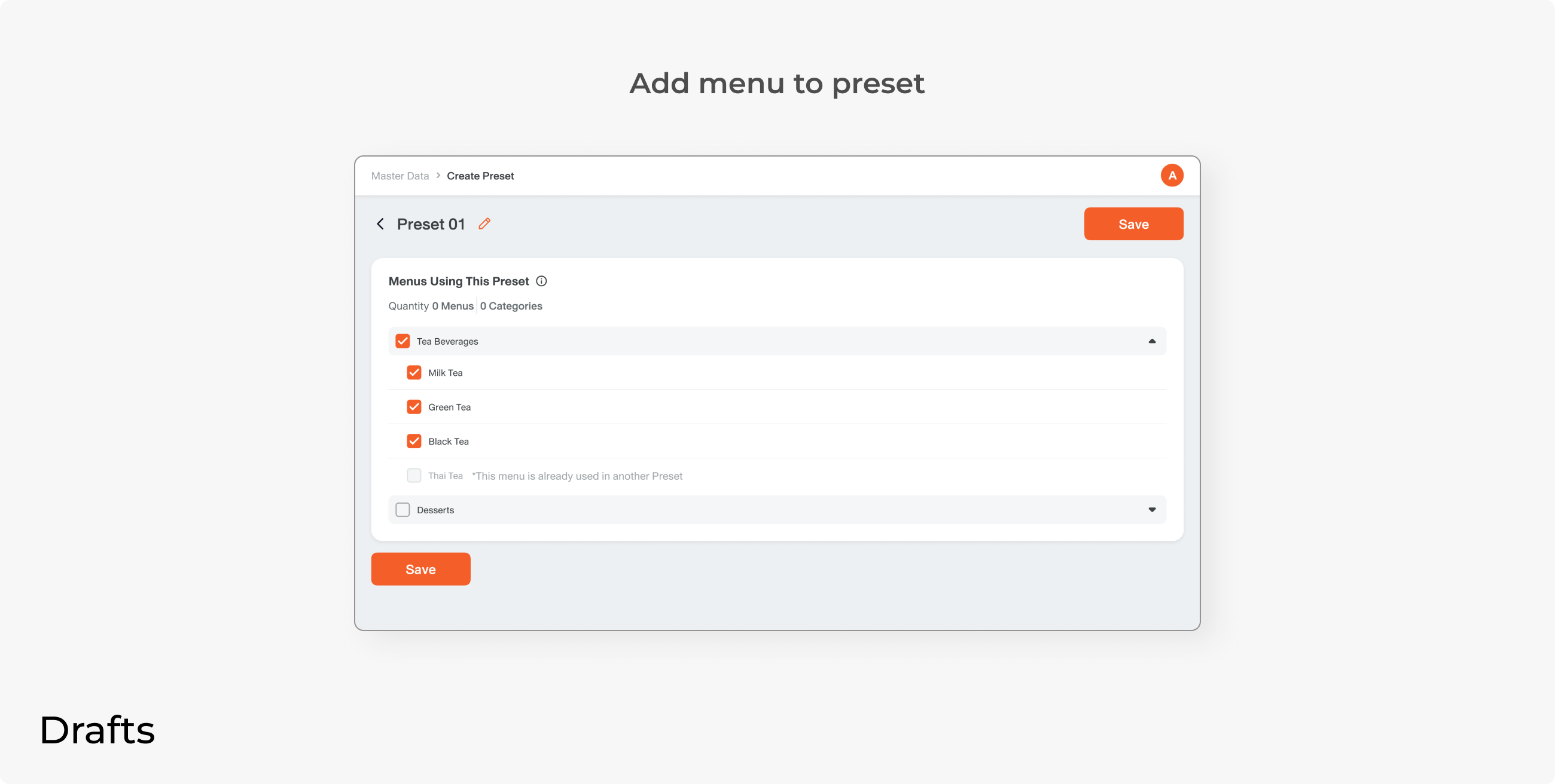
Here are some drafts from when I tried to design an option mapping screen.
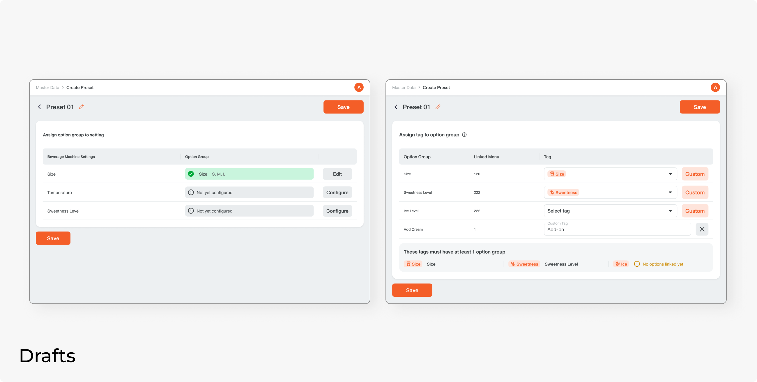
I participated in many technical discussions and tried to come up with the simplest flow. We should design a system that takes care of complex concepts for the user.
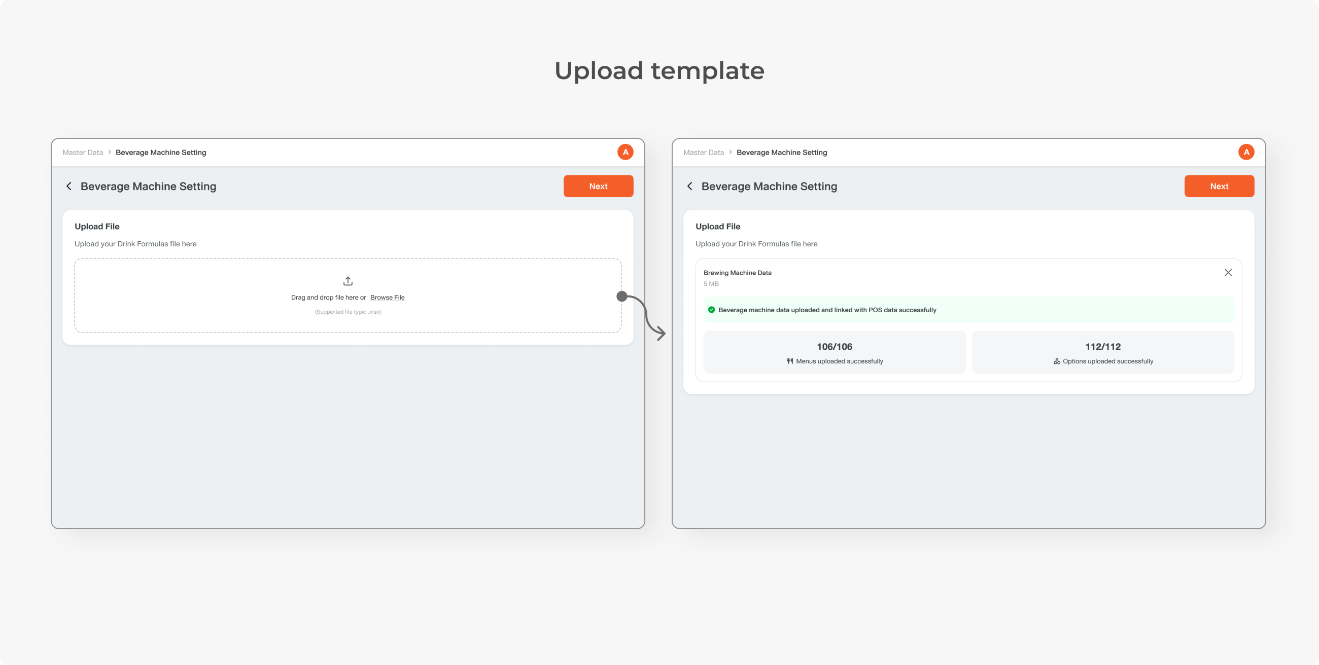
To simplify the process, I brought up this idea of uploading a template to the developer team. The user can just download the template from the machine system and re-upload it to ours, review the data, and be done. No need to map items one by one.
The engineers took care of the technical structure. The system matches data by name, then assigns a new feature-specific code (BMI code) to the POS menu so that the two systems can communicate.
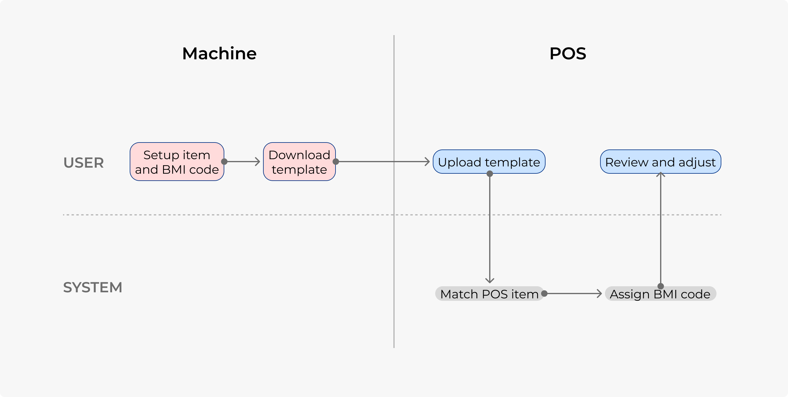
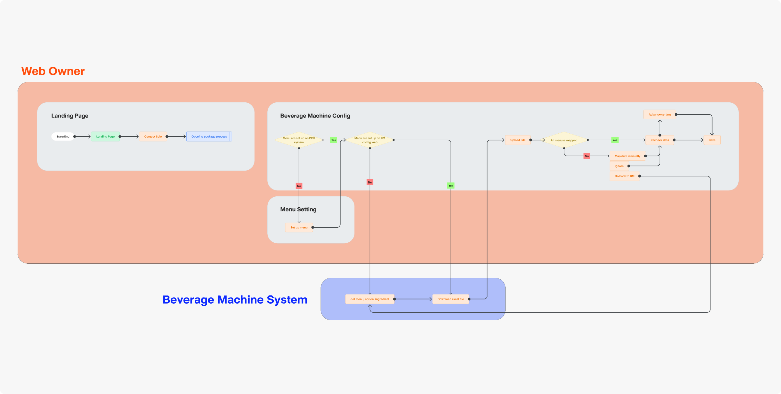
Here is an overview picture of the entire flow, showing both the setup journey between 2 platforms and storefront operation. I first created this chart to ensure that all stakeholders, including me, understand the same big picture.
DESIGN
There were only 2 steps, or even one. The user uploads the template, downloaded from their third-party system. In the best case, the user can simply review the data and continue. On the contrary, they can make changes by clicking the manual config toggle.
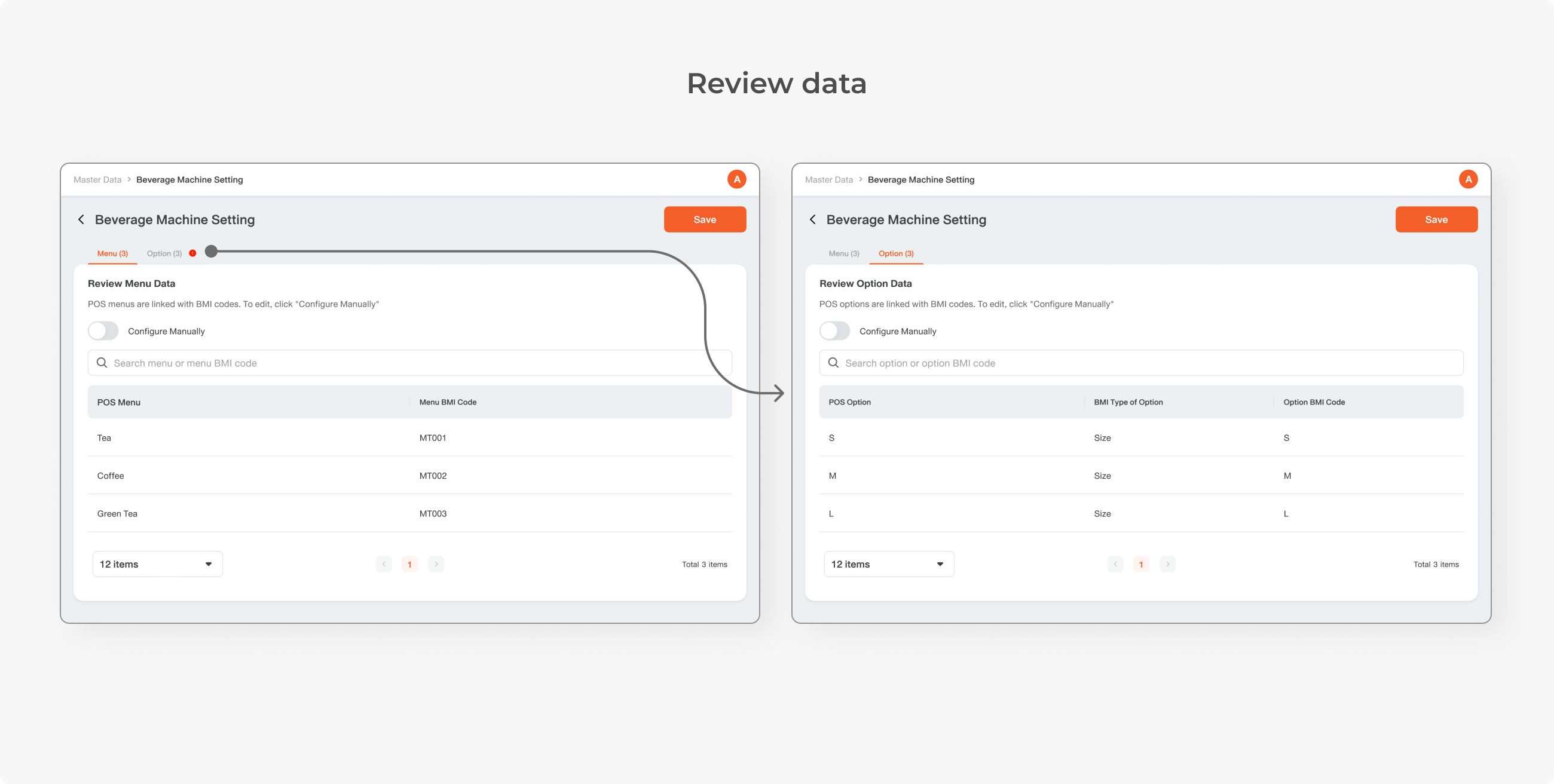
To map data, the menu and option names on both platforms must be the same, and options must be linked to the same menu. This leads to another concern: errors can easily occur.
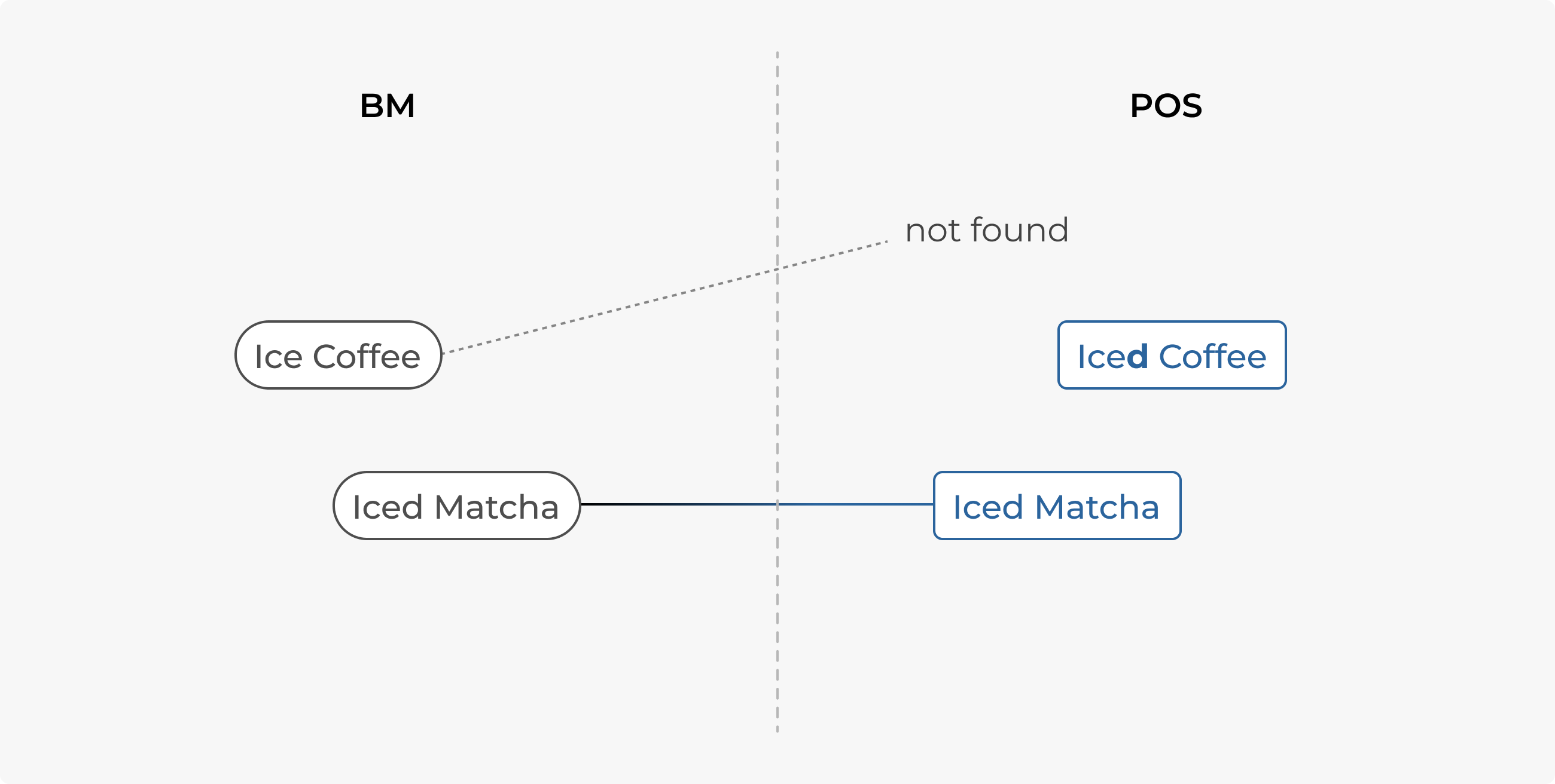
All items might not be mapped successfully. This is an optional setting to solve the aforementioned concern in case data in the template is missing or if the user wants to make any changes.
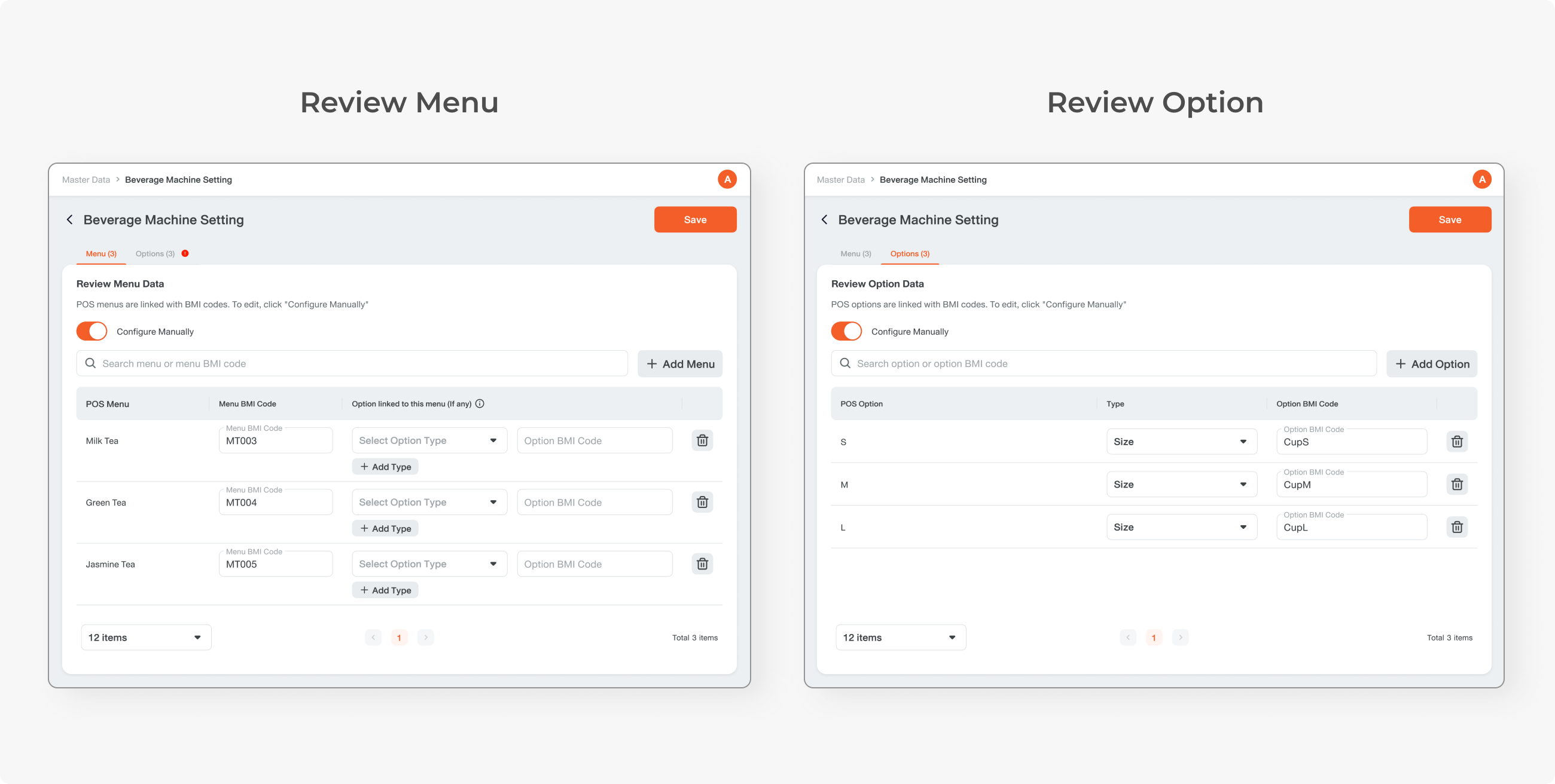
Another use case is for a restaurant with no options in the POS system. Some restaurants have an option name in the menu name (ex., “Milk Tea Size L”). This will be an issue since the machine only recognises menu and option as separate items linked together, not as one item.
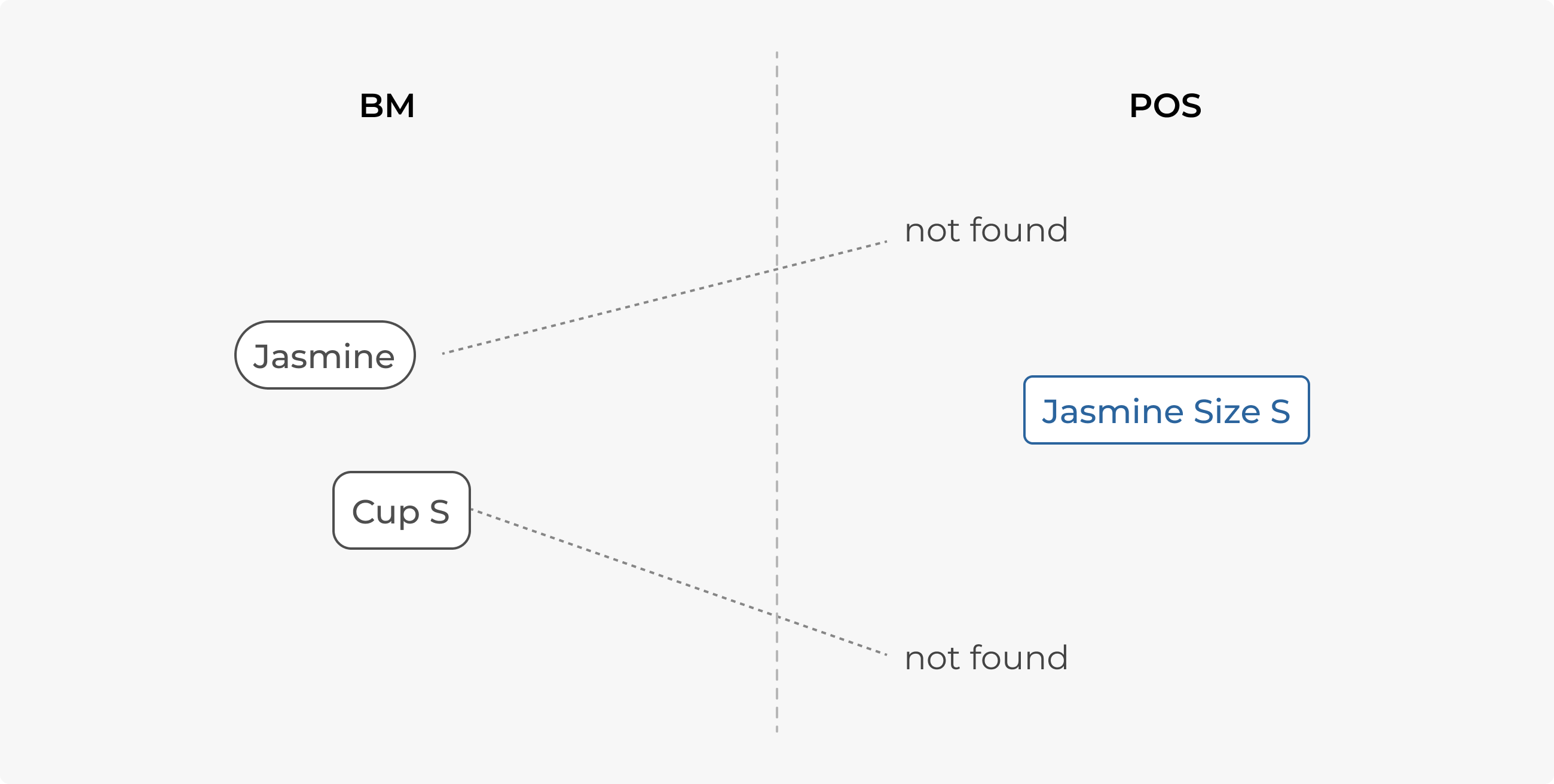
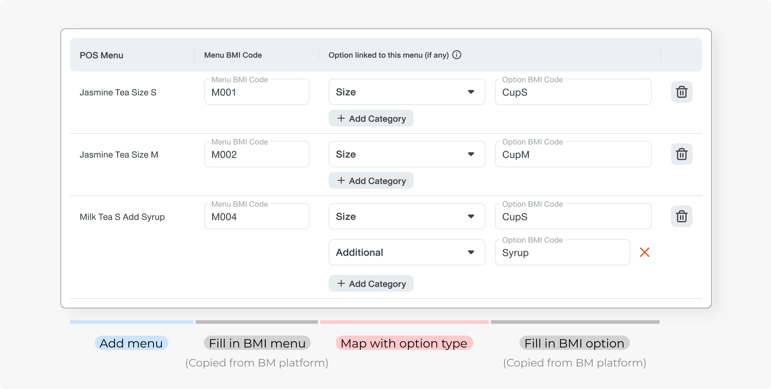
Since the system doesn’t recognise items with different names, users need to add a menu and link it to the option manually. Then fill in the BMI Code, which can be copied from the machine platform.
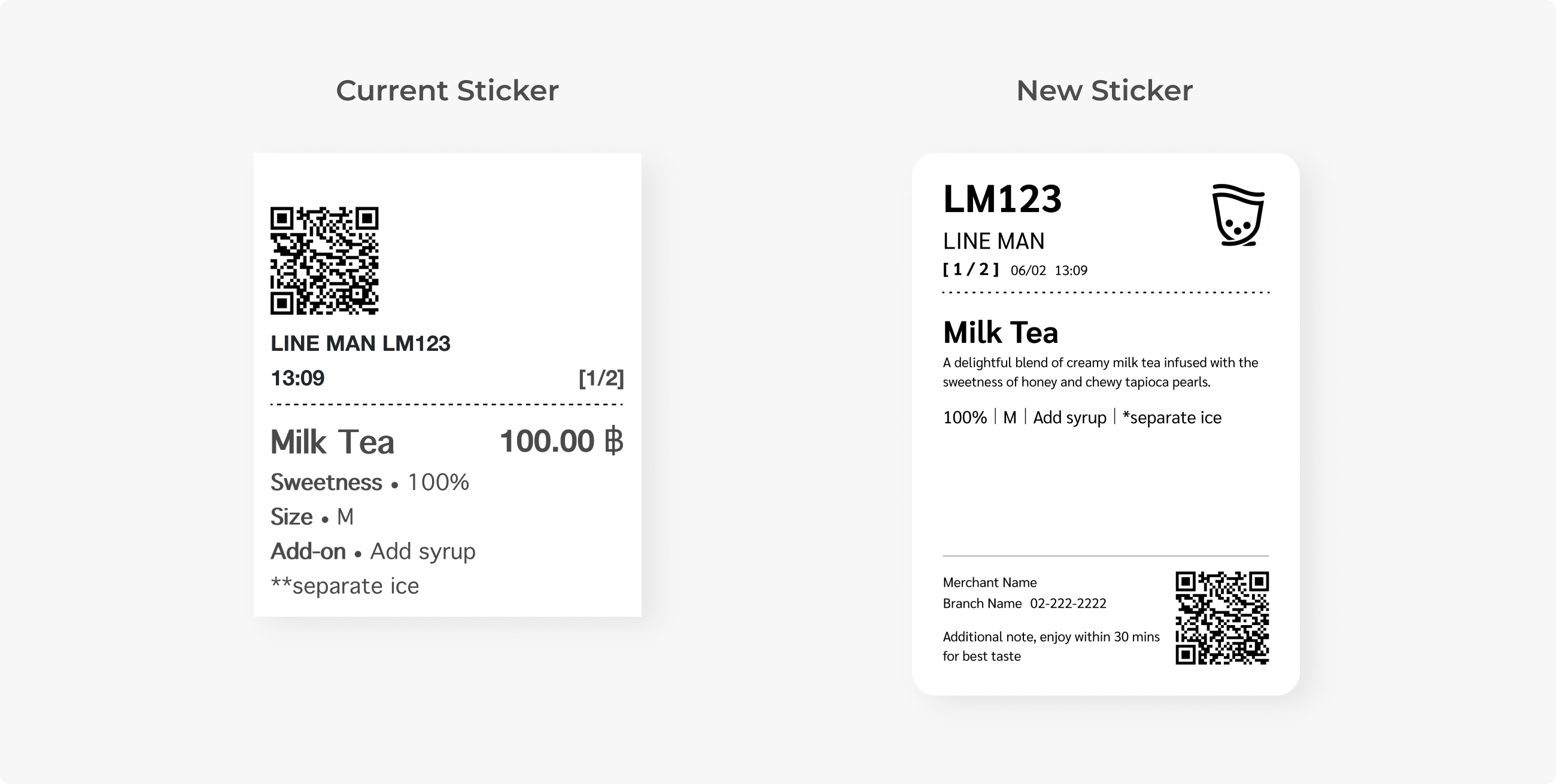
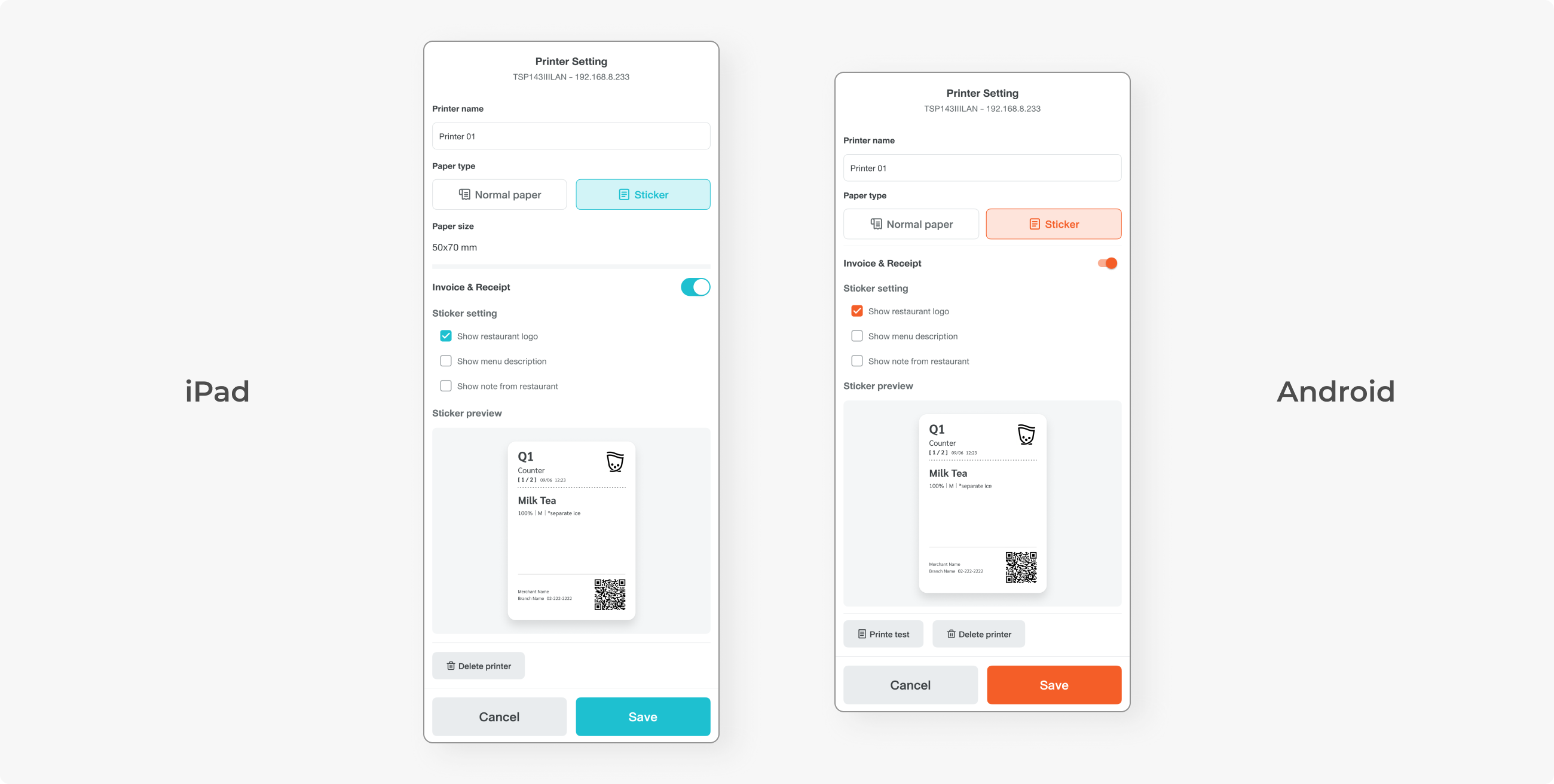
The current sticker material did not look professional, and the layout was not designed aesthetically. Most users are top-chain restaurants that want to represent their branding, so a new design is needed.
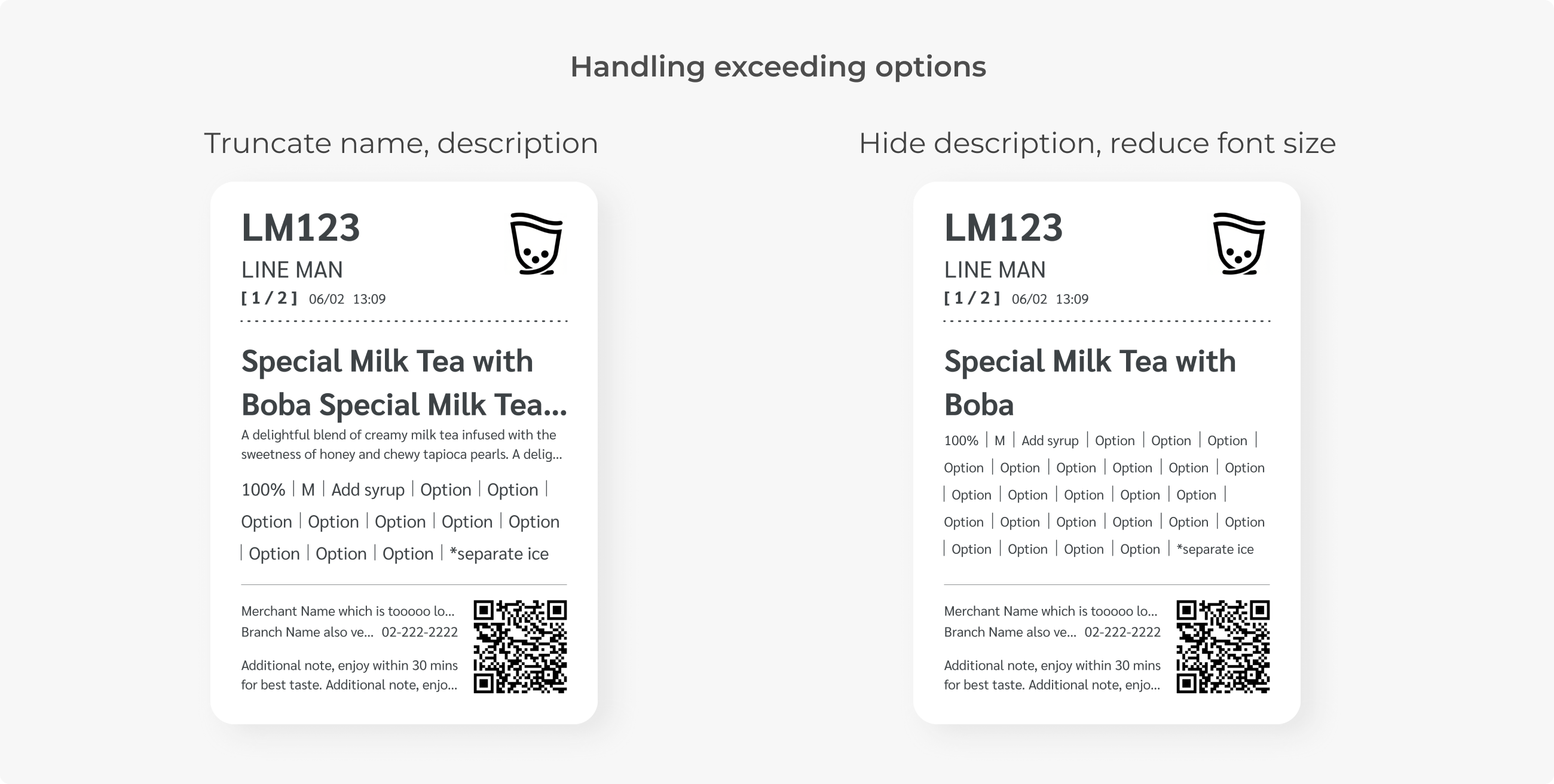
The most important element on it is the QR, which has a minimum size of 10x10 mm. Options are also crucial, as there may be options that have to be prepared by the staff, such as topping. This is why all other elements can be truncated except the option.
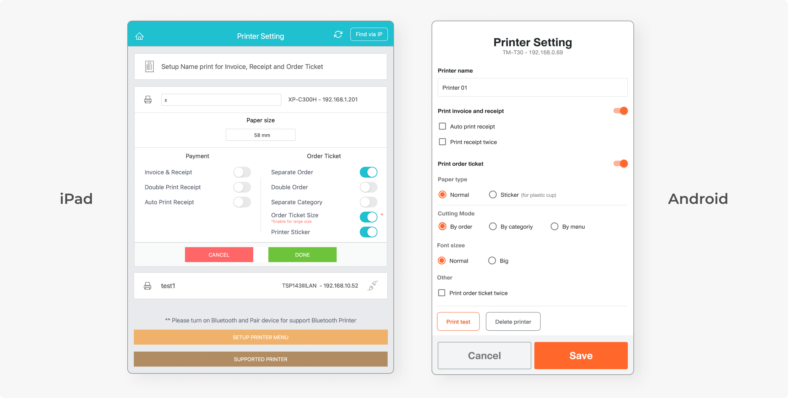
A new type of sticker means a new printer setting flow. While Android’s printer setting is already organised, the iPad’s is very confusing. There is no hierarchy or grouping of similar switches. Some toggles contradict each other. Turning one on may automatically switch off another toggle.
I replicated the design from Android and changed the information architecture. In the existing flow, the user chooses between invoice and kitchen ticket first, which is the printed content. Now it would make more sense to choose paper type first, as an invoice cannot be printed on a sticker.
ADDITIONAL IMPROVEMENT
This was actually not part of the requirement, but iPad POS still uses the old design system and legacy code, built around 10 years ago, when the UX concept had not yet been adopted.
Fortunately, the developer I was working with noticed this issue. He wanted to revamp the code, while I wanted to revamp the interface. We came up with a deal for this additional scope, and I had to deliver this within only one day.
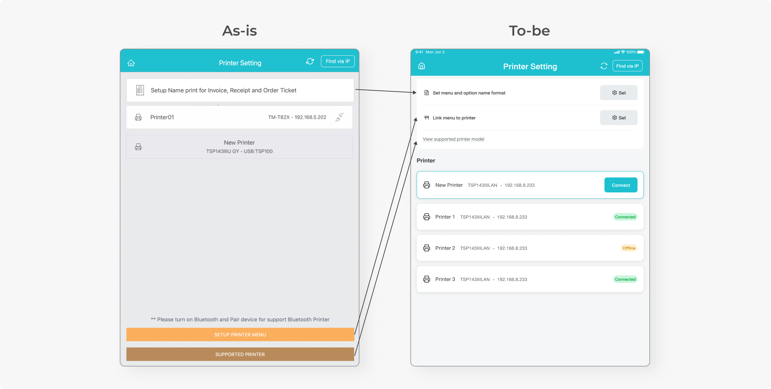
I turned the whole page into a new design system and reorganised the action button. Settings were all moved to the top, followed by printer config and new device connection. The supported printer hierarchy was reduced as it is not a setting but only a piece of information.
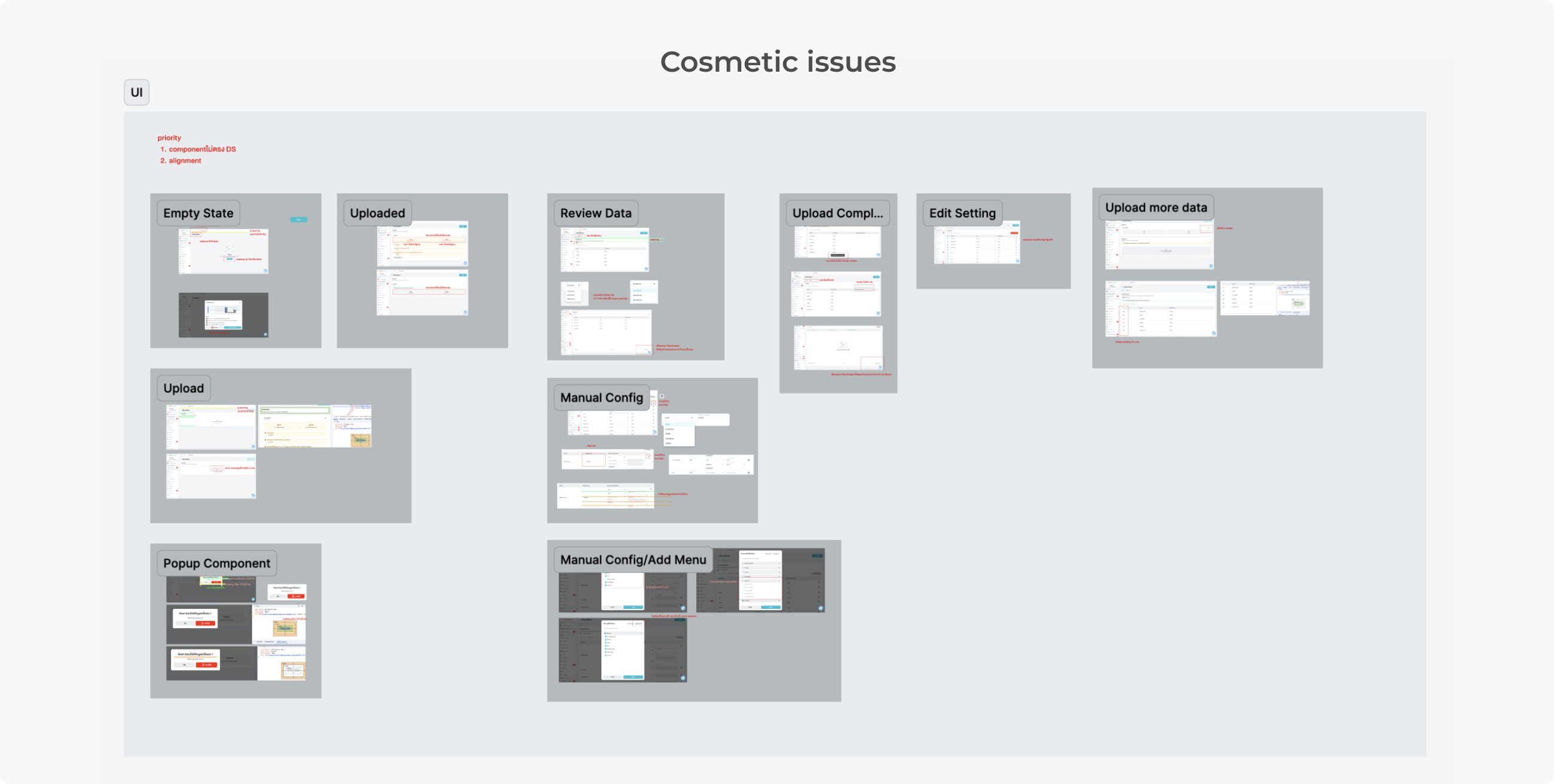
After the development process, I came back and did a quick review to ensure that the production aligned with the design in Figma, and found issues regarding the design system. Many components seem to be something else outside DS, and incorrect copy was spotted. At the time, I realised that the post-development review is crucial, and will continue doing this process.
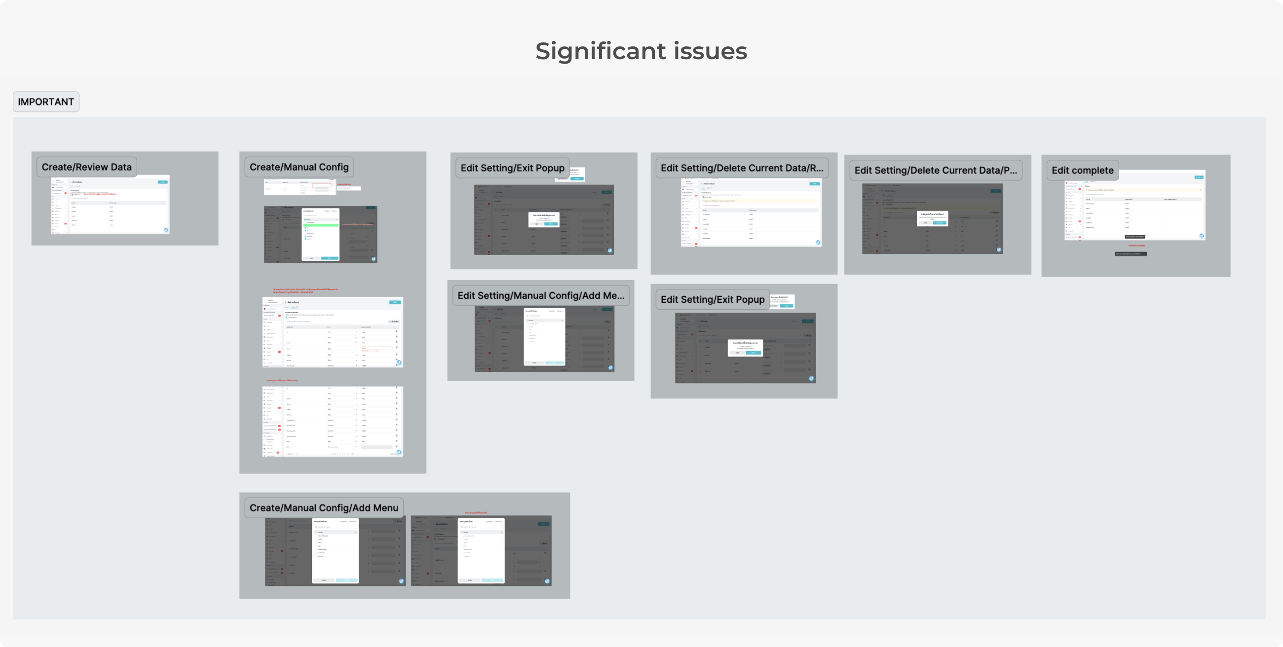
Here is how I logged design issues. They were divided into two groups: those that impact experience, and those that affect UI consistency. This was to ensure that significant issues would be solved first, before the cosmetic issues.
CONCLUSION
The most challenging part was that the concept of this project was very tech-heavy and hard for the designer to understand. I had to be involved in the technical ideation process to ensure that the journey is user-friendly and to defend against what’s bad for the user journey.
This project involved a third-party platform, which was the beverage machine system. Many technical limitations led to complex setup procedures, and the concept of menu mapping itself may seem abstract for some users.