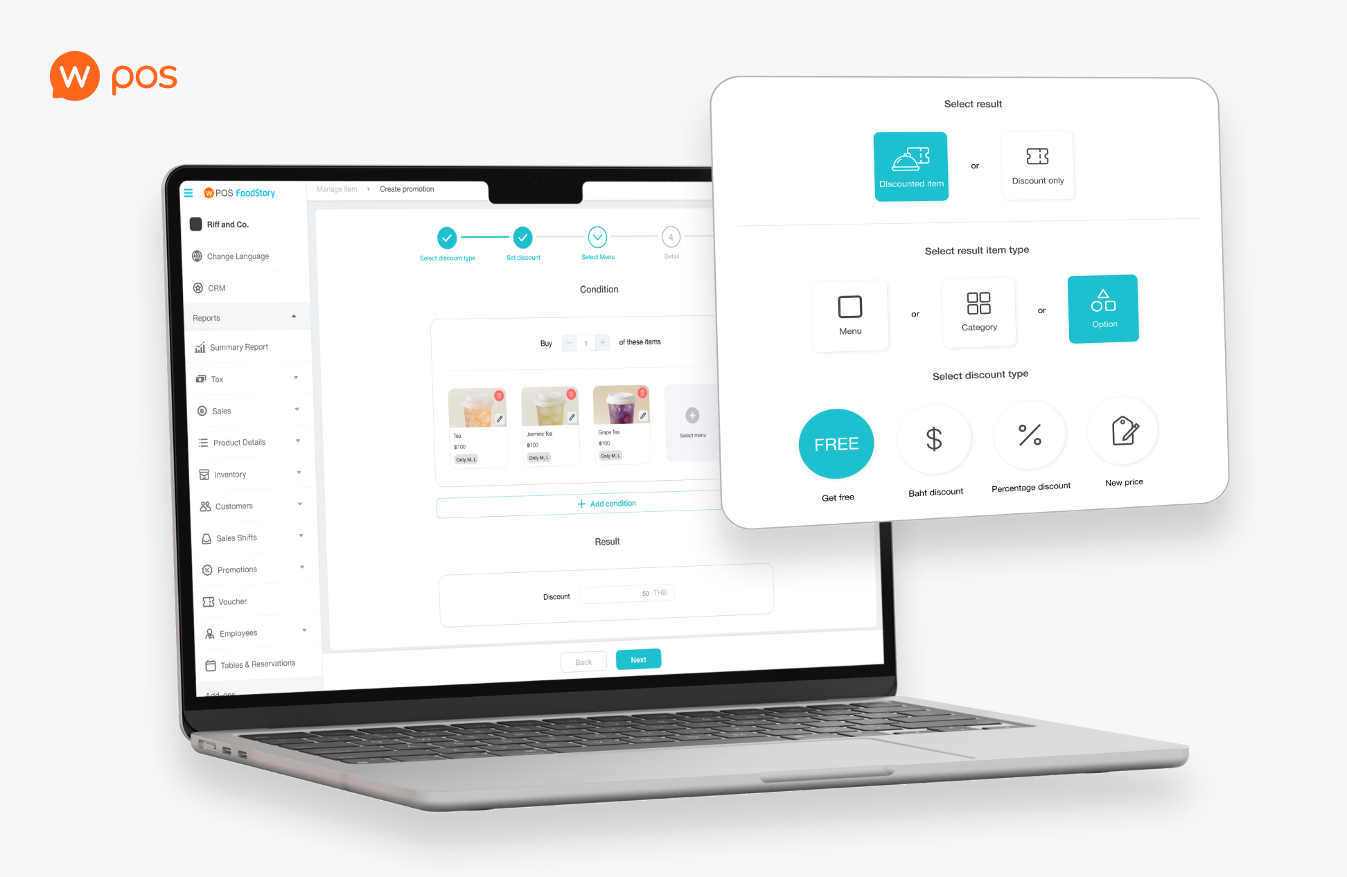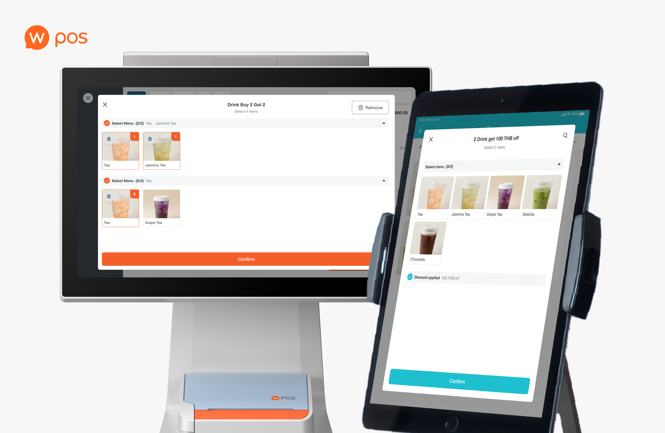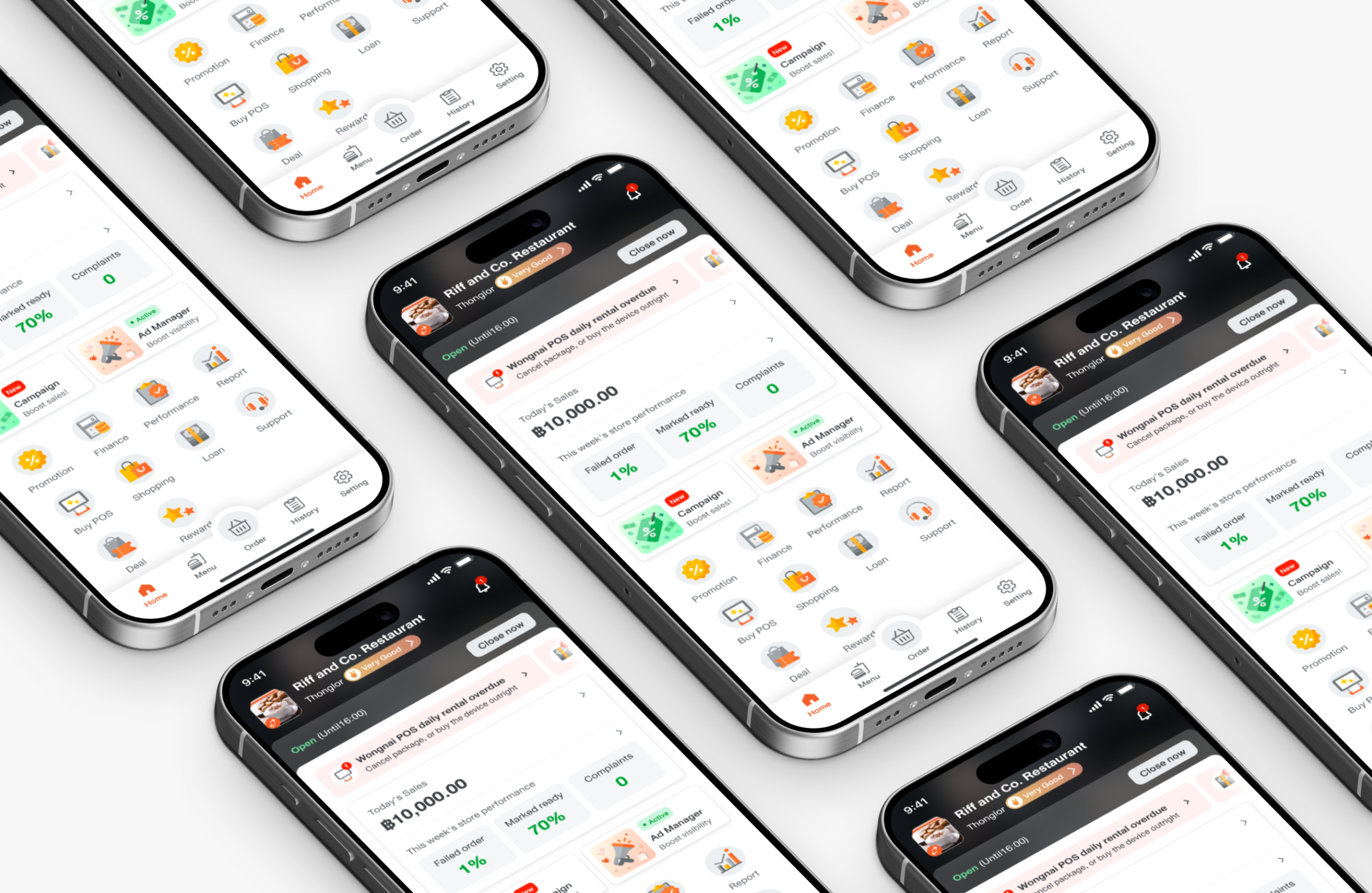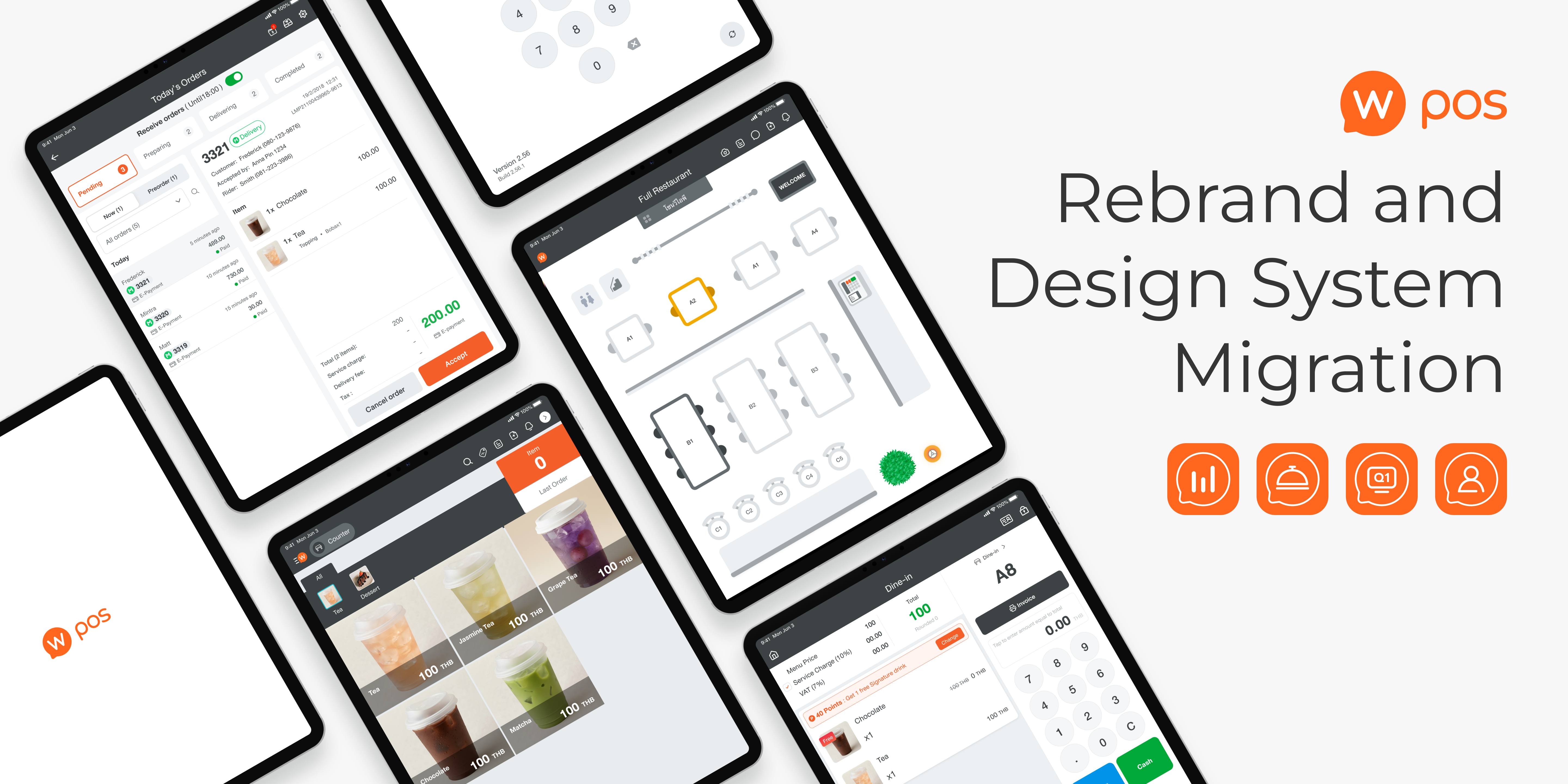

A project to consolidate products from merging companies, FoodStory and Wongnai. This includes handling user experience migration in merged products and transitioning the design system, incorporating AI tools for colour-mapping.
Optimised UX, handled feature differences between the two platforms, and transitioned the design system when merging FoodStory and Wongnai into one unified brand, impacting more than 40,000 users.
However, 3 out of 9 interviewees didn’t actually match the criteria due to miscommunication.
We didn’t do the user interview due to limitation of time, which I regret not doing so since we lose chance to gain more insight
DISCOVERY AND DEFINE
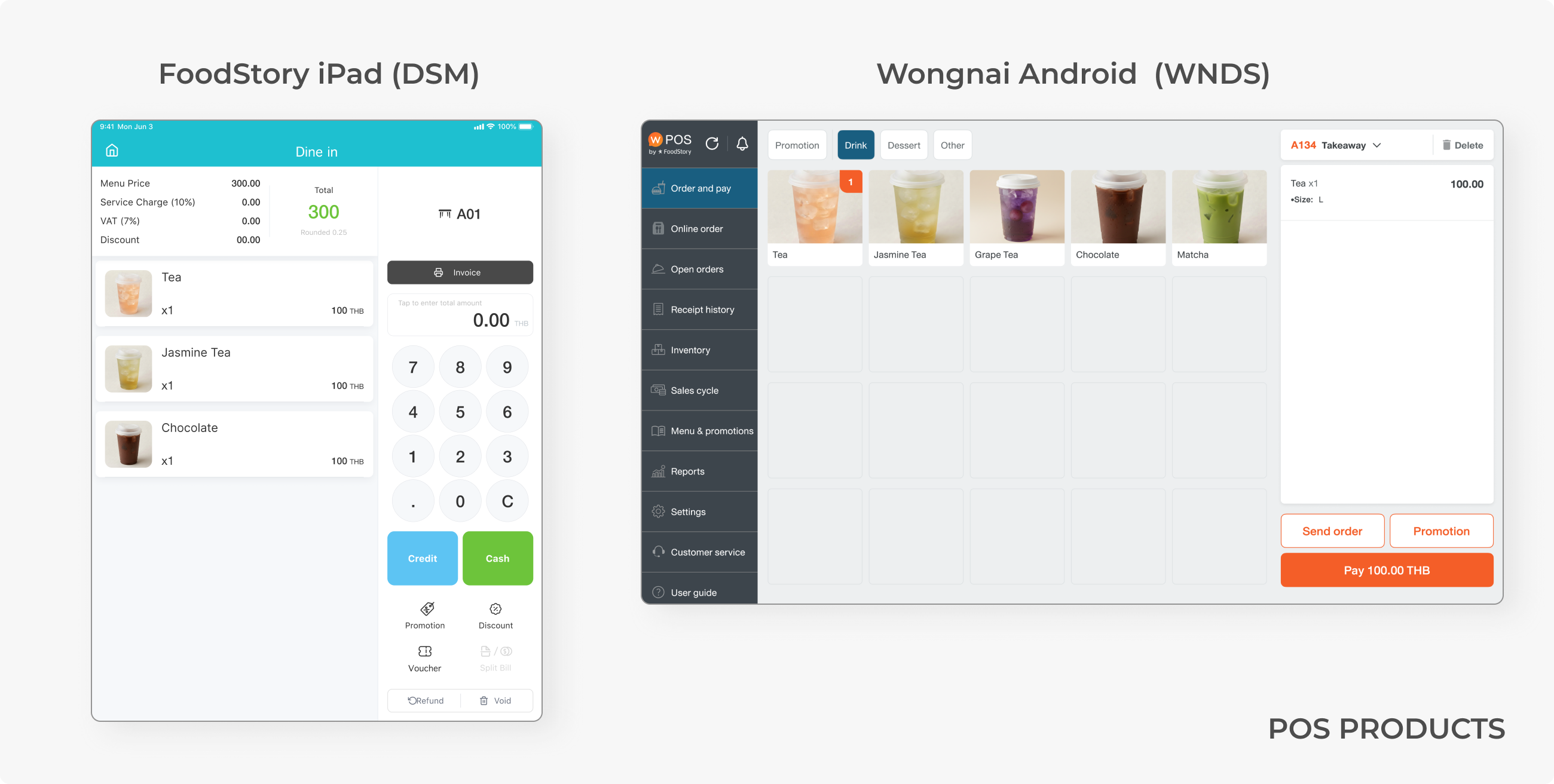
Due to the company consolidation, LINE MAN Wongnai now offers 2 POS platforms, Wongnai Android and FoodStory iPad, which use completely different design systems. FoodStory’s design system is called DSM, using turquoise blue as primary colour, while Wongnai use orange and a design system called WNDS.
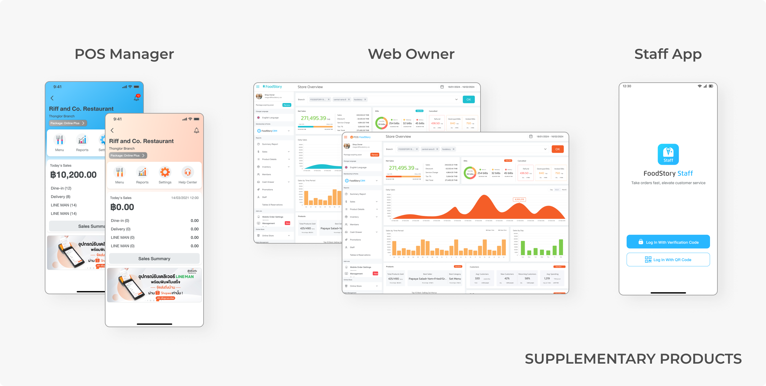
There are supplementary products for both platforms: Web Owner, POS Manager, and Staff App. Some are provided in two versions for both companies’ customers, which can be differentiated by colour and look almost the same since they were duplicated from each other.
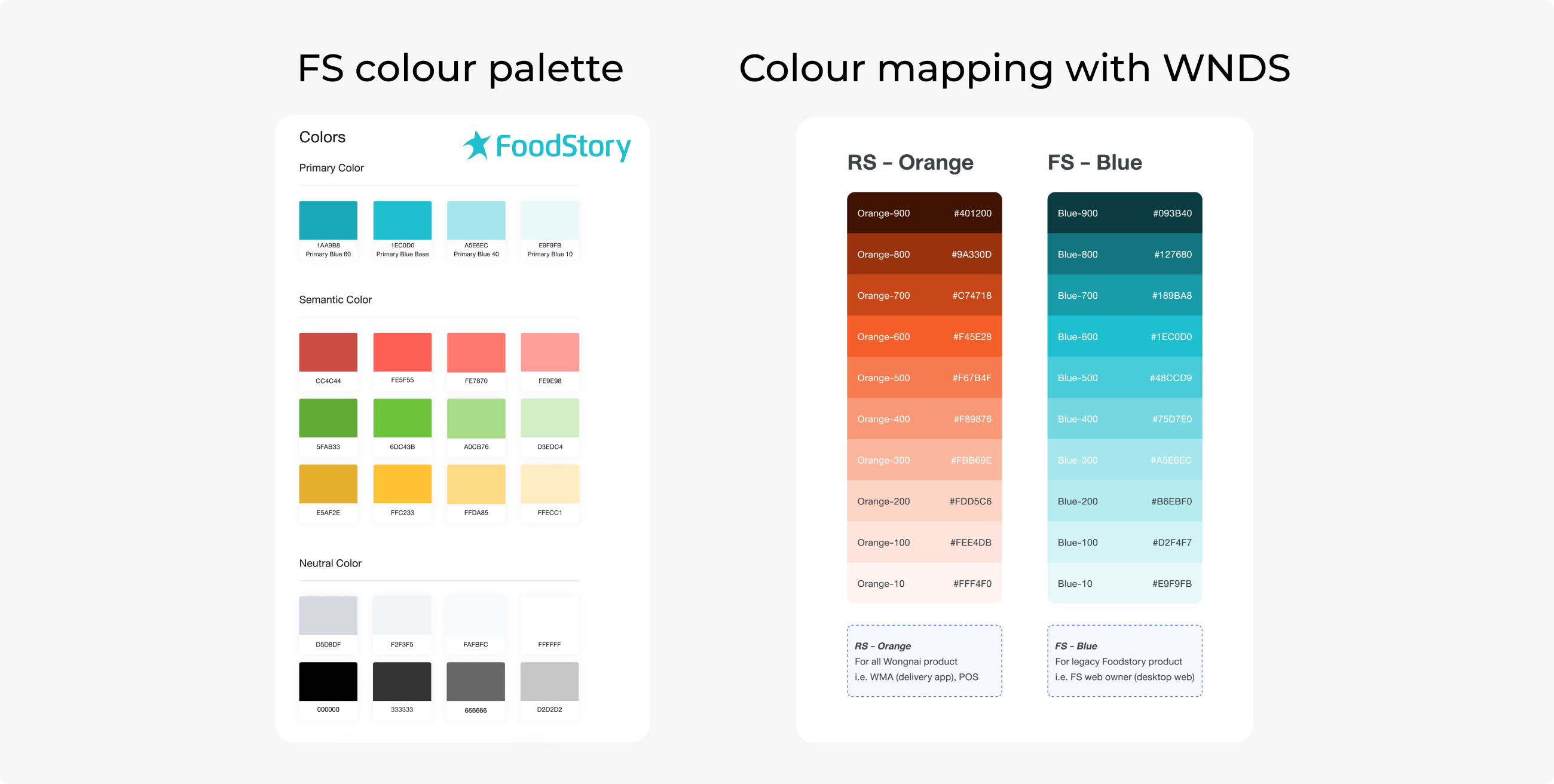
I used ChatGPT to help match these colours with colours from WNDS by inputting all the WNDS colour codes as reference data. Then, I divided 1,000 DSM colour codes into multiple sets and let the AI map them to the most equivalent colour in WNDS.
We expected that in the end, all platforms would represent the same branding as well as the same design system, but that cannot be done in a short amount of time, as the UI revamp is likely to be pushed as a low-priority task.
FIRST PHASE: UNIFY PLATFORM
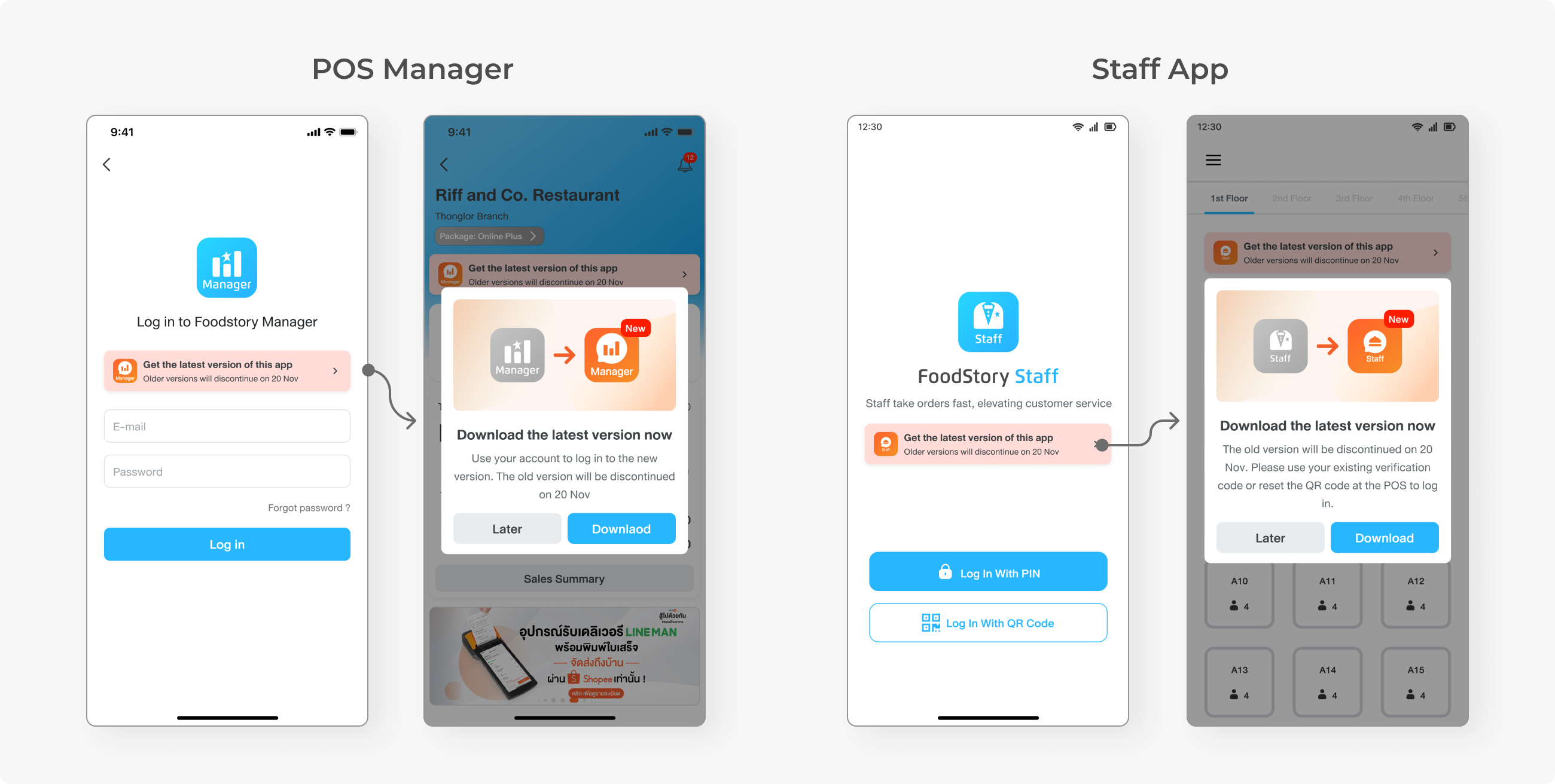
In the first phase, we started by unifying the separate platforms, which are Web Owner, POS Manager, and Staff App. This was mainly the developers’ task, while the designer’s task was to ensure migrated users are informed about their new entry point and how their data is managed.
A link to the new website was given to users. They can log in with the same account. Everything is the same; just the link has changed.
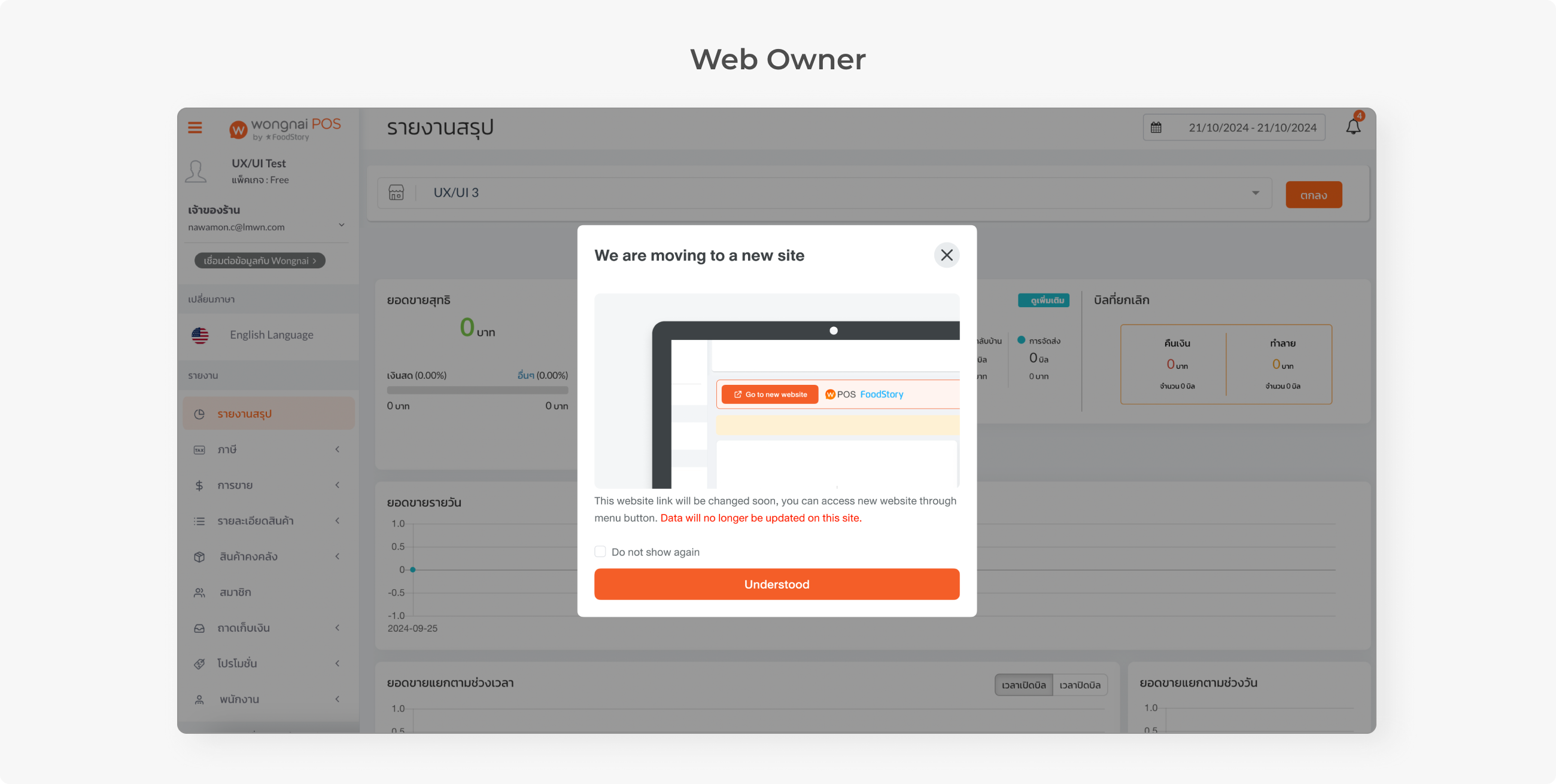
Some users use Master Data, a multi-branch management feature. If they use both Android and iPad, after merging, they have to manage every branch on the same website.
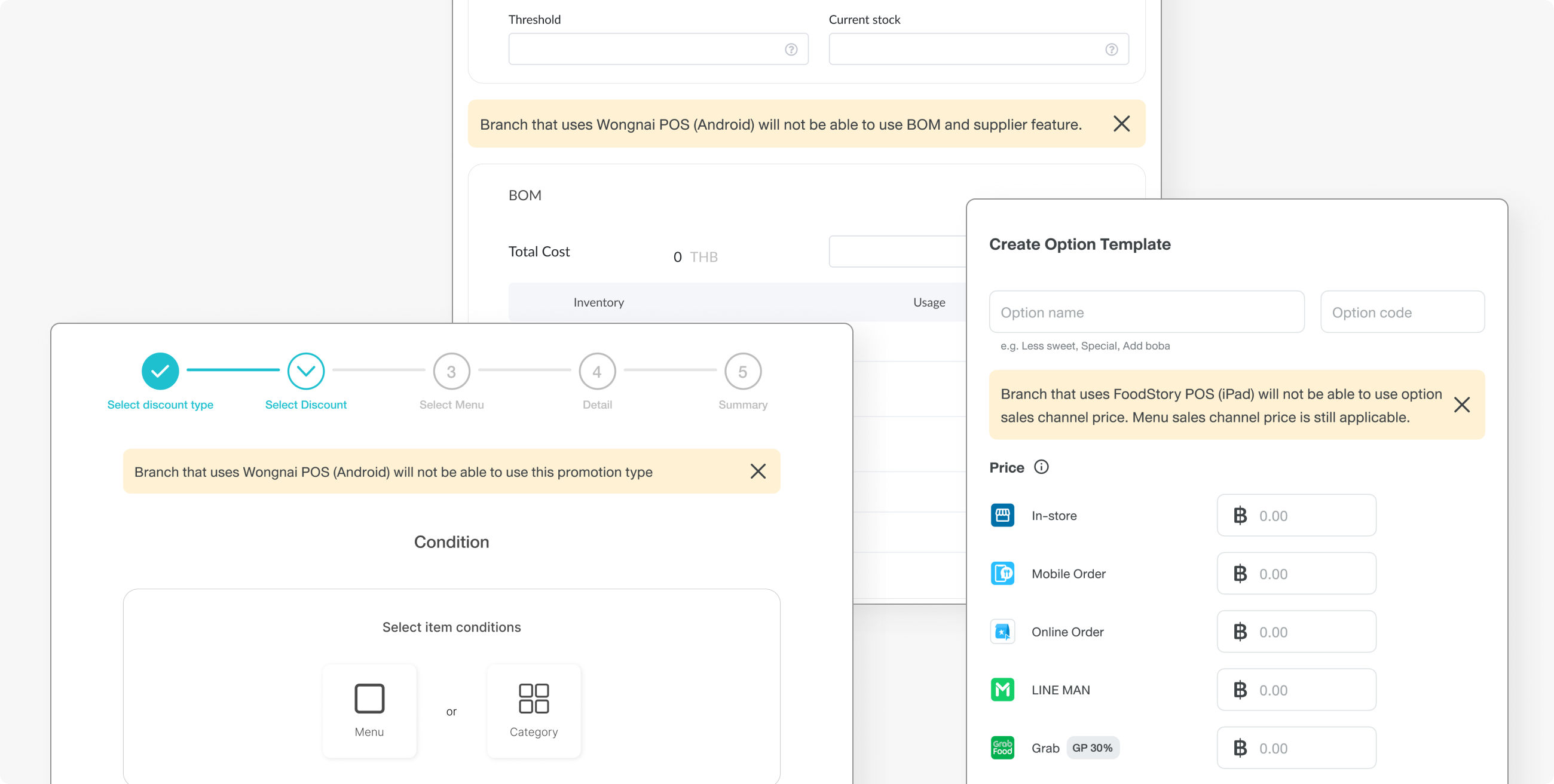
There are feature differences, and users need to be informed, so a banner is added to features that are only available on one platform, telling them this will show on branches that use the compatible platform only.
WHILE PROJECT IS ON HOLD
This project was on hold for a year due to priority shifting. We came up with a colour mapping solution. I created a turquoise palette to map with Wongnai's primary orange, and the team created a colour theme variable in Figma so that we can switch between orange and a blue theme. We could design using the blue colour without having to worry about future double work of re-assigning colour.
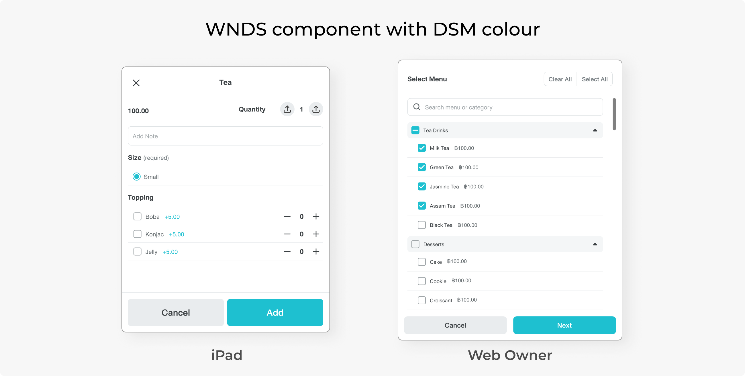
For the components, we have created a guideline that all new features on FoodStory platforms must use WNDS but with a blue colour to be consistent with the platform. However, this was not quite practical, since developing new UI components would take more front-end effort, and this part was usually cut off from the process.
So practically, on iPad and Web Owner, users may find two different design systems of components in the same flow.
SECOND PHASE: DESIGN SYSTEM TRANSITION
A year later, the rebrand task priority had been moved up. Most of the FoodStory app’s code is legacy, and developers need to revamp each page one by one.
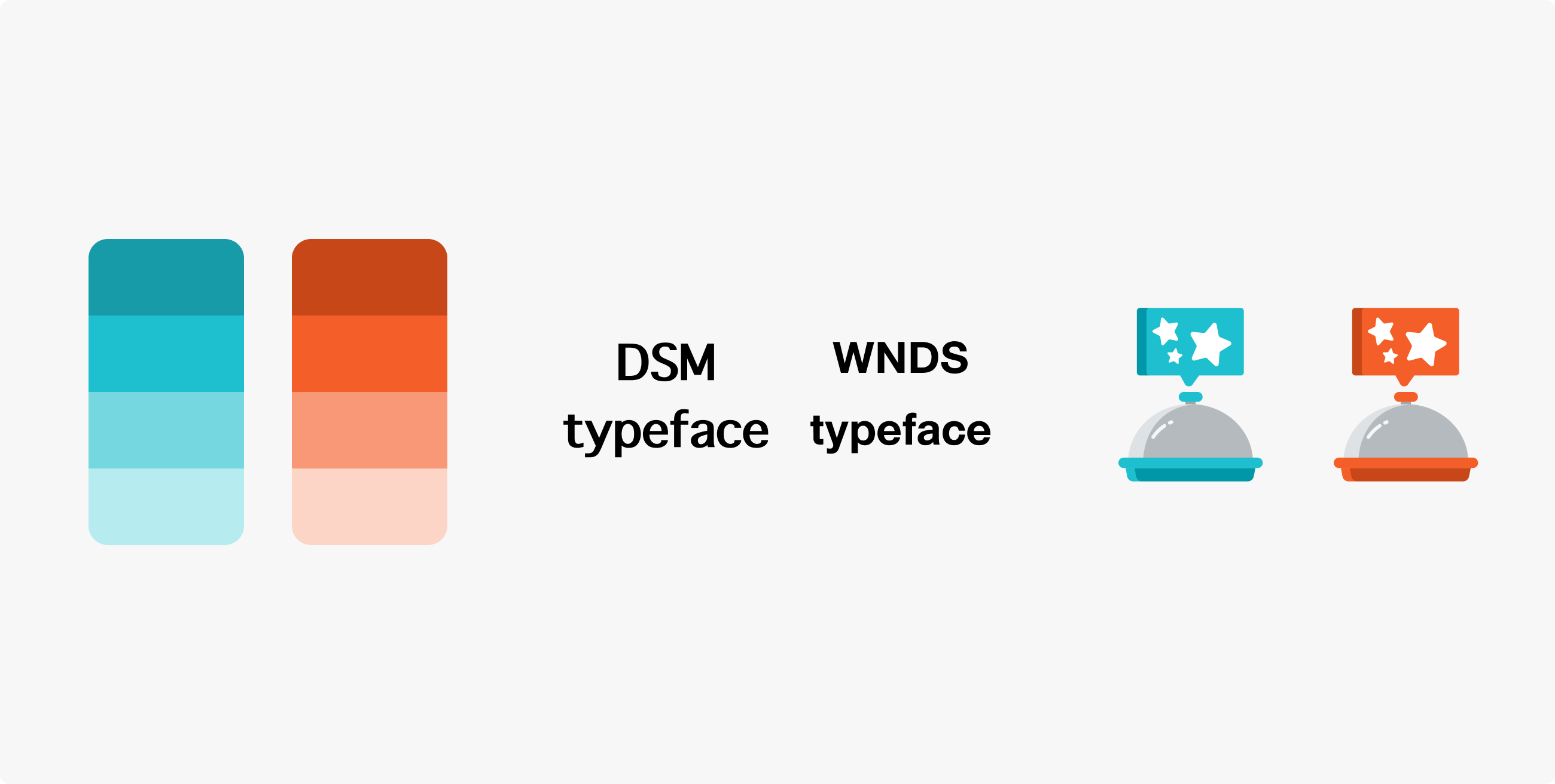
The timeline was to change the colour first, followed by the typeface, then the icon and illustration, which would be launched altogether. Component revamp was left out because that would take enormous effort.
In order to perform a one-click API transition, developers need to map all the colours in the system. There were around 1,000 colours, which is quite overwhelming, and most of them are almost identical.
I used ChatGPT to help match these colours with colours from WNDS by inputting all the WNDS colour codes as reference data. Then, I divided 1,000 DSM colour codes into multiple sets and let the AI map them to the most equivalent colour in WNDS.
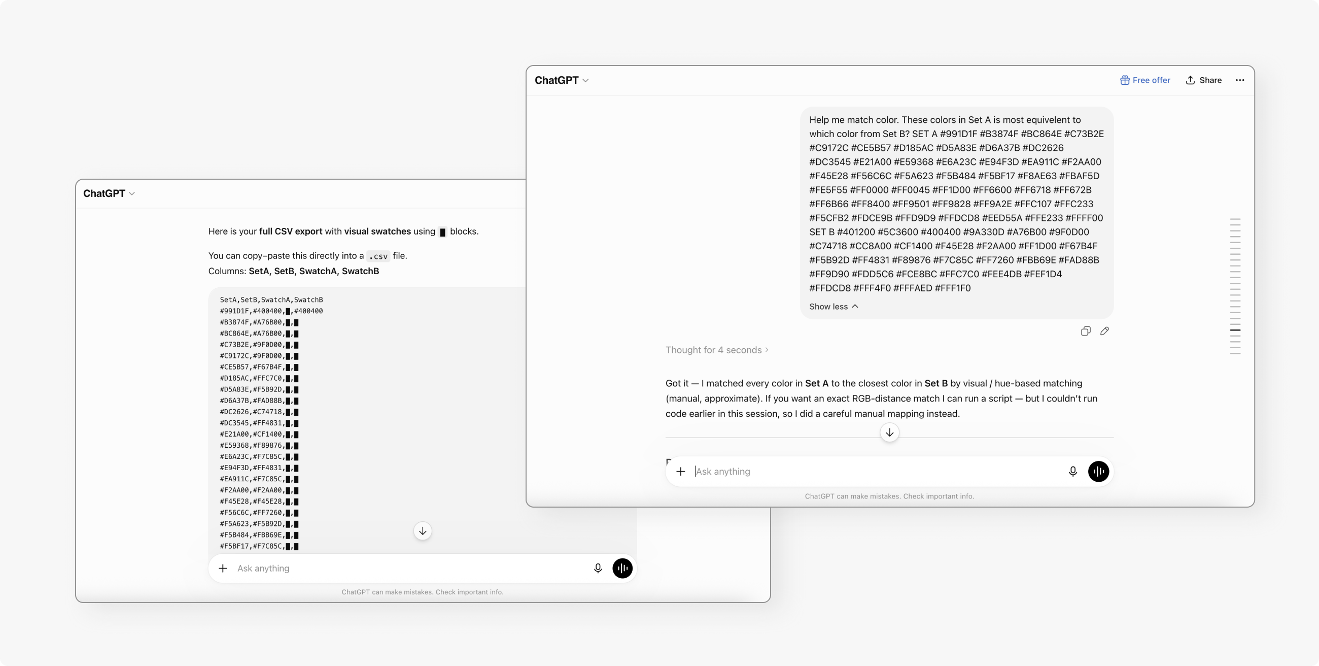
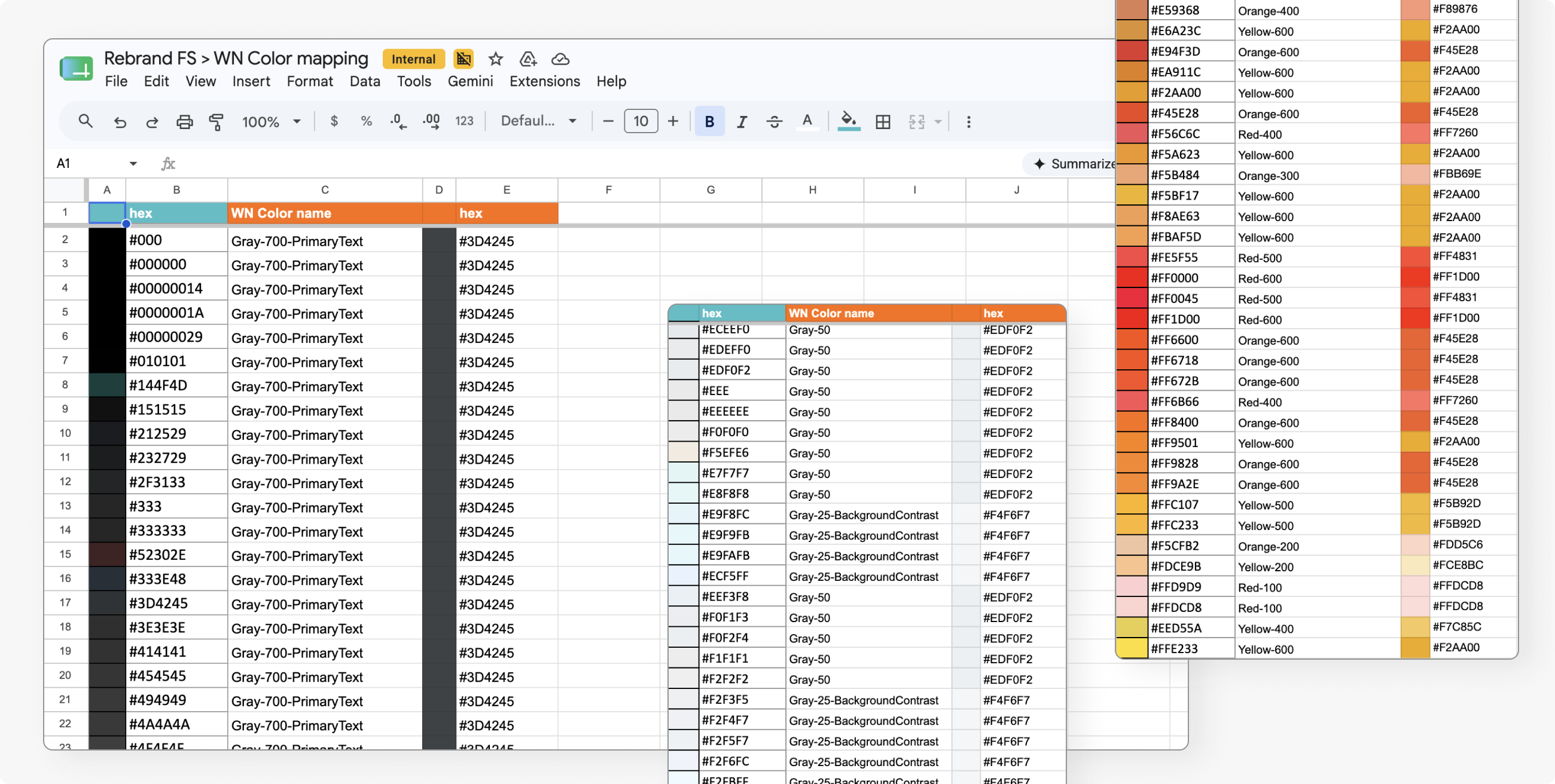
However, during the development process, I was still involved to review all pages one by one to see if anything broke.
One issue was that the use of colour in the iPad UI is very chaotic. One could find the primary action button in various colours, such as blue, green, yellow, or even brown. Also, most colour tones were pastel and didn't meet the WNDS contrast standard. Mapping colours directly would result in an aesthetically unpleasing use of colour and an inconsistent pattern.
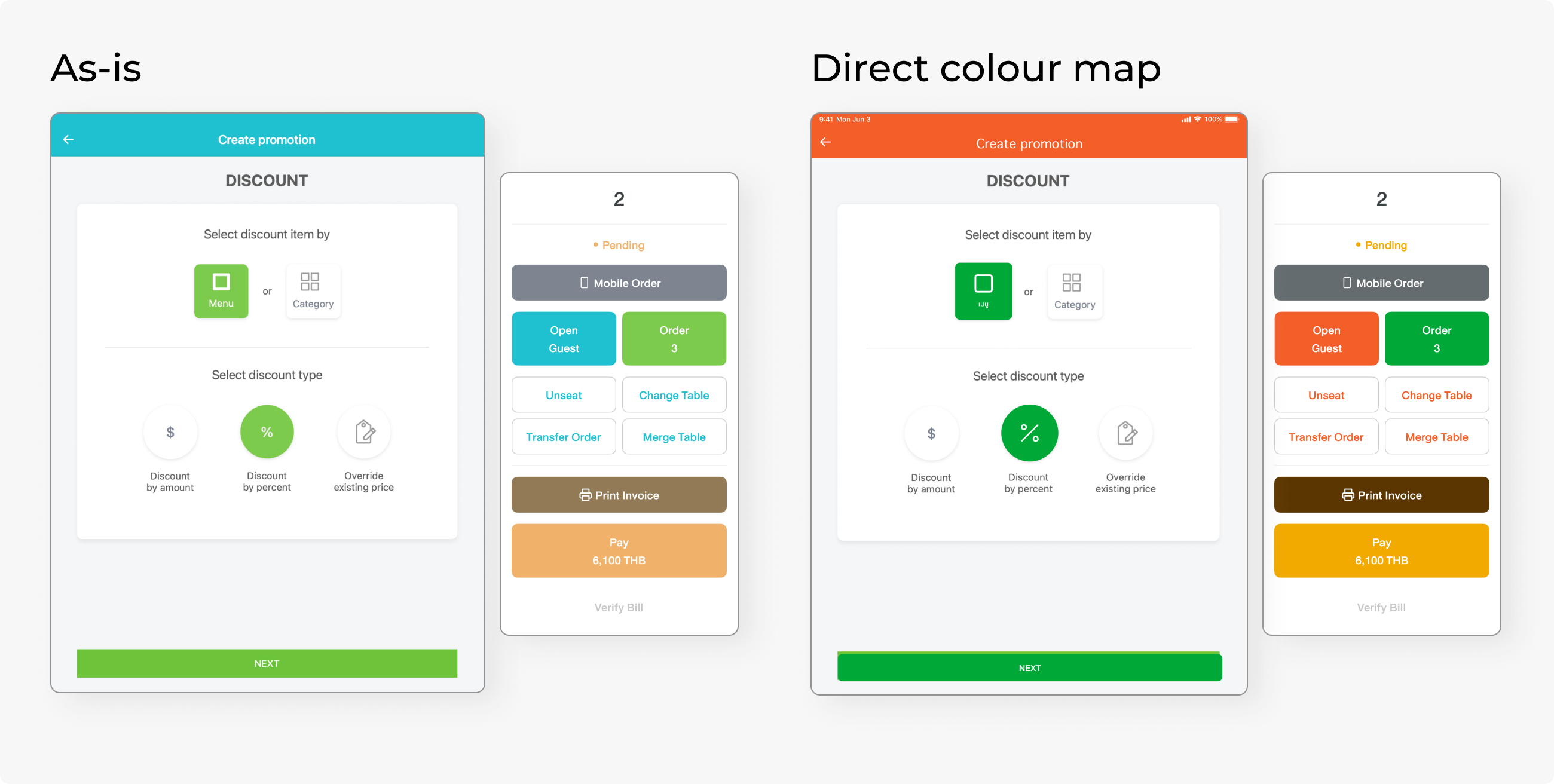
I tailored the colour in some significant screens that users see multiple times a day, such as a PIN on the screen and a table command pop-up. Also, the top bar, which was previously FS primary blue, was changed to grey-700, rather than WN primary orange, since it would be too bright.
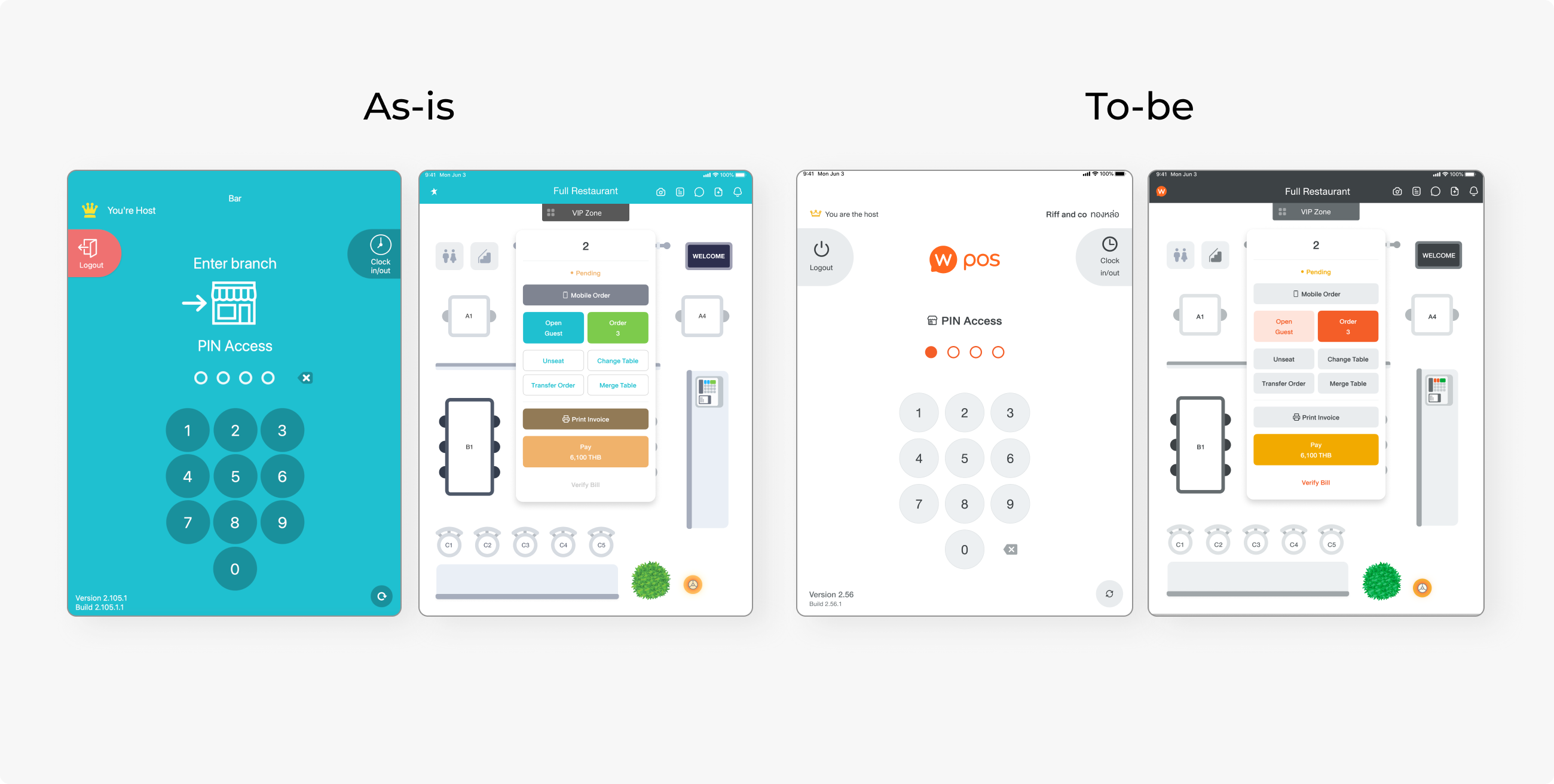
I identified the colour patterns, and the most common one is the red and green pair for confirmation and cancellation. These are all changed to primary orange and flat grey.
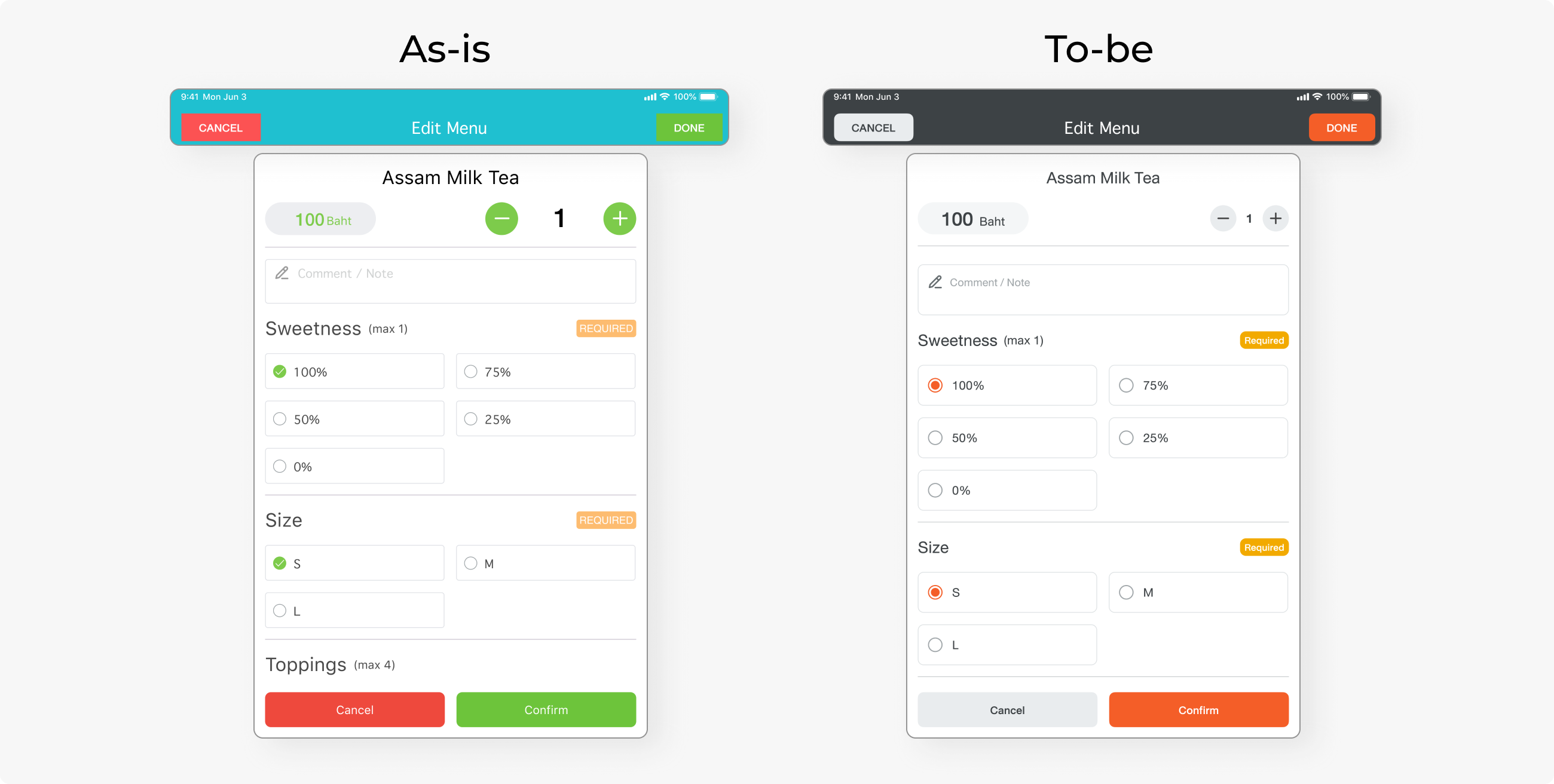
Sometimes, red and green were used for other actions, such as plus and minus, or create and delete as secondary equivalent actions. These patterns are all turned into flat grey buttons.
According to persona research, some storefront staff are foreigners who cannot read Thai or English. They learn to use the POS by remembering colours and icons. In this case, changing red and green to grey might affect how users differentiate the buttons, so an icon was added to prevent buttons from losing their visual context.
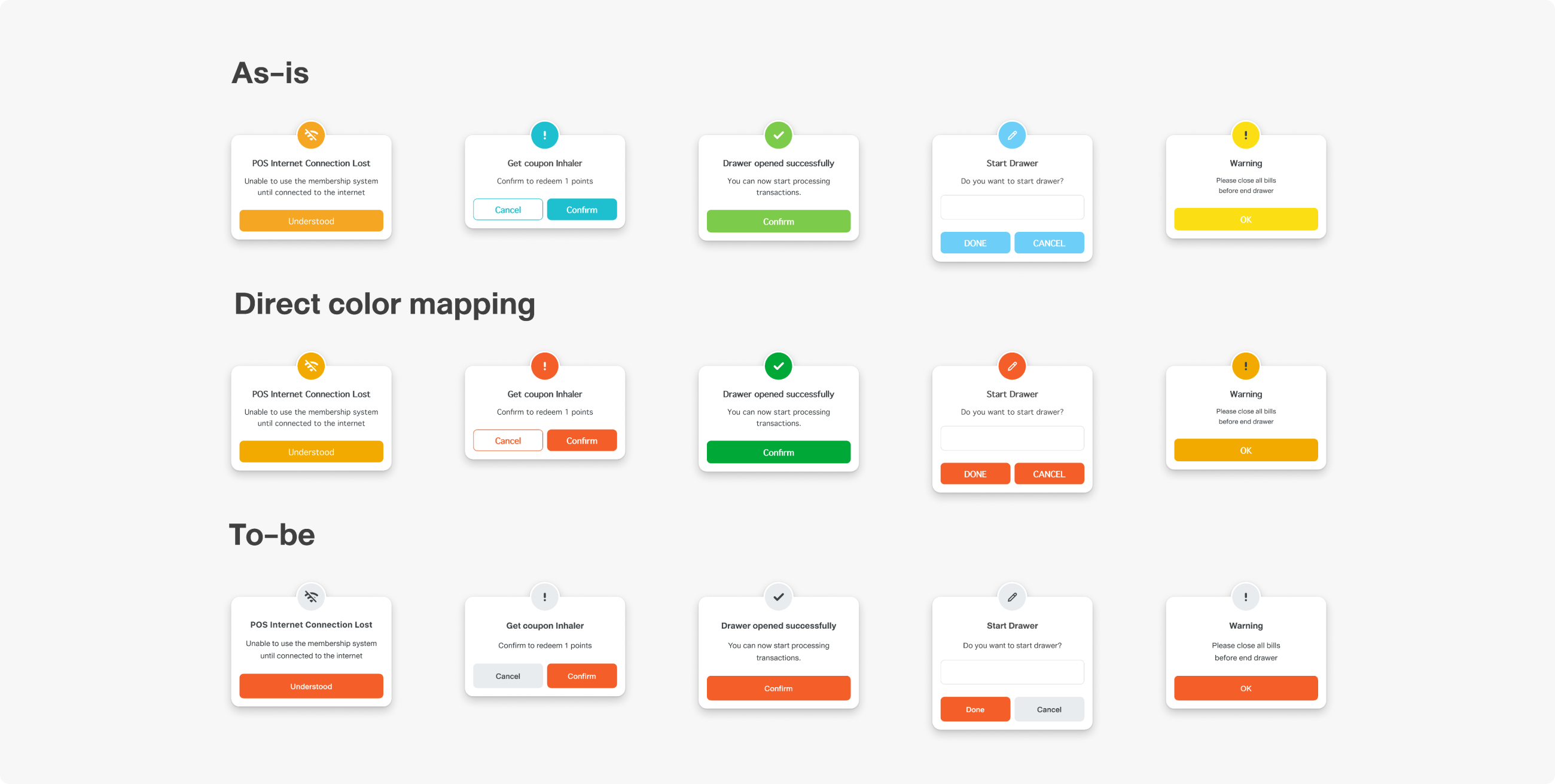
Various colours were used in the dialogue component, which did not have a meaning at all. All of them were changed into the primary orange colour. The primary button is not always on the right, and I intentionally kept it untouched. This is because users might be used to tapping the same position, and switching might increase the chance of clicking the wrong button.
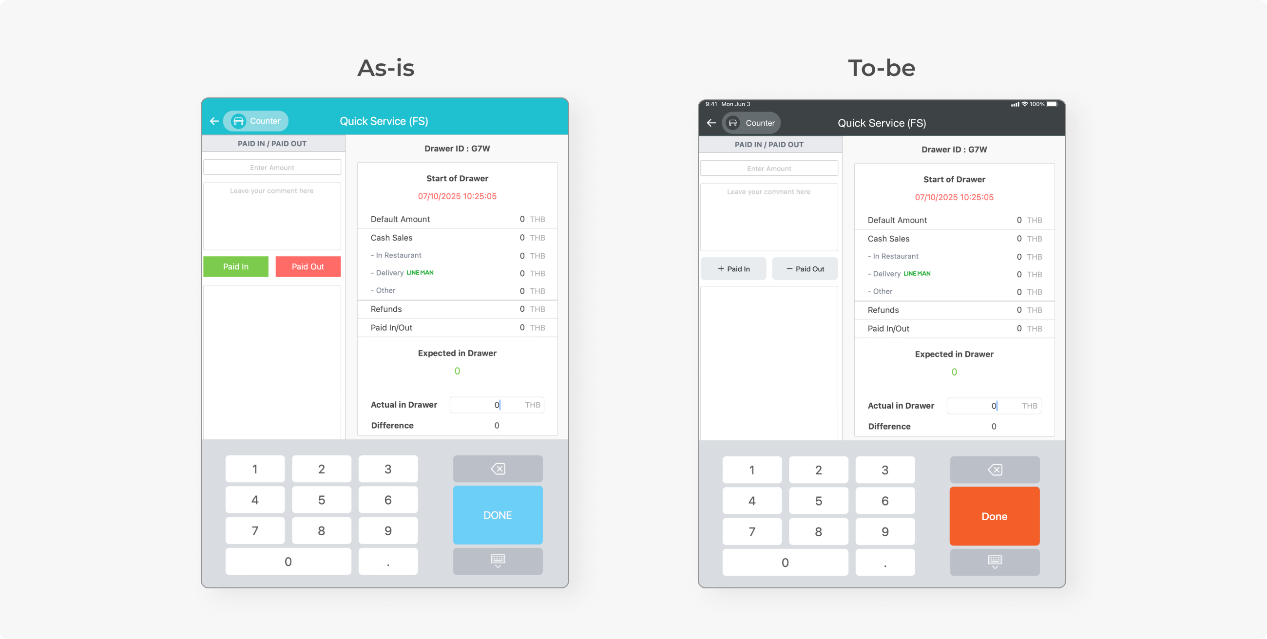
There was no significant pattern in these two colours. They just appeared together quite often. Yellow buttons that convey primary action were turned into orange, and the others were turned into either secondary or flat grey. Brown buttons, which mostly appeared to be non-primary action, were also changed to flat grey.
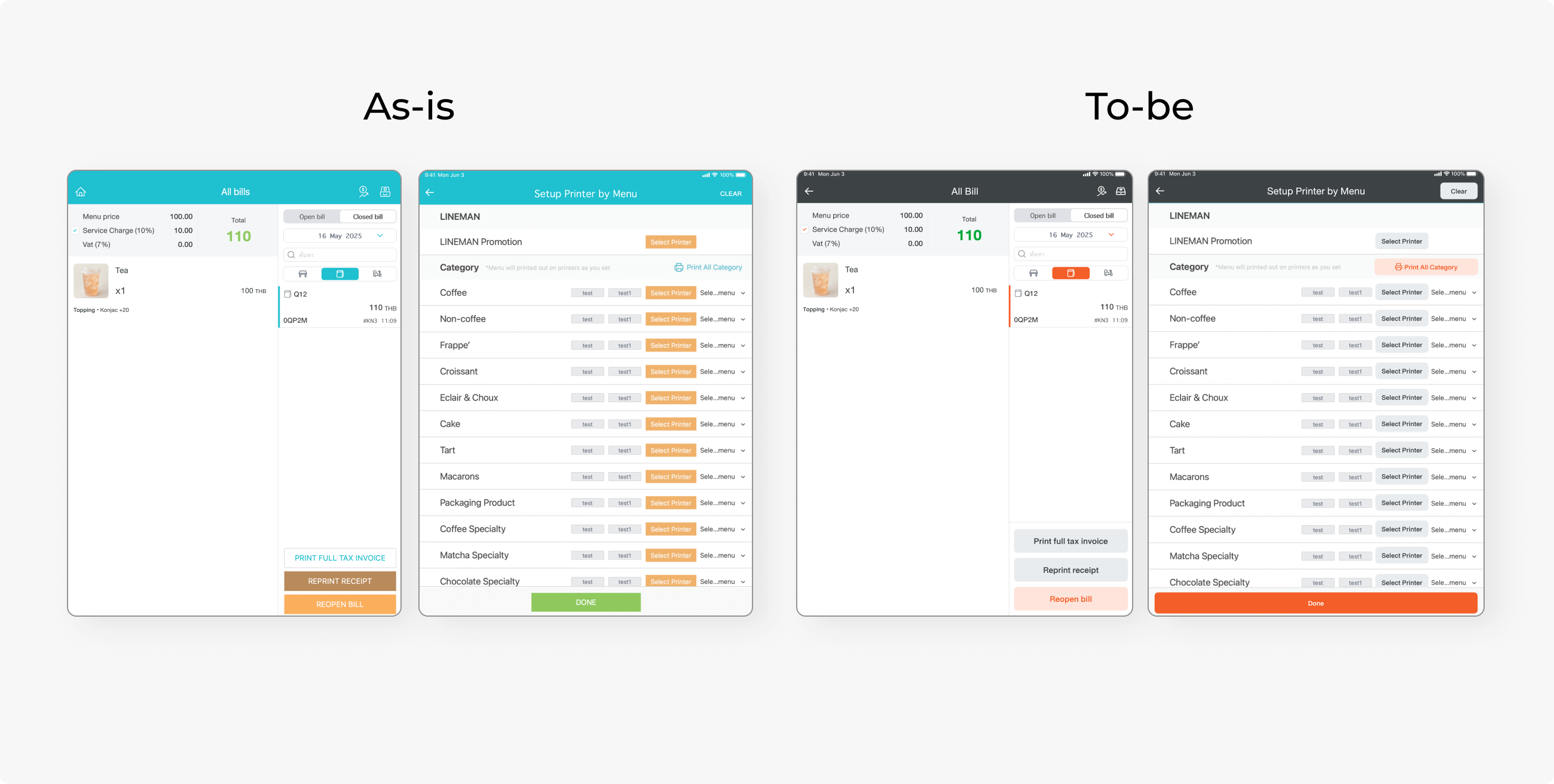
Icons and illustrations had to be changed to be consistent with the design system. Another issue was that most materials were in .png, which took longer to re-create in .svg format. This was only done with icons in the frequently used flow, while the minor ones were ignored due to insufficient time and effort.
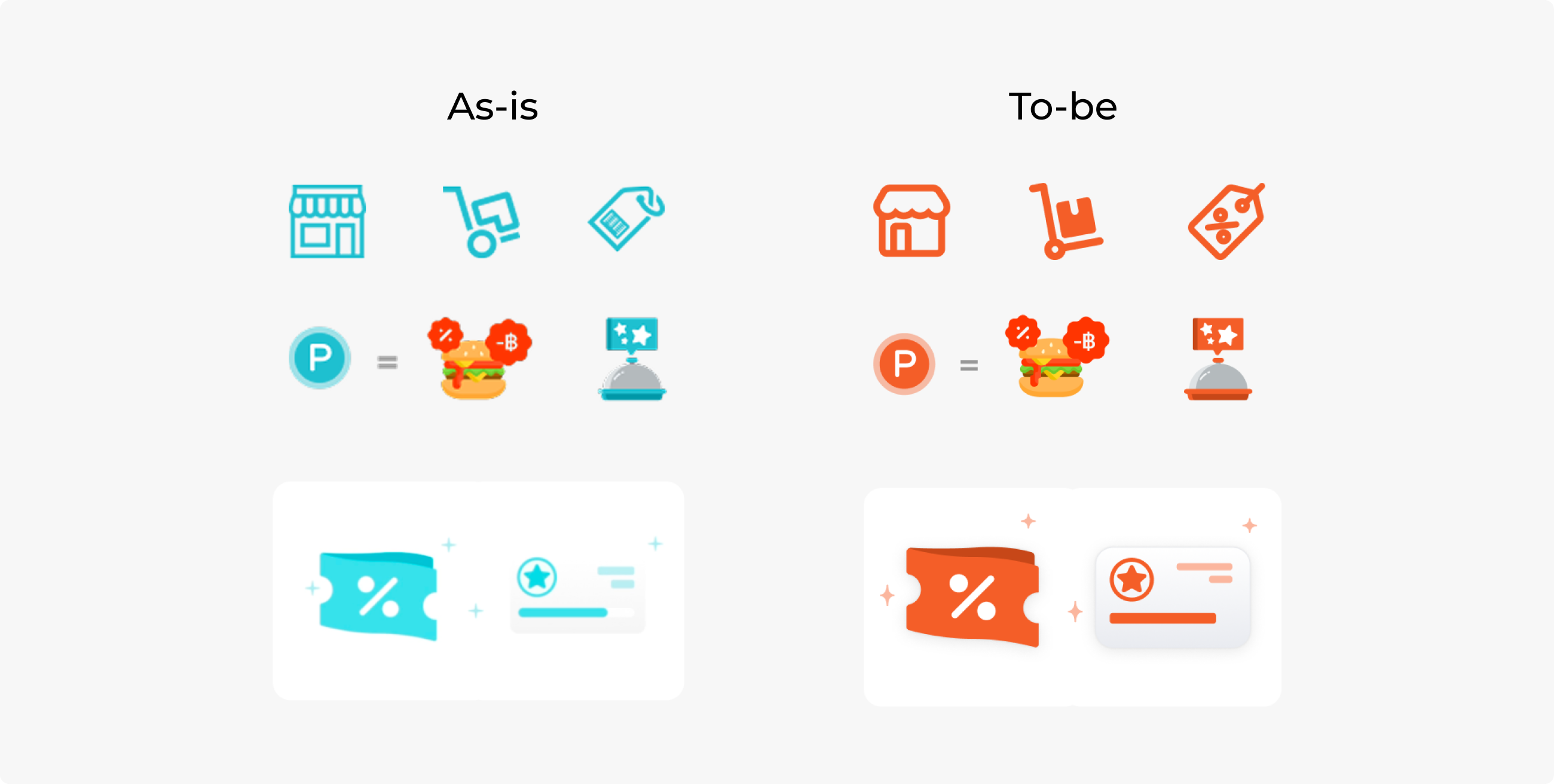
iPad POS provides a theme colour change feature. There was only a single colour shade per theme in the system, as only one colour shade was switched with the primary FS blue. However, WNDS uses more colour shades, not just the primary 600.
I used Claude Cowork to help me turn a set of single colours into a palette equivalent to WNDS colours. This way, the system can map the entire palette and switch themes seamlessly.
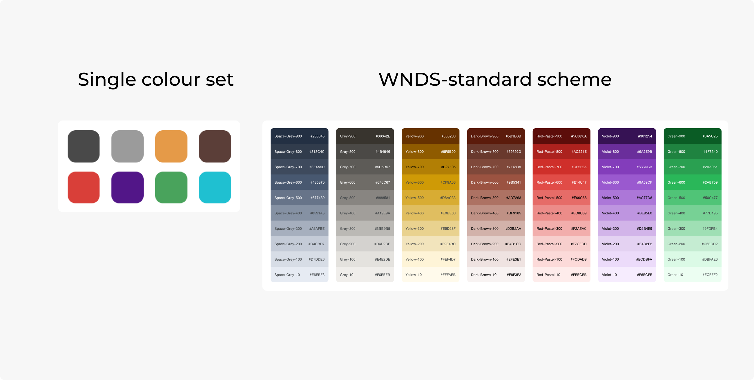
Some colours were tweaked due to several issues. Most colours were adjusted to meet the contrast standard and to be more aesthetically pleasing.
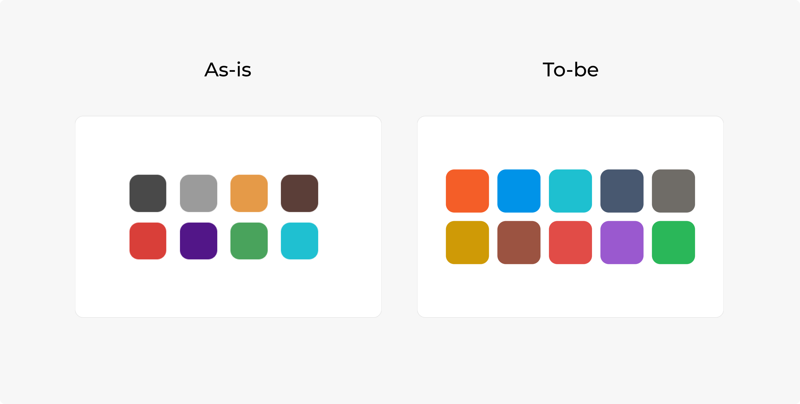
2 greyish colours were very similar. The light one looked like a disabled colour. I turned dark and light greys into greenish and bluish tones so that they look different. This way, we can improve the theme switch feature without removing any colours that users might be used to.
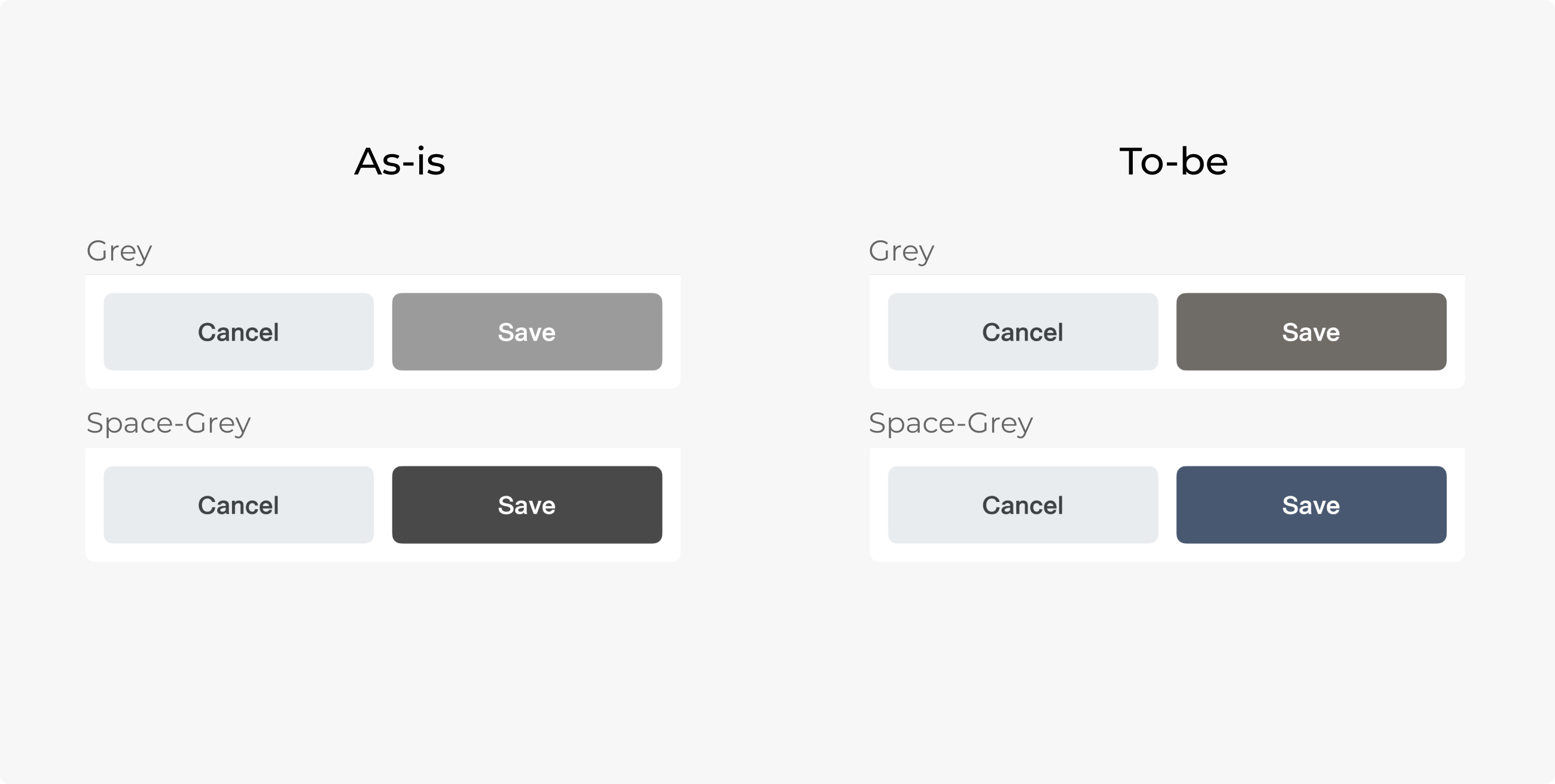
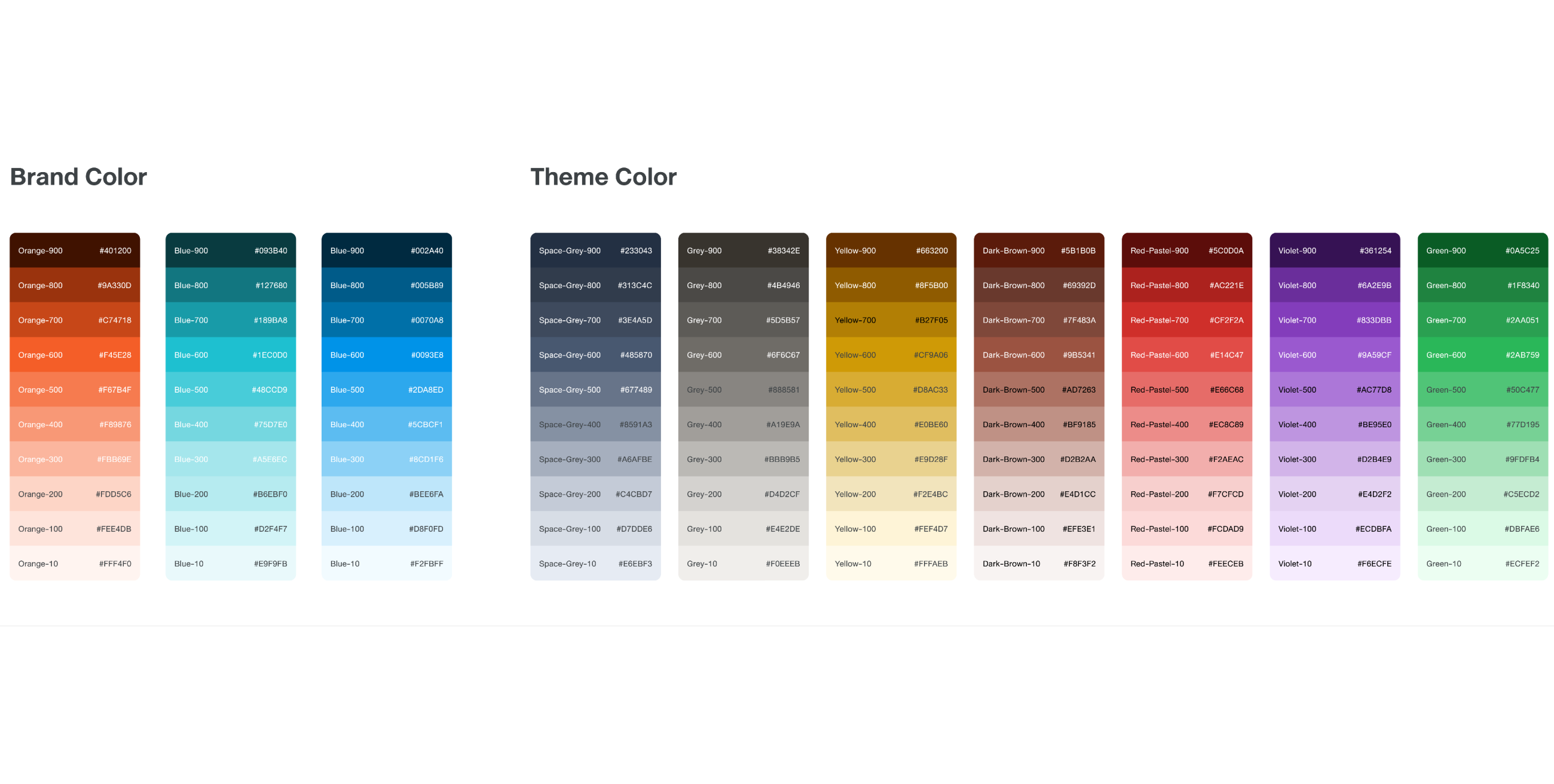
Here is how the colour theme works. The new Top bar remains the same dark grey colour for aesthetic reasons, while components with primary and secondary orange are switched to the theme color.
REVIEW PROCESS
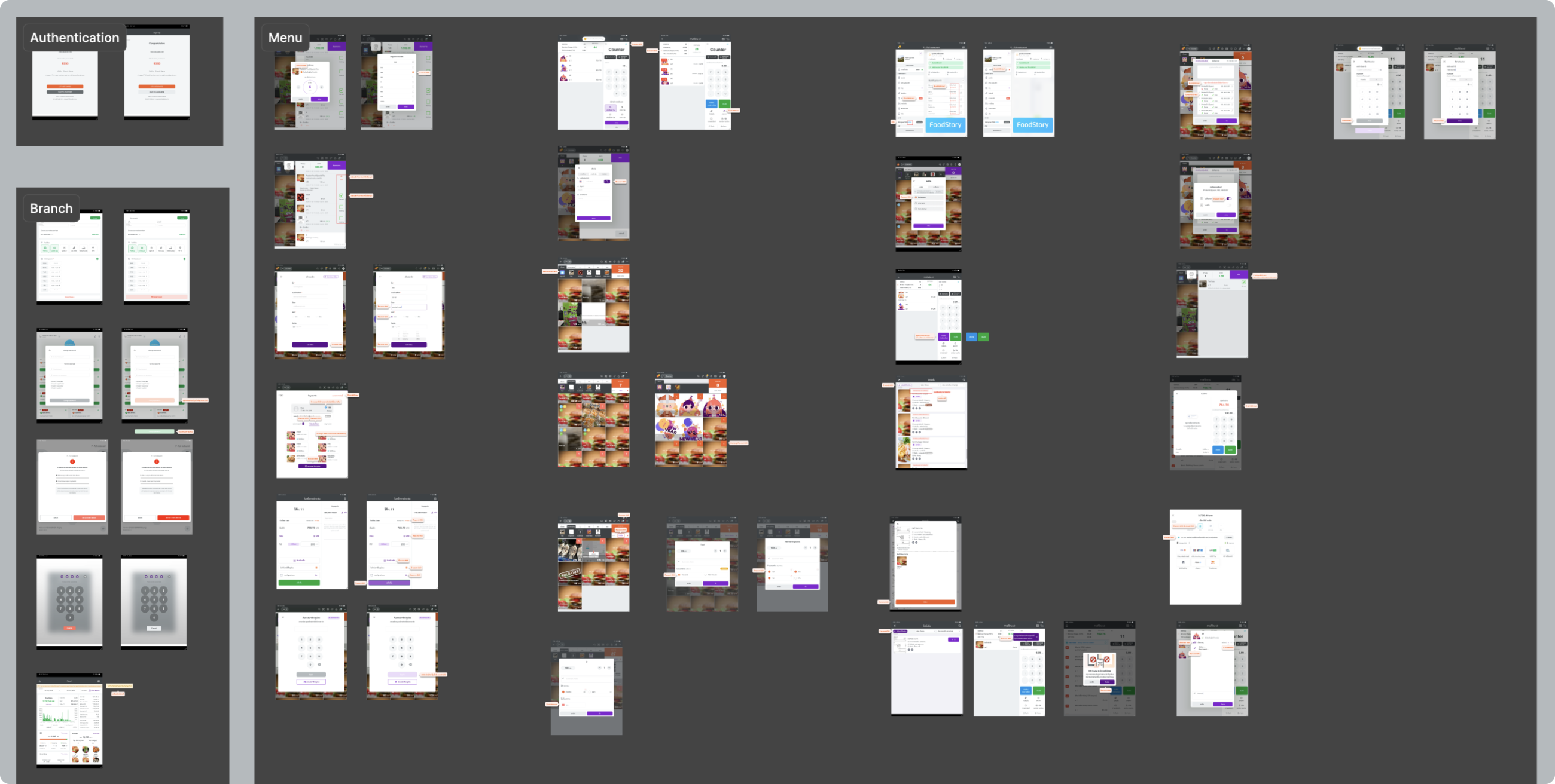
After the engineer finished their tasks, I had to review all the screenshots one by one. I logged changes in Figma, showing as-is and to-be versions. Most of them are just simple colour switching, but they can enhance the experience and retain UI consistency.
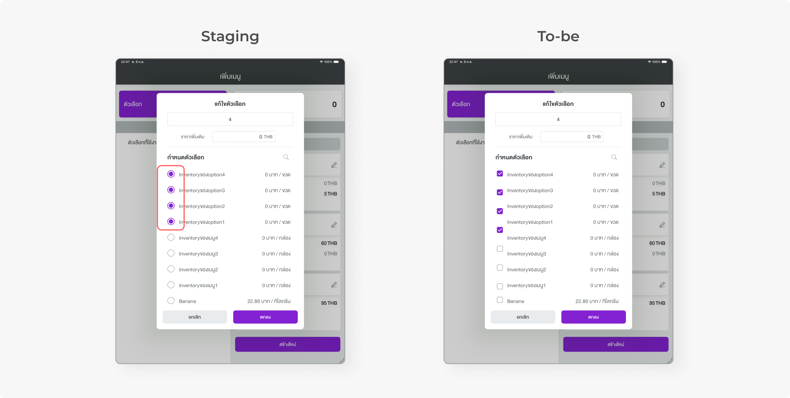
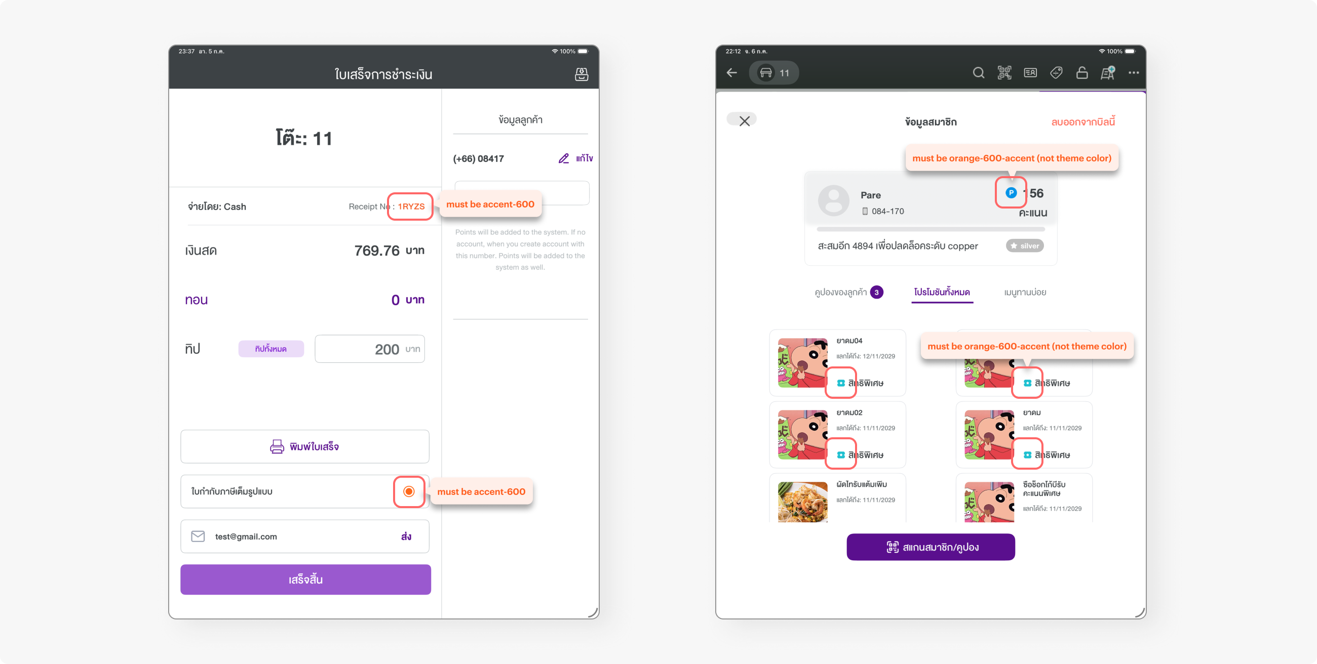
Some major issues were spotted, such as misuse of the component. Multiple selection turned out to use the radio component rather than checkboxes.
There was also misuse of colour types. There is “accent-600,” which is a primary colour that can be switched to other theme colours, and primitive “orange-600-accent,” which will not change in any environment. I had to flag these issues to the developers.
CONCLUSION
The priority was shifted back and forth, making it hard for me to switch context. Also, the priority of the interface revamp was generally low, so it was difficult to push it up from the backlog pool. When revisiting the project, everything was in a rush, and I had very limited time to help developers review the design.
What I learned is to be open-minded about innovation and tools that can help accelerate the process. At first, my perspective toward AI tools was not that positive, but without it, I would not have managed to deliver the colour mapping task on time. What is important is how we adapt ourselves to new technology and how we use those tools in our workflow.