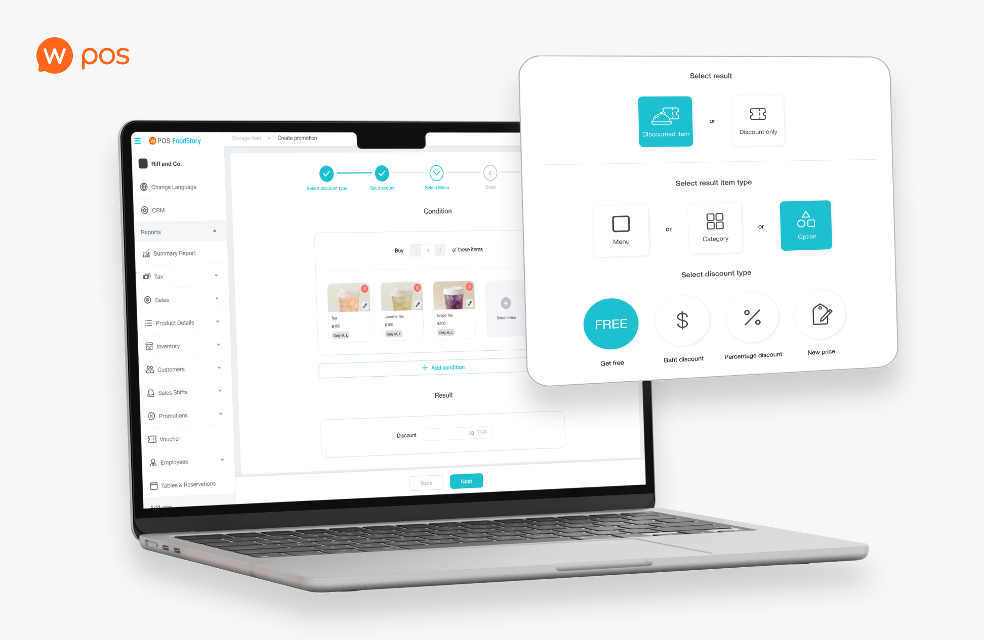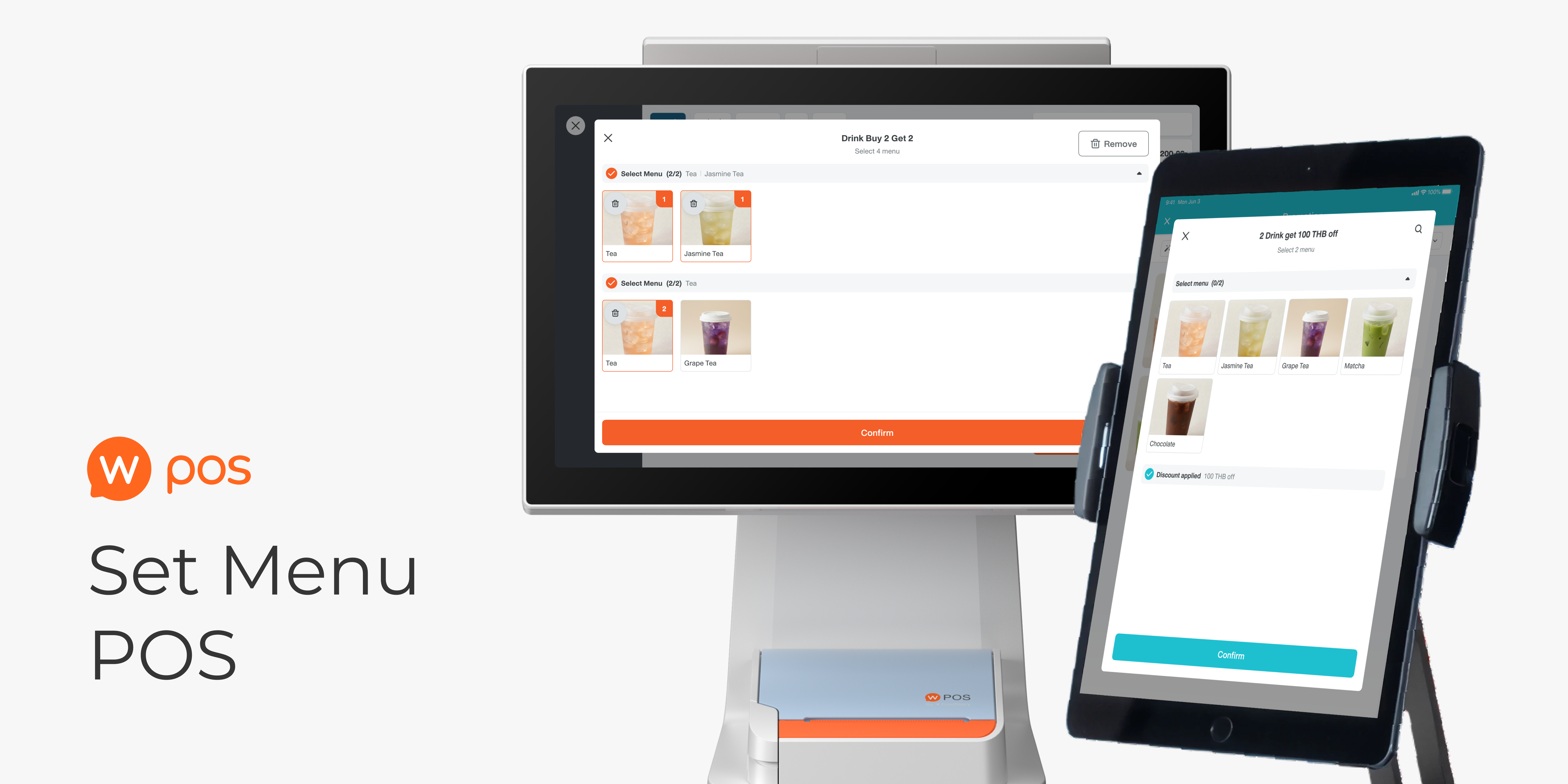

A feature targeting beverage merchants who offer set menu promotions. Design an end-to-end bundle promotion flow across 3 platforms: back-office desktop web and POS compatible with both iPad and Android. Read Part 01: Set Menu Backoffice
PART 02
This part demonstrates how I manage storefront operational flow consistency among 2 different platforms.
160 branches top-chained merchants acquired upon launch, accounting for more than 60% usage proportion compared to other promotion types.
However, 3 out of 9 interviewees didn’t actually match the criteria due to miscommunication.
We didn’t do the user interview due to limitation of time, which I regret not doing so since we lose chance to gain more insight
DISCOVERY AND DEFINE
This POS flow, including iPad and Android, is a continuation from the back-office setting on the desktop website in Part 1. This part demonstrates how I design to support storefront operation while handling differences in behaviour between the two platforms with a single adaptive design.
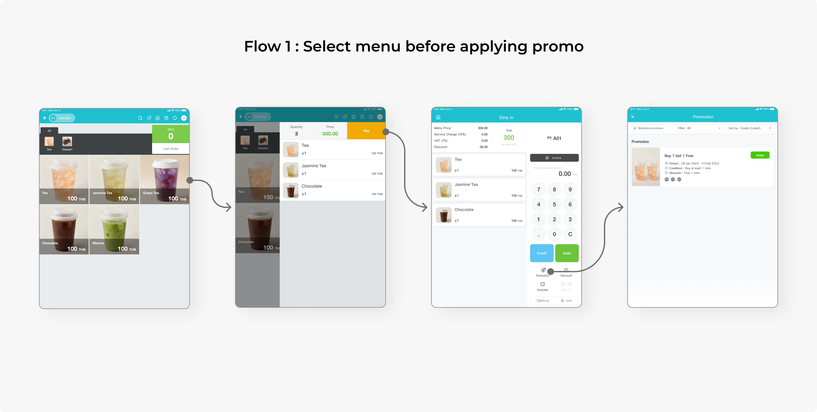
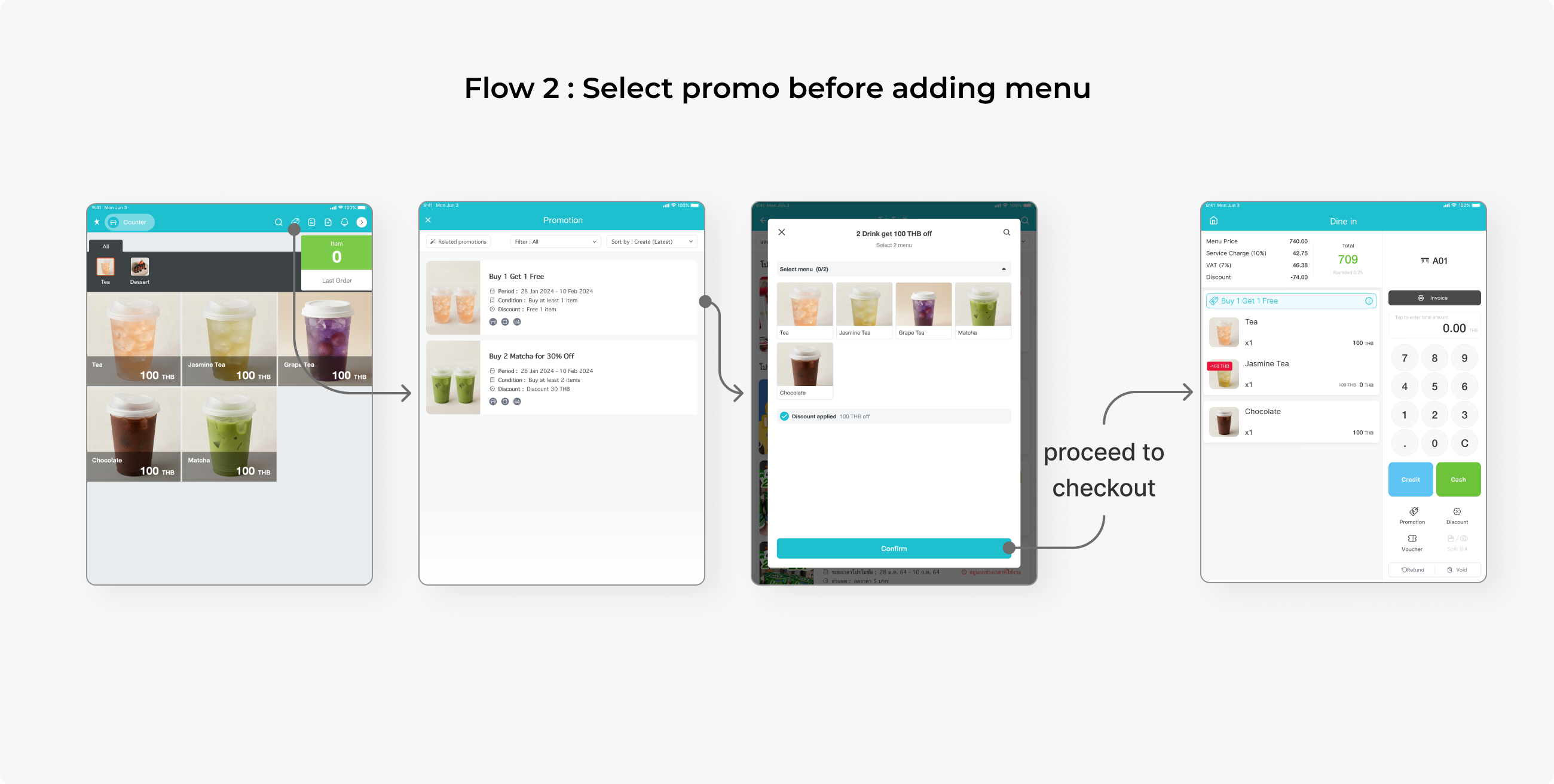
There are 2 methods to order a menu with a promotion:
- Pick the menu first, then apply the promo at the end
- Pick the menu from the promo page in one go.
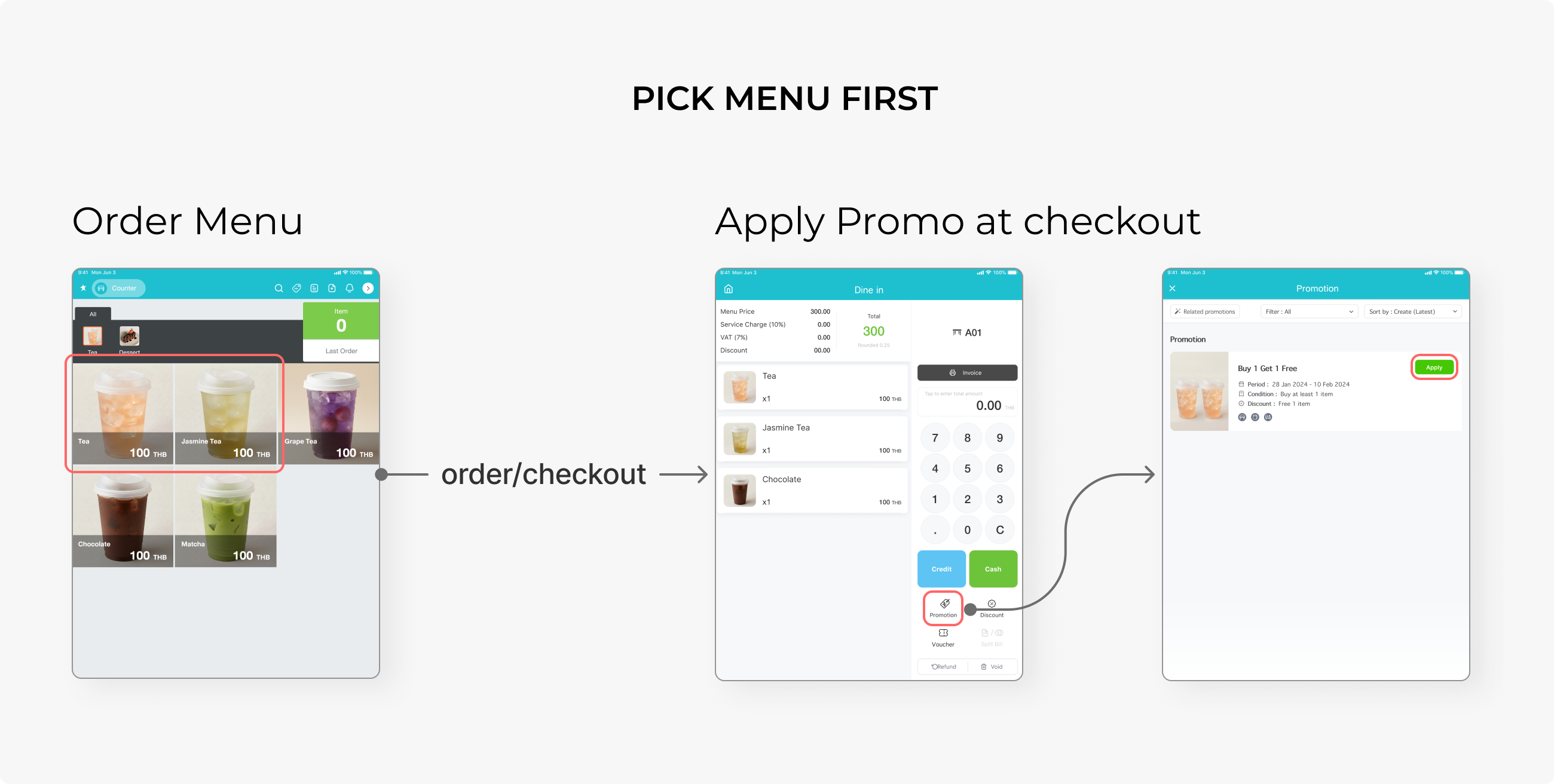
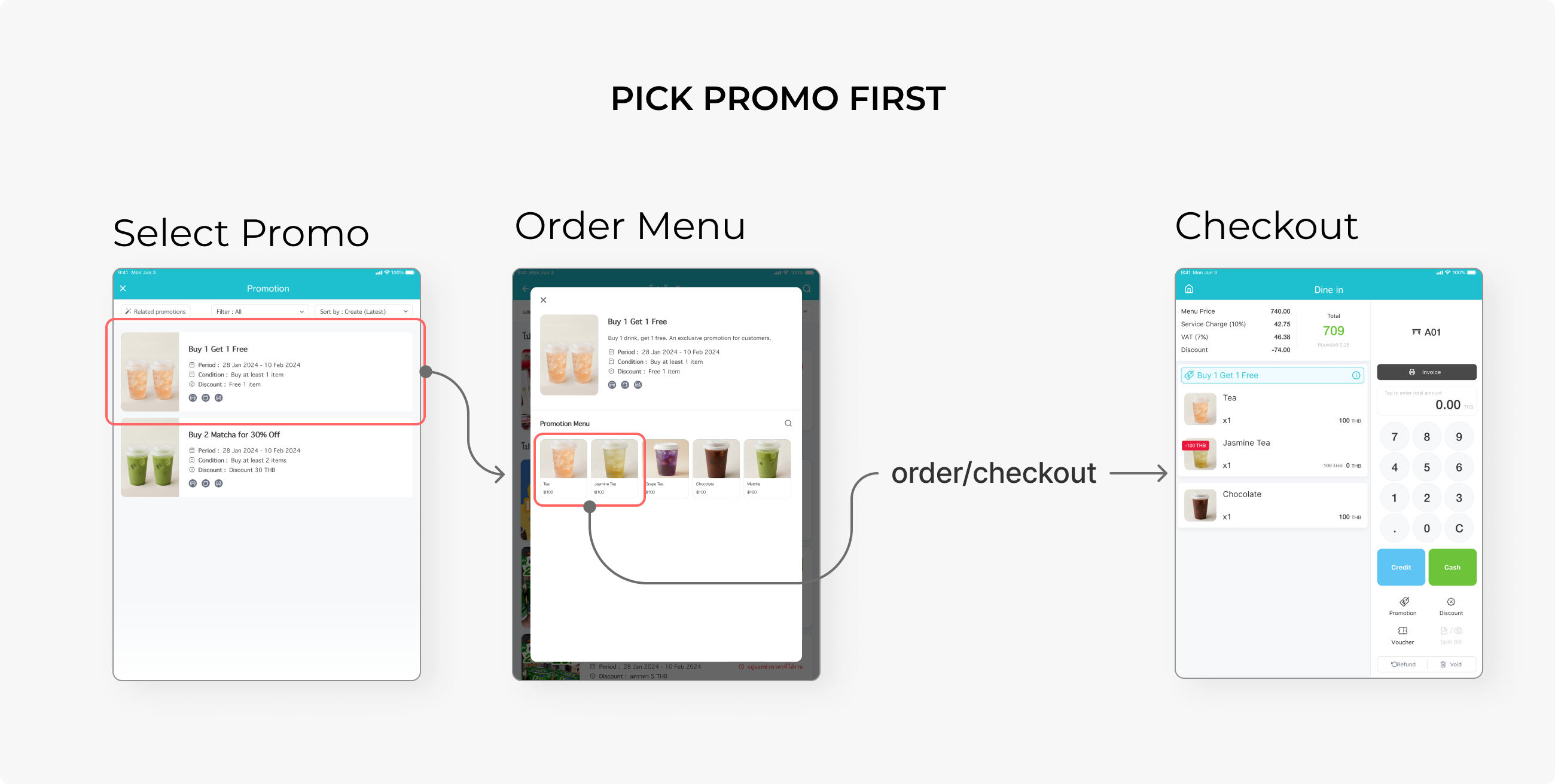
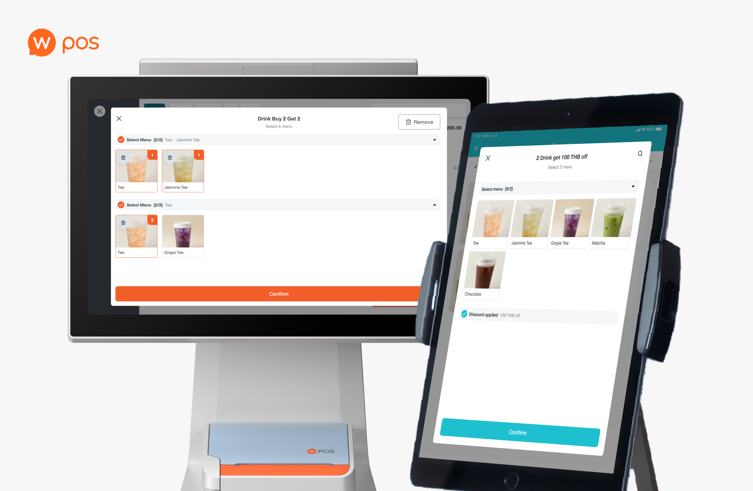
The problem was that there was no confirmation button in the promo popup. When a user taps the menu card, it is immediately sent as an order, without any feedback. We also need a new interface for bundles that contain a multiple-selection pool in one promo.
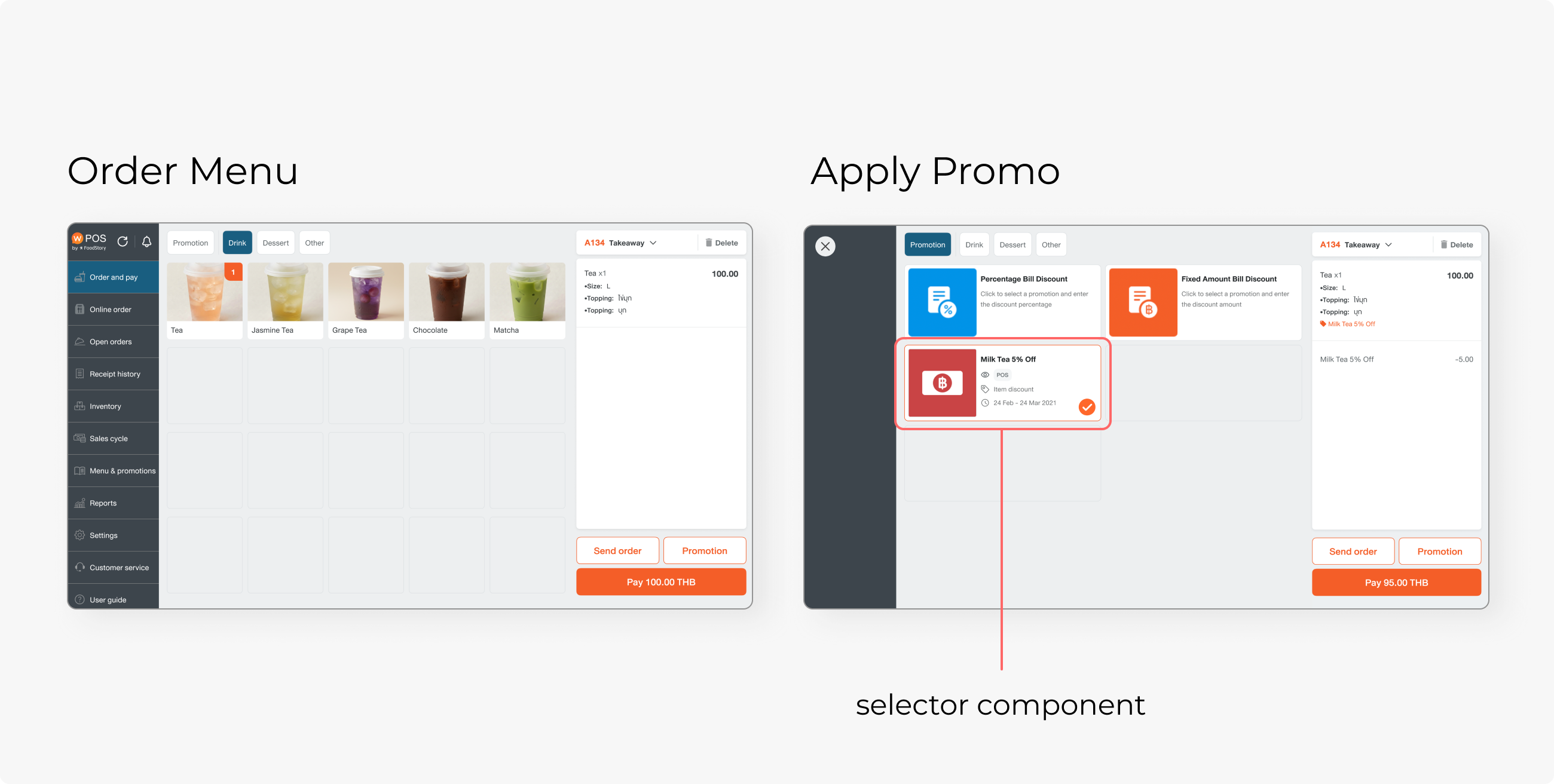
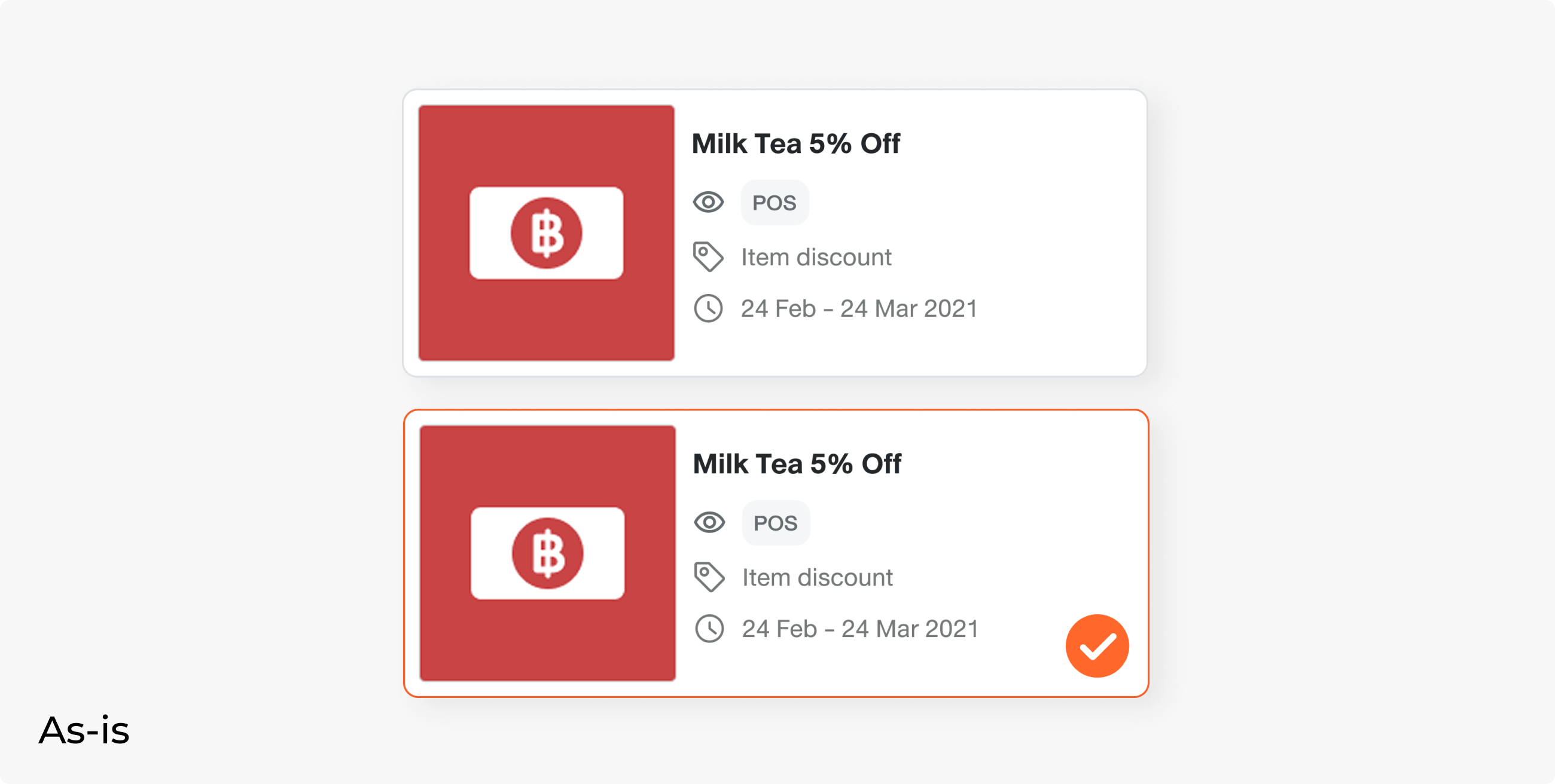
For Android, users need to select the menu first, then go to the promo tab and apply the promo by tapping the card, which will turn into a selected state. Unlike iPad, Android only supports single-item discounts, and the current card was designed to be a selector.
IDEATION
There were 2 methods to order a set menu on iPad, but only one on Android. Also, Android only supports a single-menu promo and one promo per bill, while iPad already offers a multi-menu promo and multiple promos per bill.
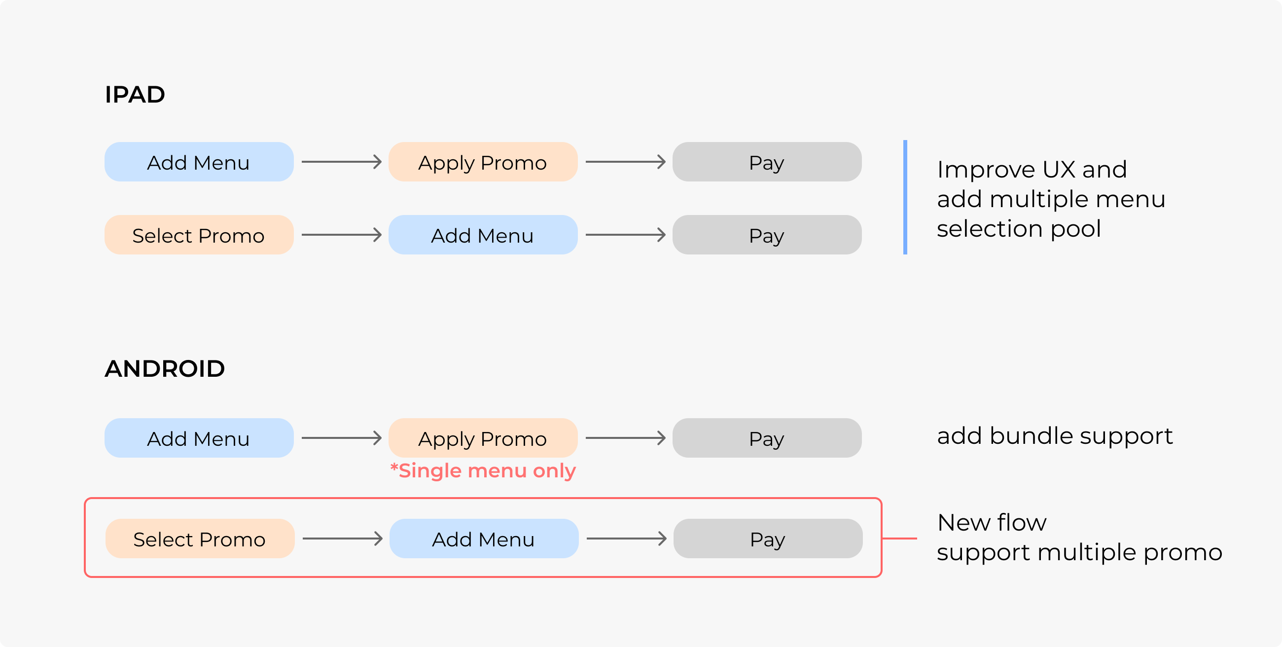
To make it equivalent, Android users must be able to do both menu-first and promo-first selection. This affected the promo card component, which currently works as a selector only.
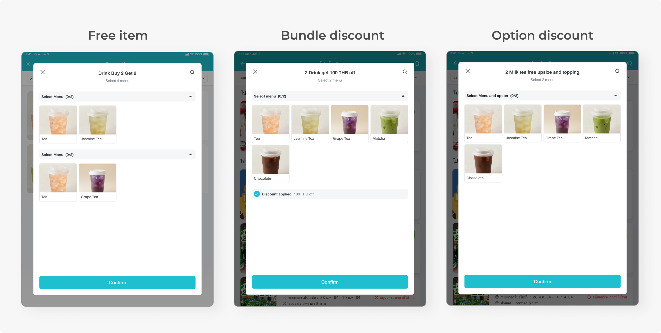
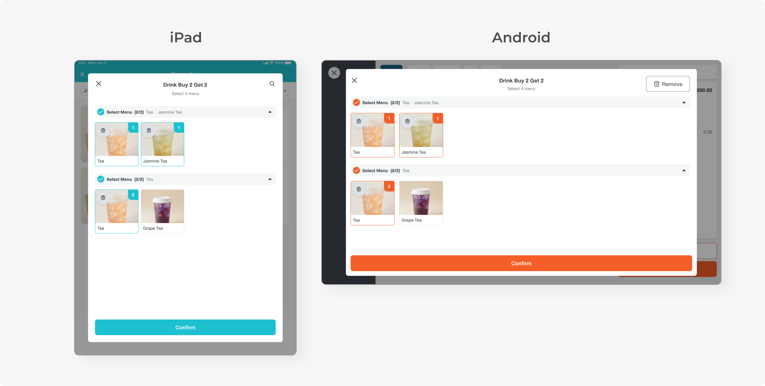
We need a new menu selection interface so that users can select items from multiple pools. To save engineers’ time and effort, the team came up with the webview solution, allowing us to develop one webview flow and apply it on both Android and iPad.
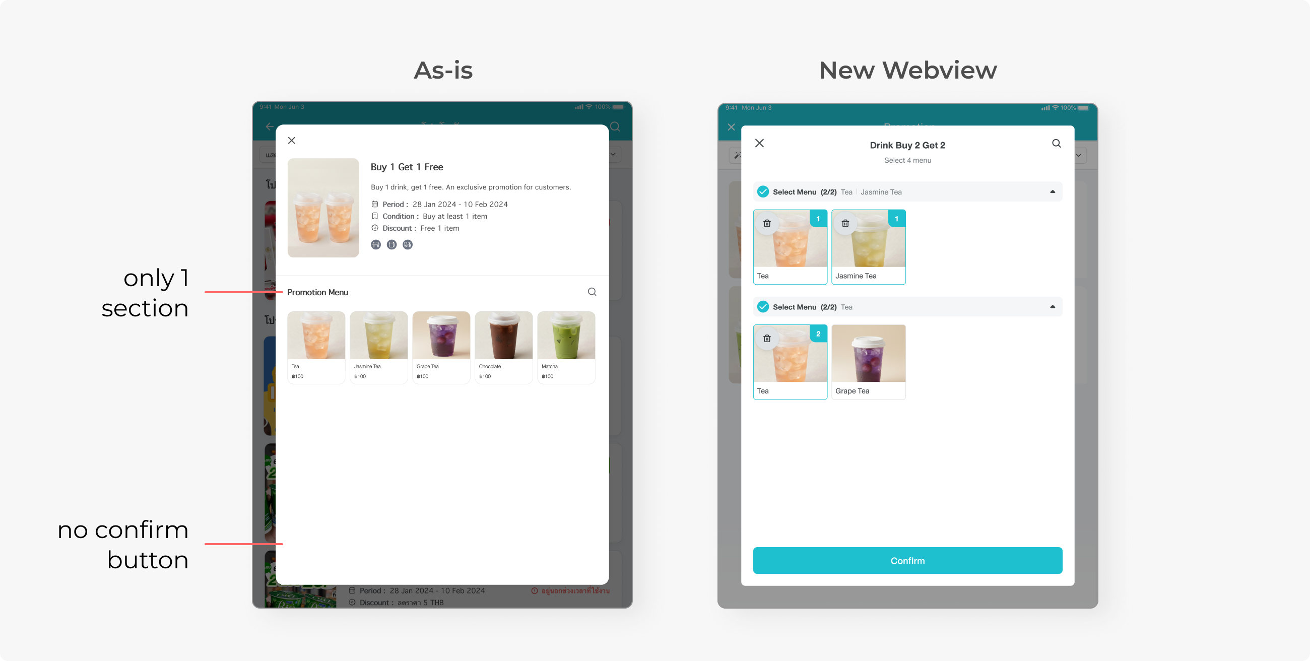
I added a confirmation button and organized the menu into sections, with the number of required items labeled.
The challenge is that the Android device is horizontal while the iPad is vertical. The layout must be user-friendly in both orientations. Also, iPad and Android work differently in applying promo, but need to share the same user journey.
DESIGN: IPAD
There are two ways to order, either select the menu first or select the promo first. These were all the as-is flow. Only the ordering popup was changed into a webview.
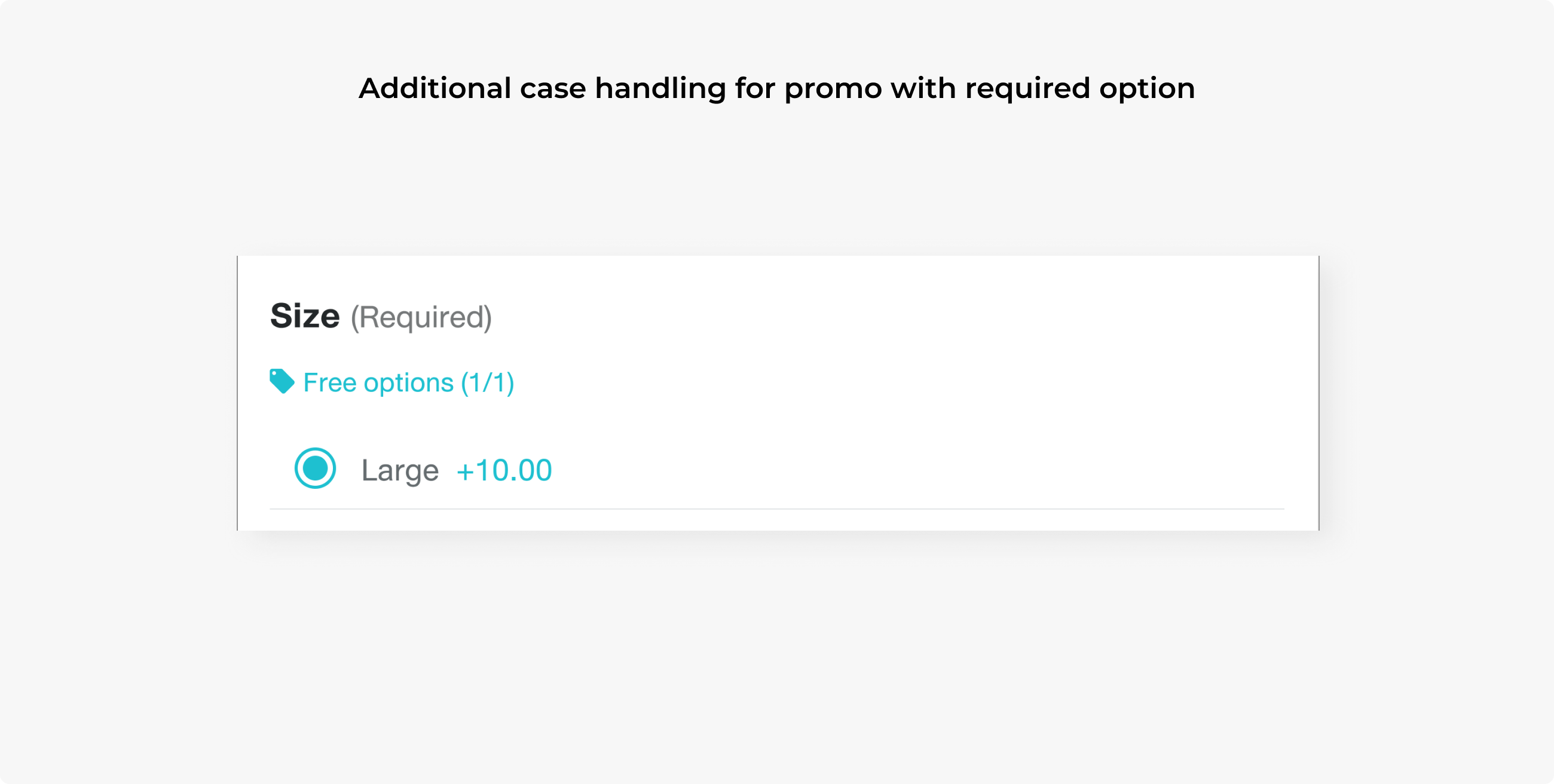
Some promos require customers to buy a specific option. In this case, other non-applicable options will be hidden, as the customer can only order “Size: L” anyway to get the promo.
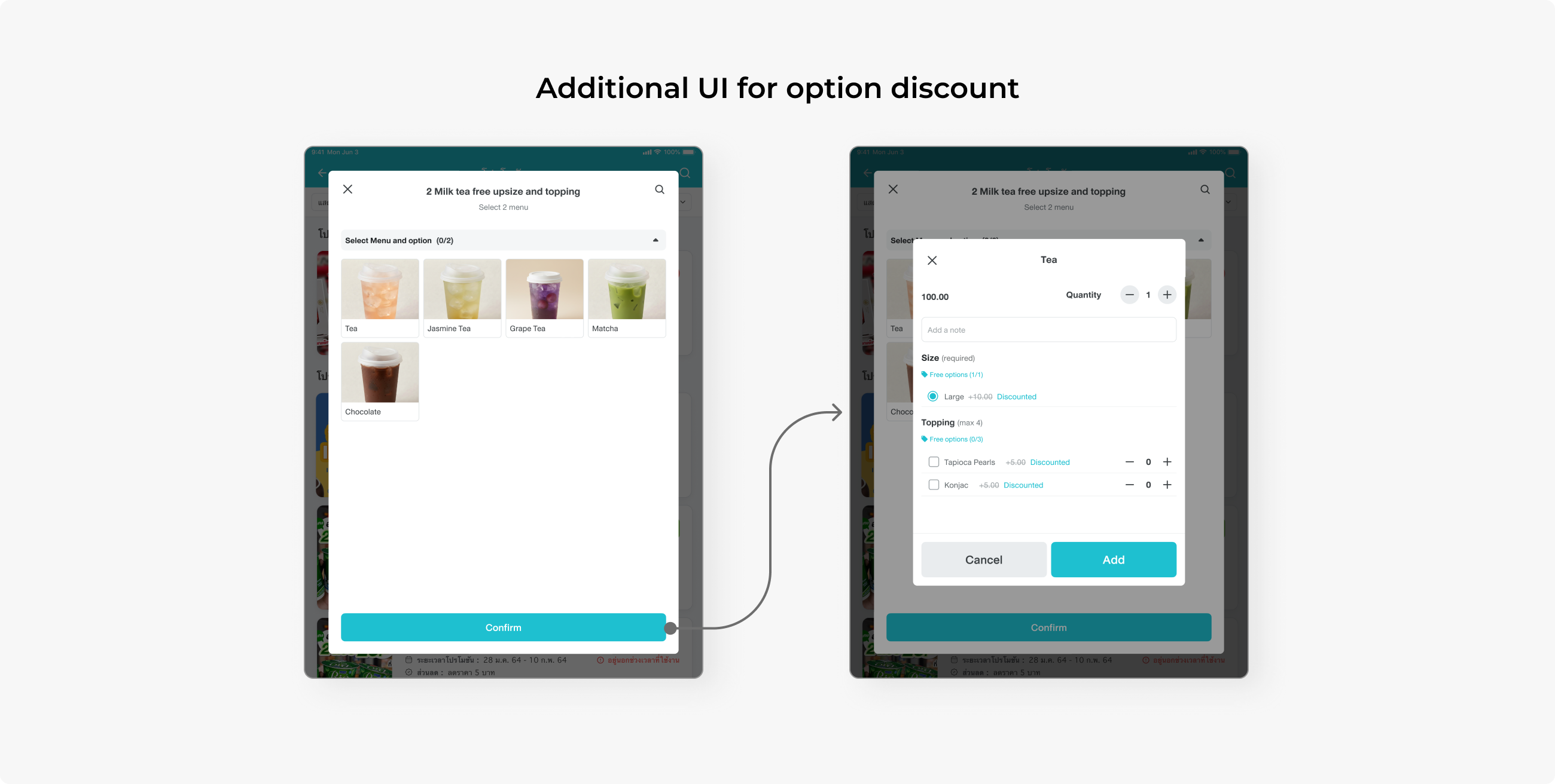
A discount label is added so that staff can inform customers about which option is discounted. This part involved usability testing.
After completing the design, there were still some concerns about the iPad flow. With the help of a UX researcher, we came up with usability test sessions, having storefront staff who regularly work on iPad POS test:
1. Set menu flow has a different UI than other promos. Will this lead to confusion?
2. Do users understand how to order the free option promo?
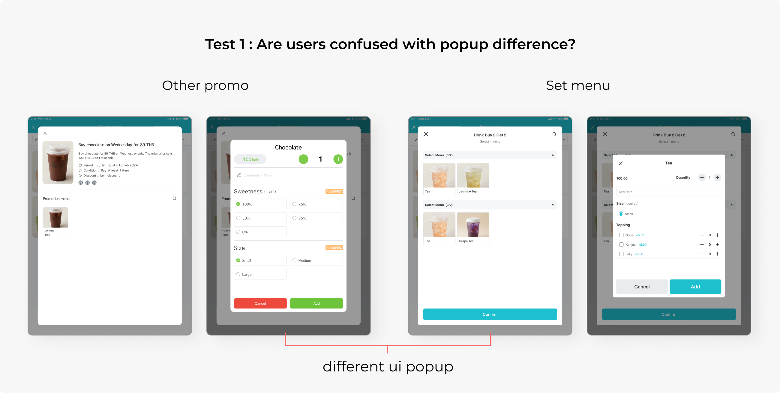
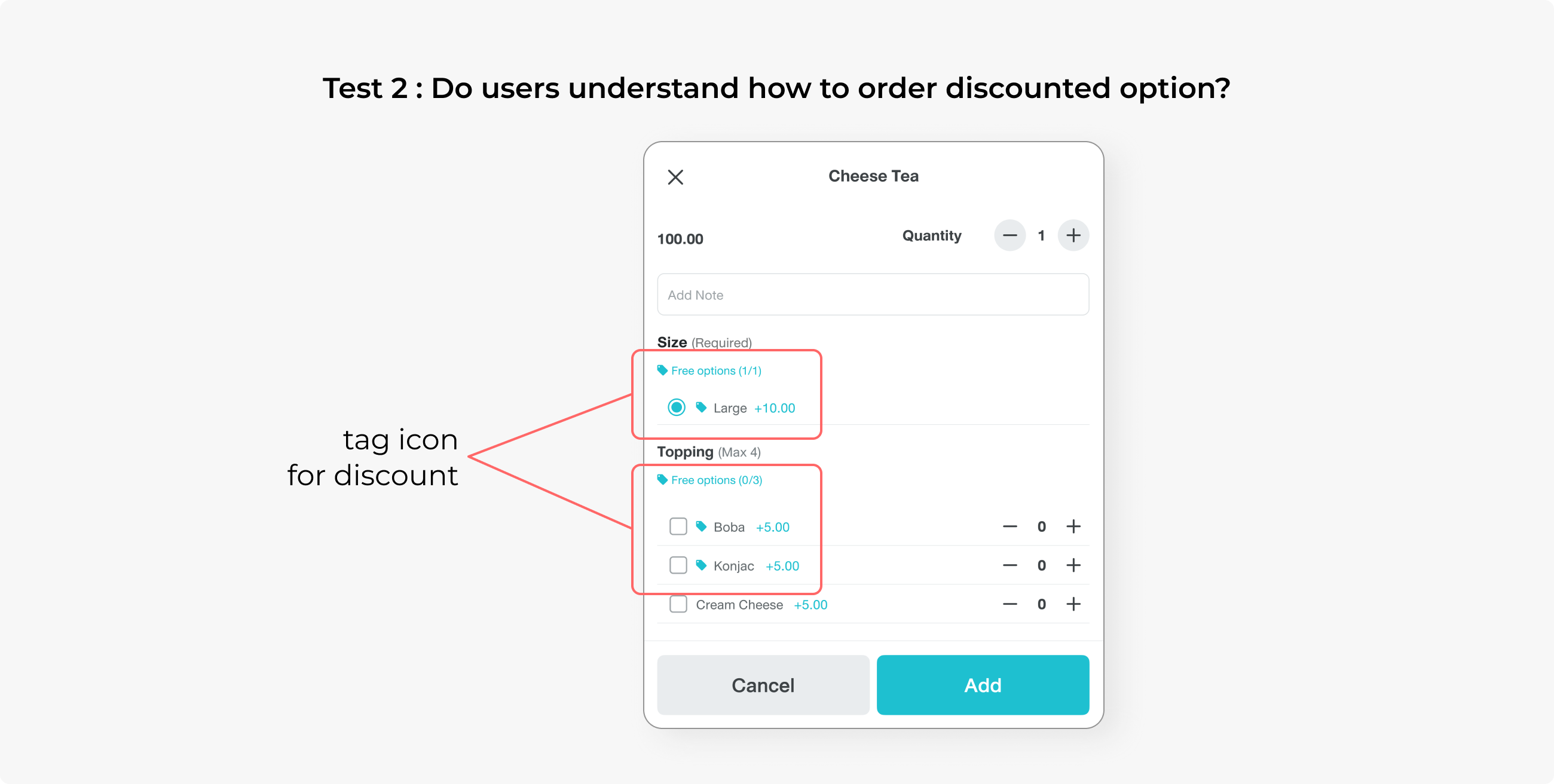
UI differences had no issue at all, as all users completed the task, but there was confusion about the option discount. Users do not understand that the “tag” icon means a discount.
Also, they did not know they could order via the “promo” tab, as they always memorise the menu list to order first, then apply the promo at checkout. This issue was solved by having the sales team improve the onboarding process.
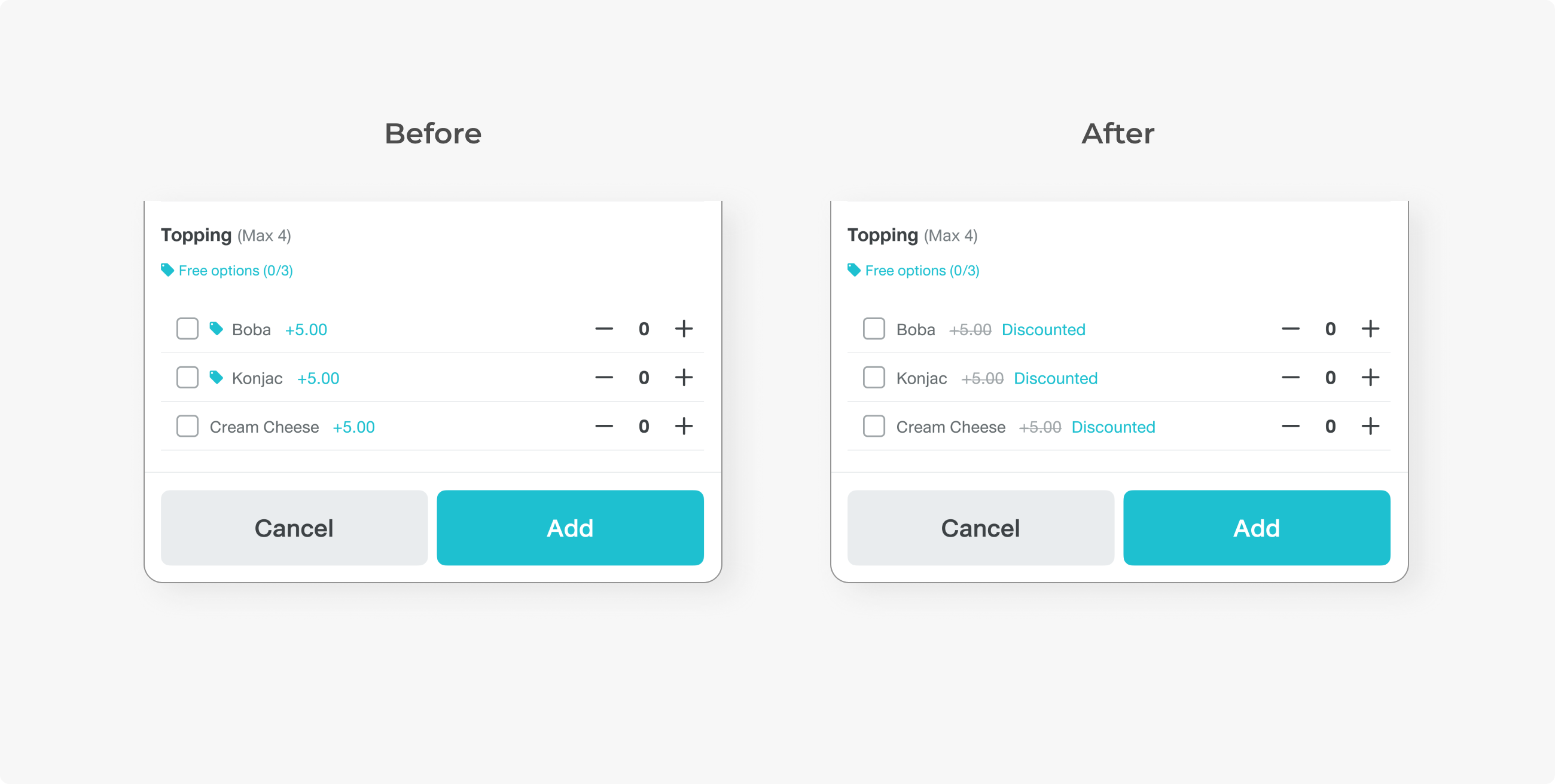
“Tag” Icon was changed to “Discounted” text labels. Text with direct meaning provides better context than just an icon. Unfortunately, we cannot show the price after the discount due to a technical limitation.
DESIGN: ANDROID
Before the webview idea came up, I had drafted the promotion flow, using the same journey as iPad’s, where the user clicks the card to trigger the menu selection step. However, dividing the promo into sections and navigating to a new page would take too much effort, compared to a webview popup.
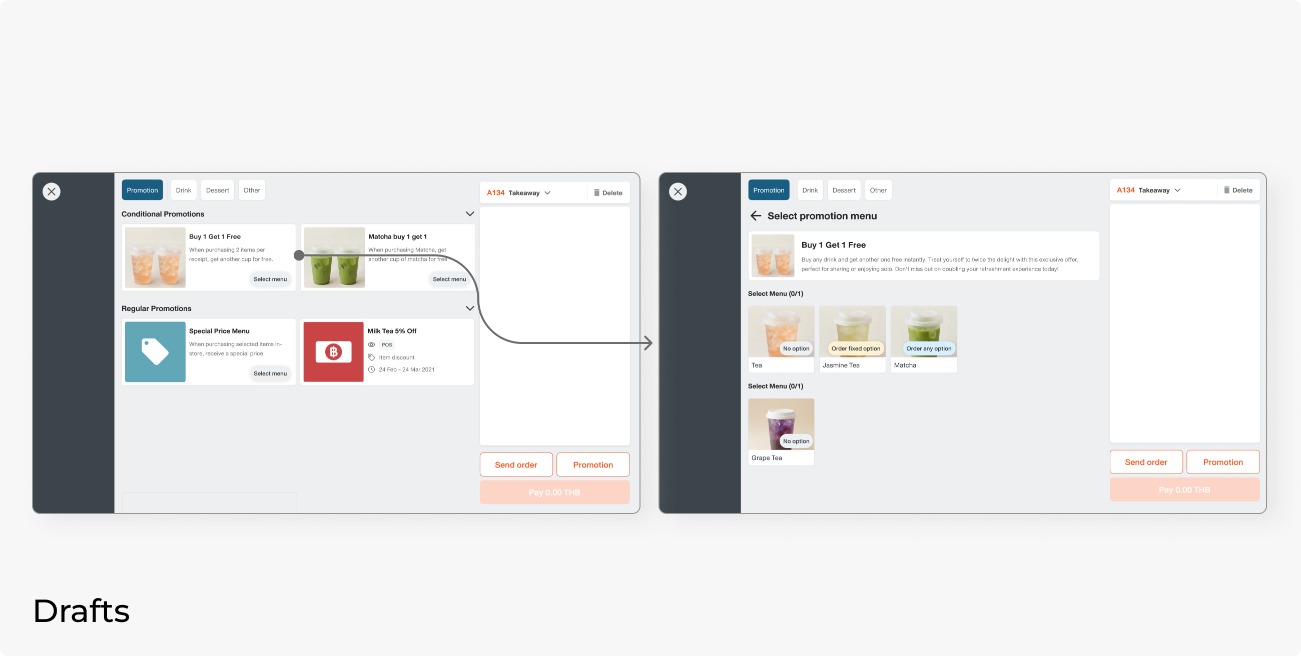
The current promo card serves as an “apply this promo” button to the existing menu in the order. We need this component to also trigger the menu selection webview.
Here is the new logic. When clicking, the system will check whether all required menus are in the correct order.
- If yes, it applies the promo and changes the state to selected.
- If not, the webview displays, and the user can select the rest of the menu.
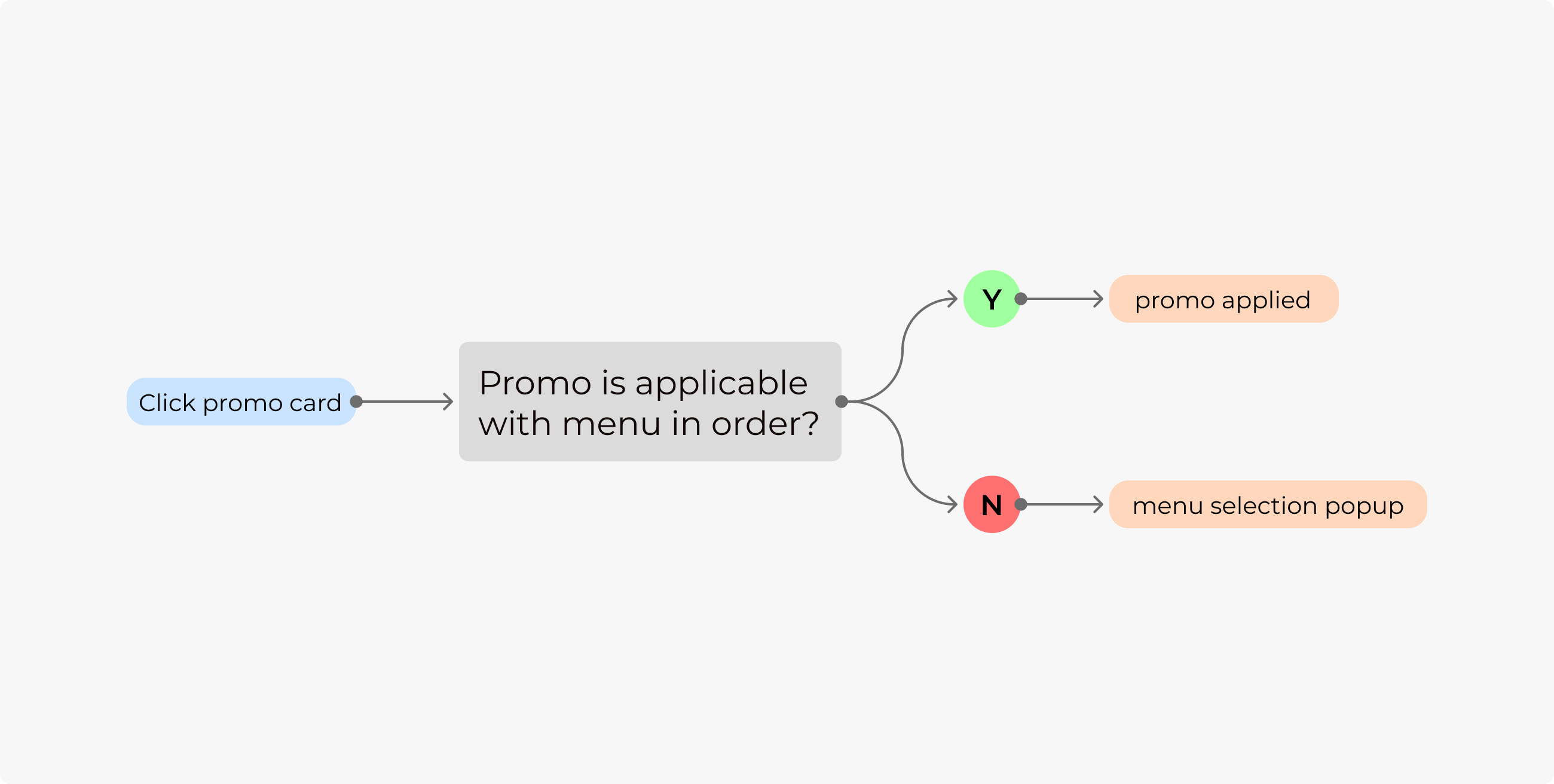
Users who were used to adding the menu first won’t be affected, and it will be easier for those who want to select a promo before ordering the menu.
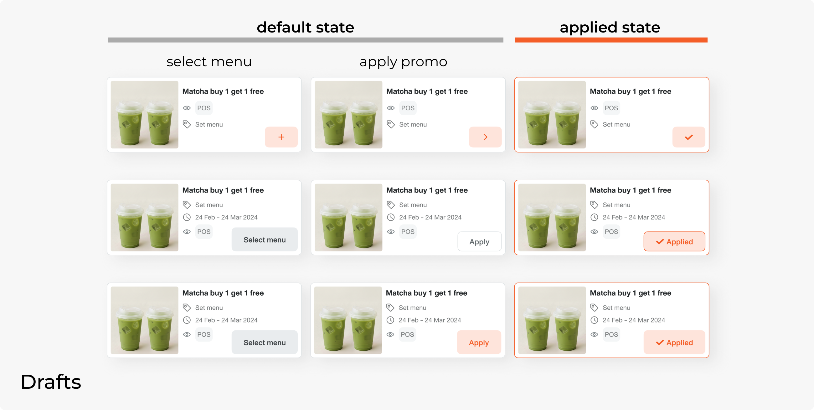
These are drafts of a promo card. The layout is currently tight, so the CTA should not take too much space and must communicate that the user can do 2 actions:
1. Apply promo to menu in the bill. (“applied” state needed)
2. Select menu in that promo.
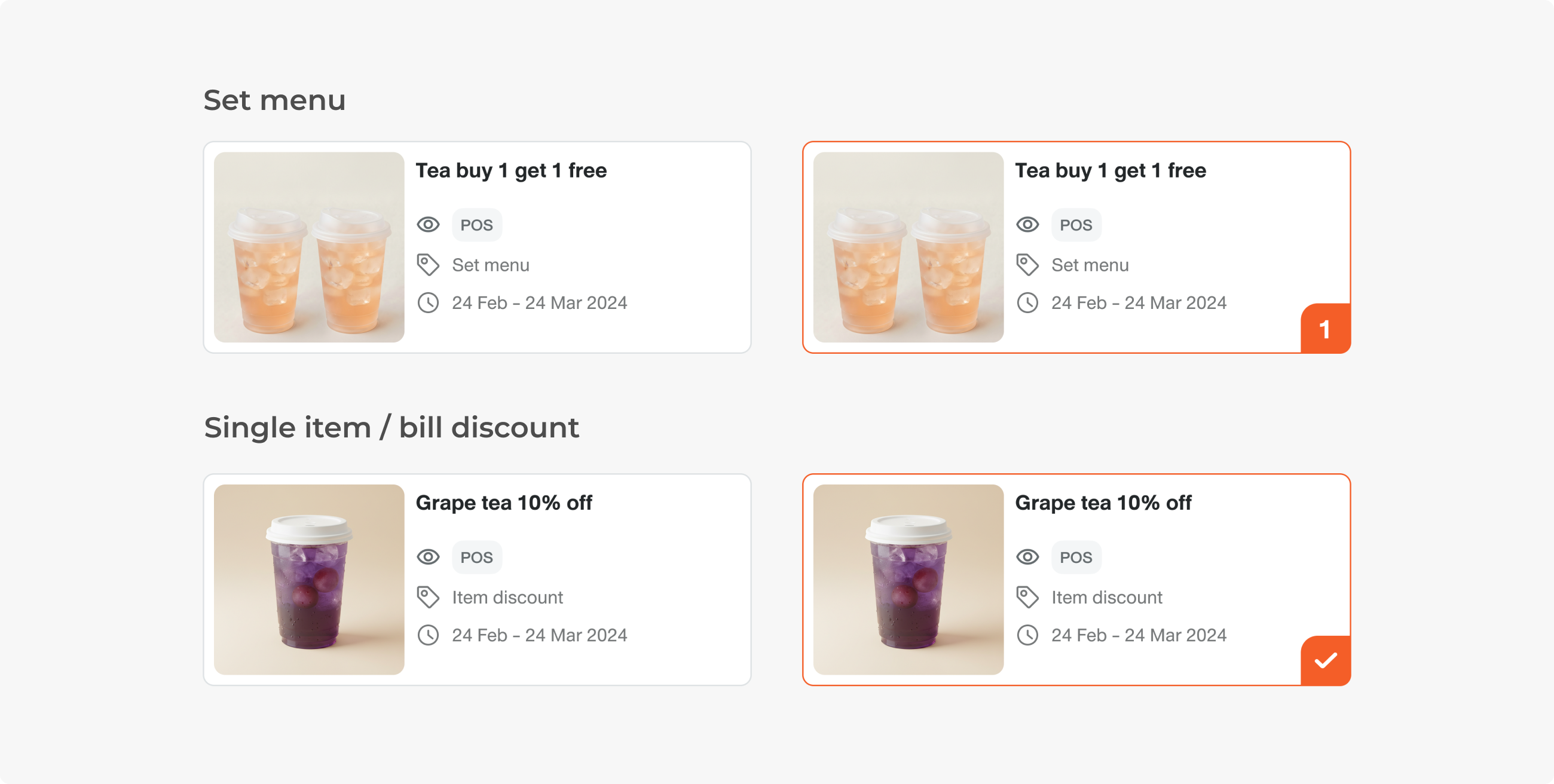
In the final design, there are 2 types of cards: for the set menu and for single-item promos. The default state stays the same. Promo for single items still uses the same check icon, while the set menu promo uses a number, which is the number of promos ordered.
Here is how users can order a set menu in 2 flows. Users who are used to adding the menu first can still go through the same journey. There might be a scenario where a customer orders by using a promo name. This way, they can select the promo first, then select the menu in that promo.
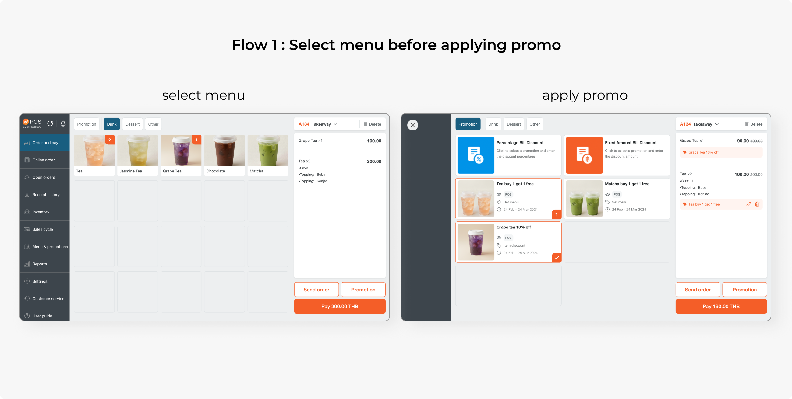
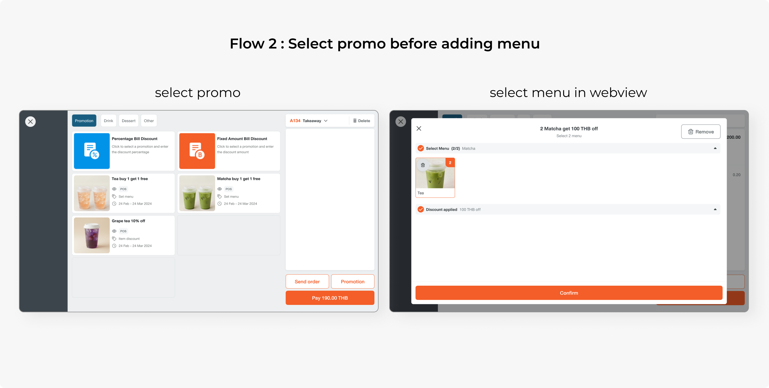
Ideally, when ordering more than 1 promo on the same bill, there should be a dedicated “make another” component for adding more promos, but that would be too big a scope, so we ended up with this flow. Users click the same card to add another promo.
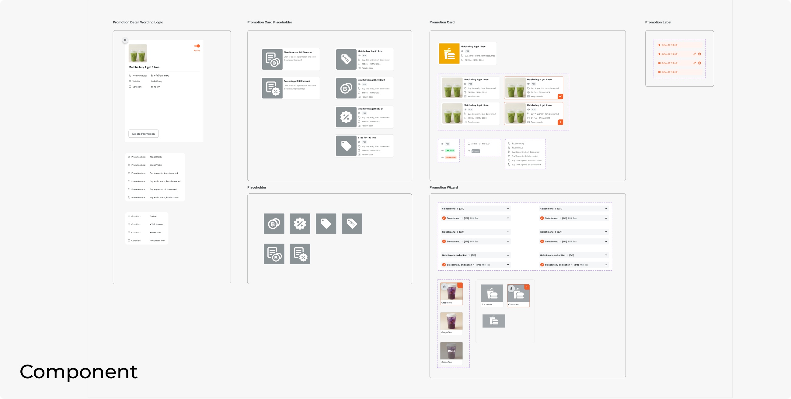
This is how I documented my Figma file. There is a dedicated section for component guidelines and specs, so that engineers can look at them in one space.
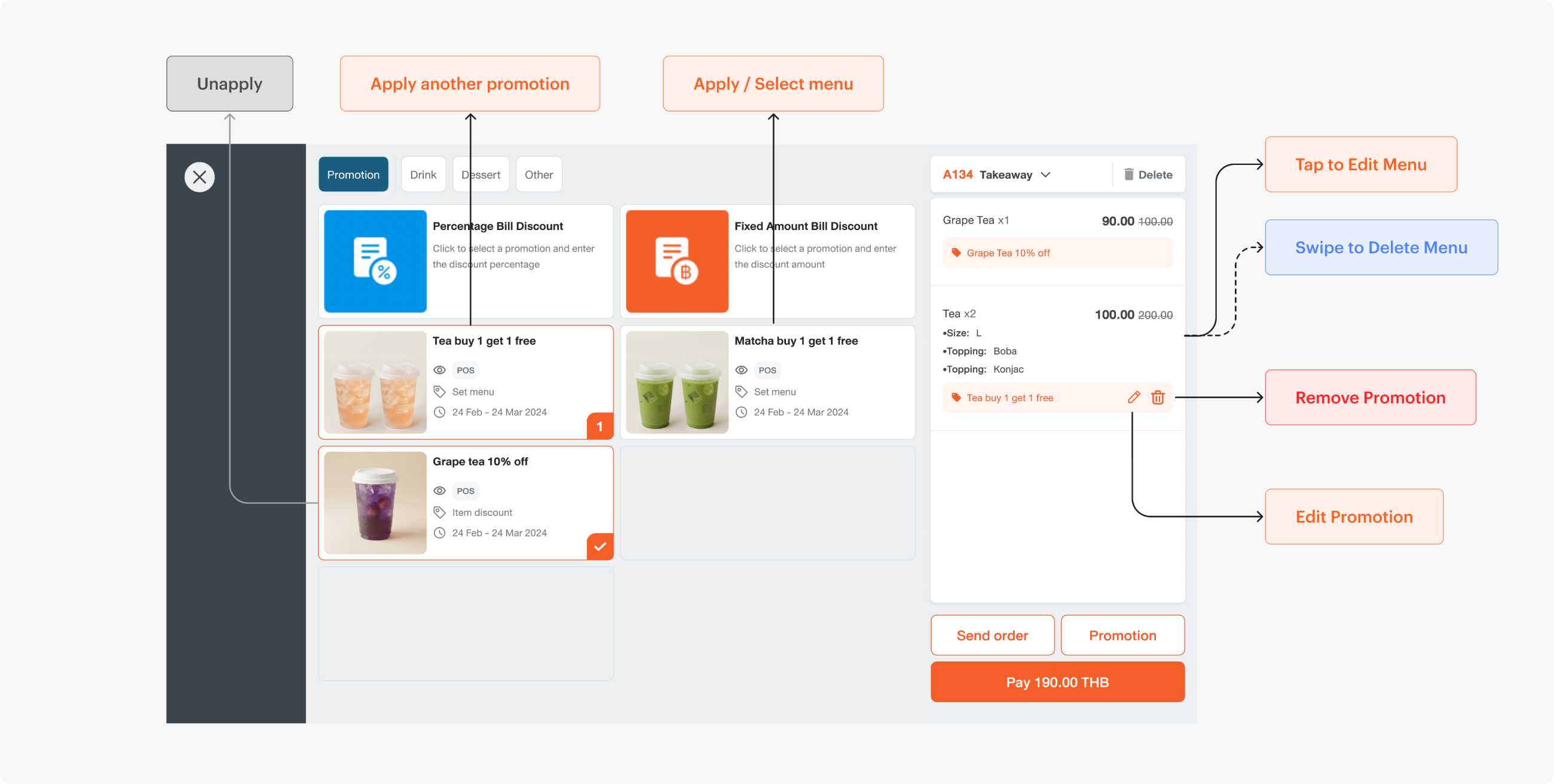
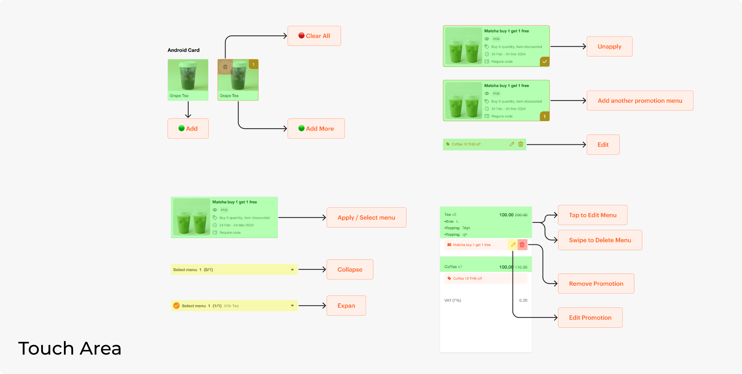
There are several actions that can be performed in the order panel. Having touch area guidelines helps the team understand the interaction of each component.
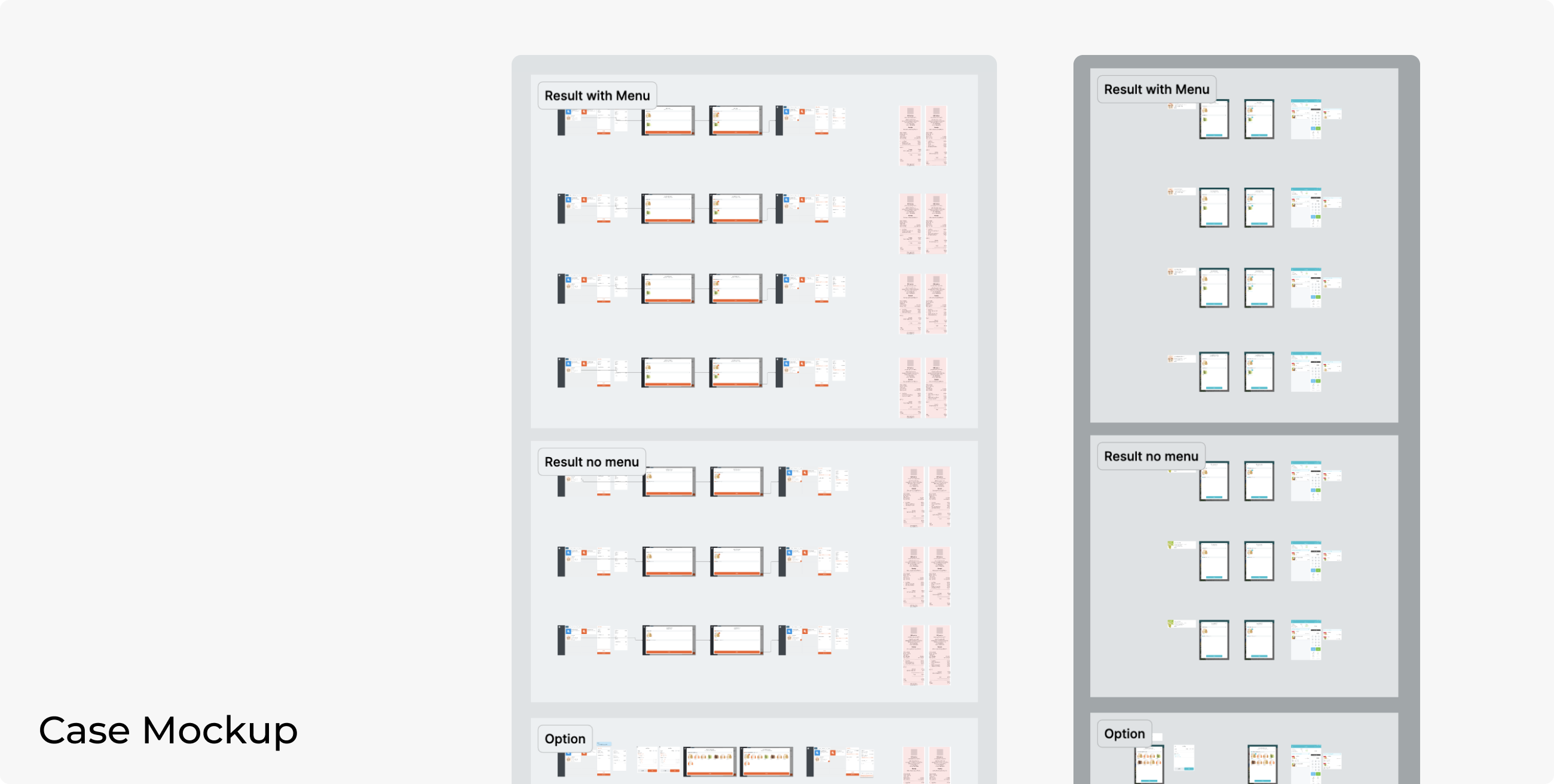
There is also a section for case mockups. Although these may seem repetitive, having clear mockups for all cases can prevent engineer confusion. This is what I've learned from my previous project.
CONCLUSION
I was responsible for multiple platforms, and it was my first time switching from a platform-based workflow to a feature-based one. Generally, my scope of work involves the website and iPad, so I had to learn how Android works and tried not to design something that breaks the current behaviour.
The most challenging part is to design one flow that will be applied to different platforms, different user behaviour, and different user journeys. I also learned to quickly switch context between multiple products, as the process is not linear. I had to design all platforms together to ensure that the feature works as a whole.