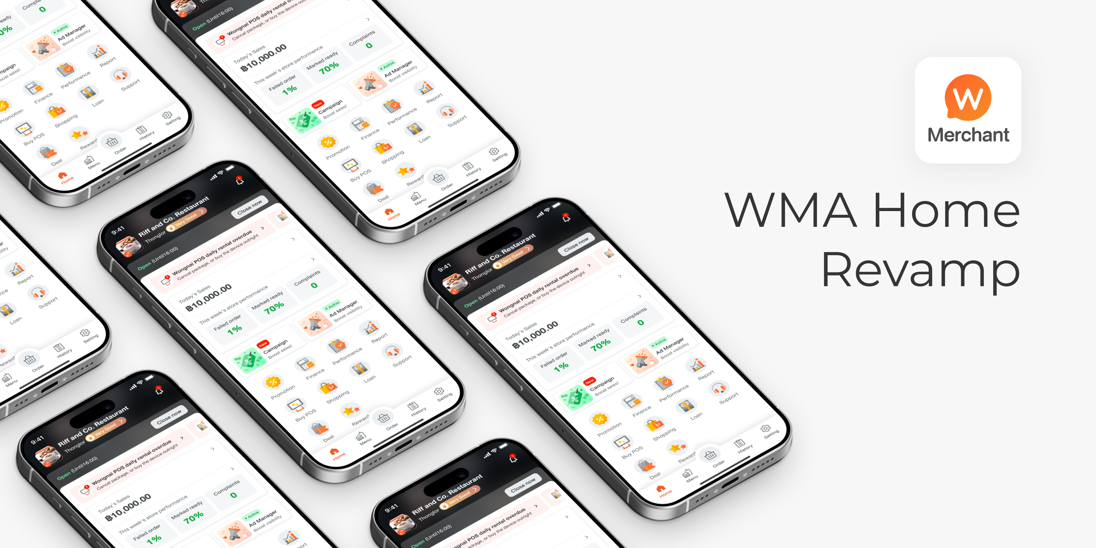

An interface redesign project aiming to boost merchant sales and performance as well as increase marketing campaign join rate, while still maintaining a good user experience.
More than 2,000 merchants join the Campaign weekly and improve sales, and more than 1,000 merchants have improved operational performance per week.
However, 3 out of 9 interviewees didn’t actually match the criteria due to miscommunication.
We didn’t do the user interview due to limitation of time, which I regret not doing so since we lose chance to gain more insight
DISCOVERY AND DEFINE
WMA, Wongnai Merchant App, is an application for merchants offering delivery service on LINE MAN. Merchants can accept orders and update order status, as well as manage menus, promotions, and Ads.
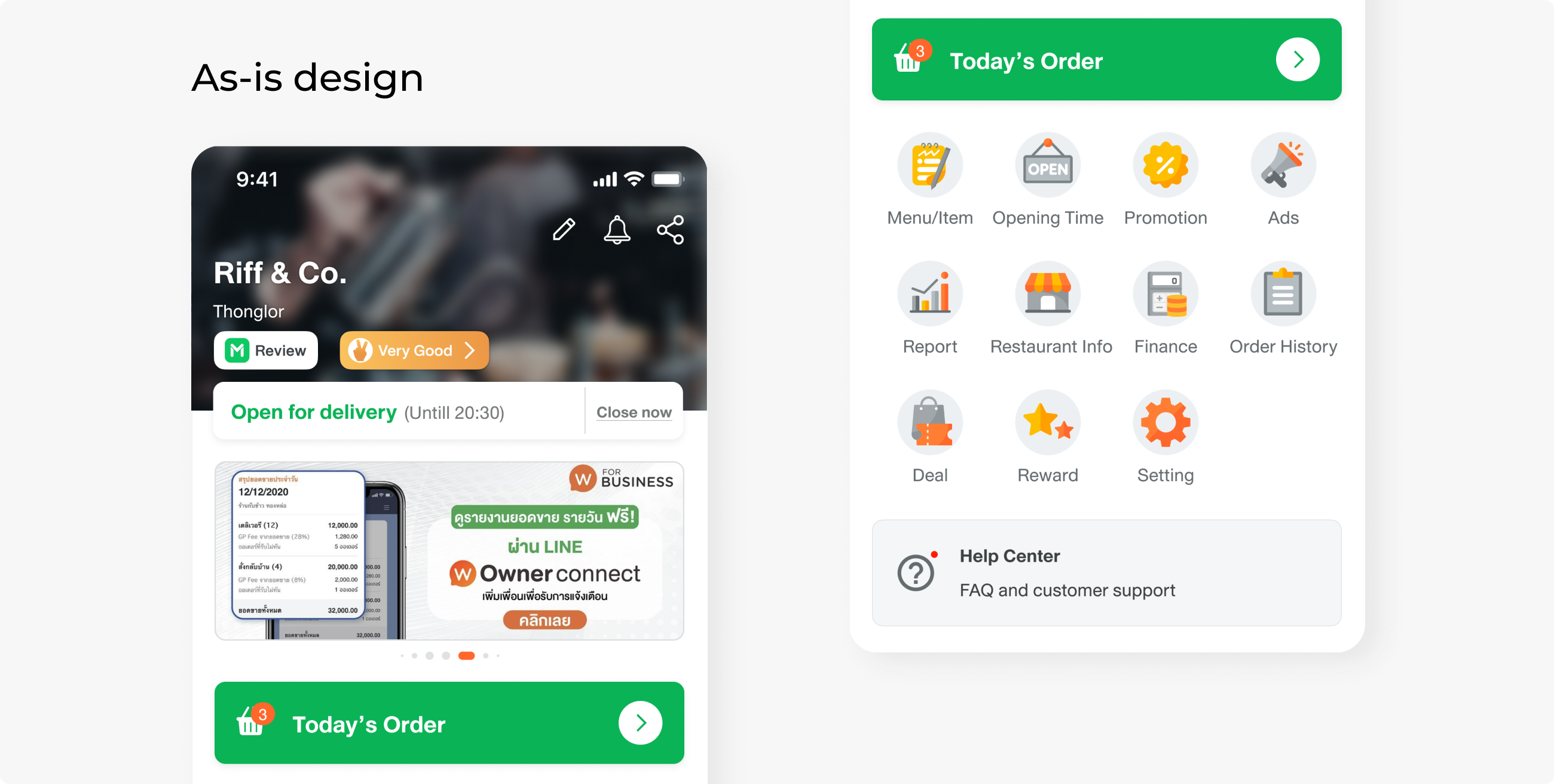
The problem with the current design is that all the components are clustered, including pins, cards, and banners. Every team also wants their new feature or information to be in a prioritised placement, resulting in a busy layout and no hierarchy.
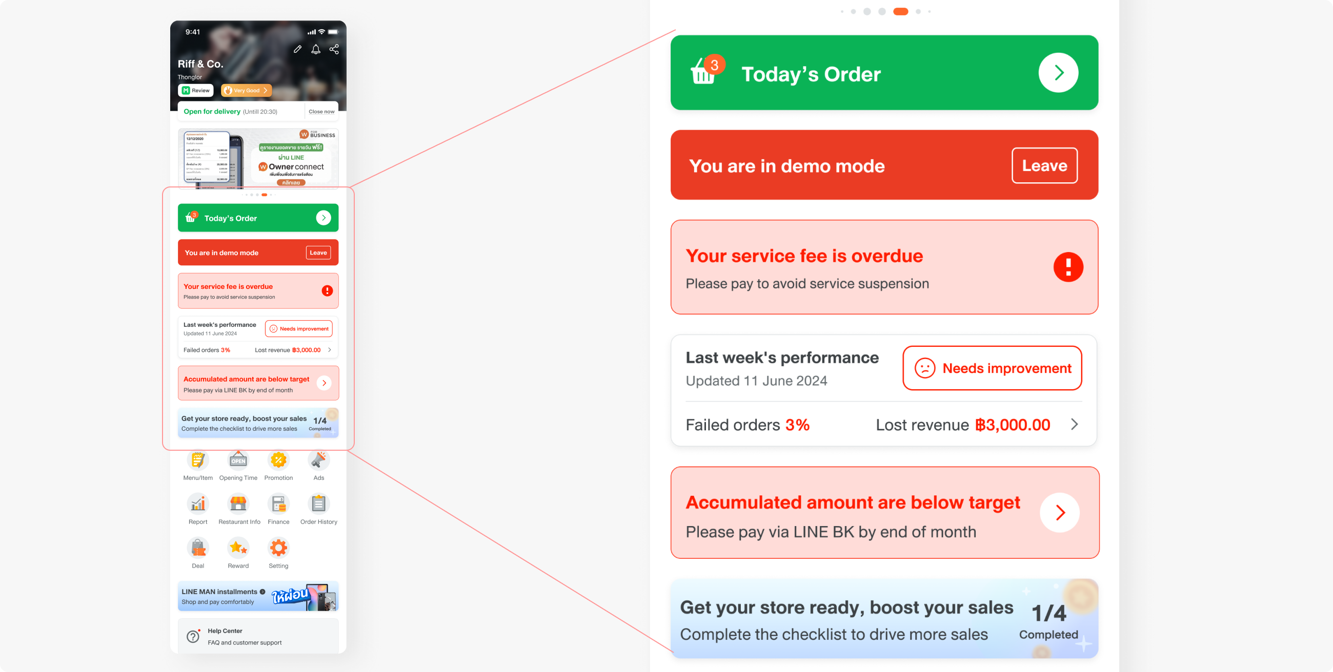
With the problems above and requirements from C-level, our goal was to:
1. Organise elements on the home page and create guidelines for future content.
2. Highlight the importance of merchant sales and performance.
3. Highlight the entry point of “Campaign”, a marketing tool that helps merchants boost sales with co-subsidising discounts.
IDEATION
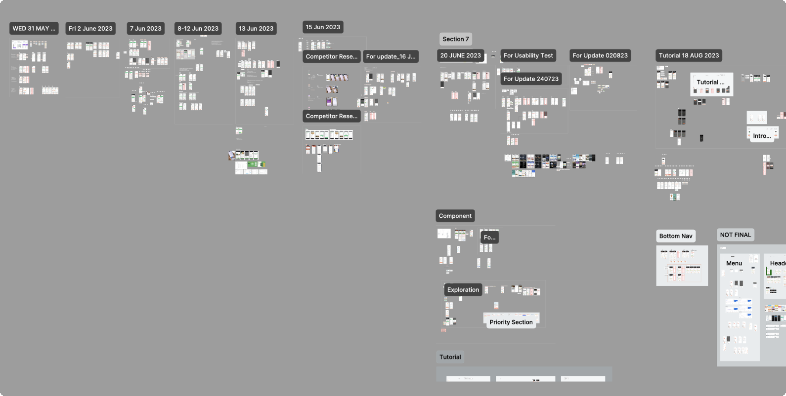
We did a huge amount of work before coming together to a final piece. Since this is a very big scope feature with high impact, the entire process must be reviewed by the C-level.
I started by doing competitor research for references and identified each section of the page to get a better picture of how to organise components.
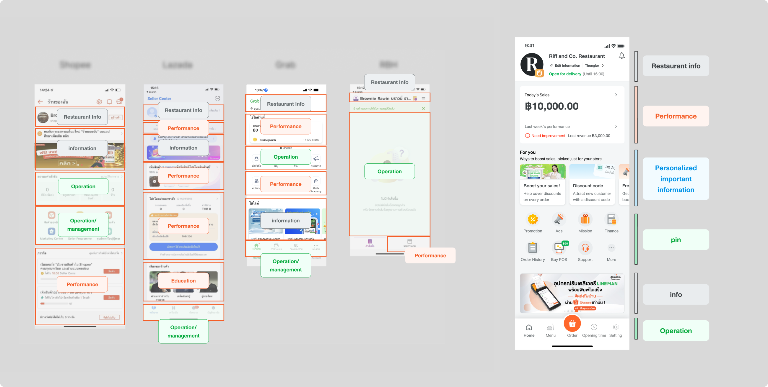
The first task was to organise and handle the clustered elements. I analysed the competitors’ home page and defined the function of each section. Then, my team and I divided design tasks based on sections.
Performance should be the most dominant section. We noticed that most competitors use a bottom navigation bar for operation-related functions, so we wanted to apply this concept as well. Another significant section was the personalised marketing tools, located just below performance.
Then we came up with several ways to reduce space for pins, such as collapsing sections or hiding in “more” pins, but it was rejected since all pins should be clearly visible on the home page.
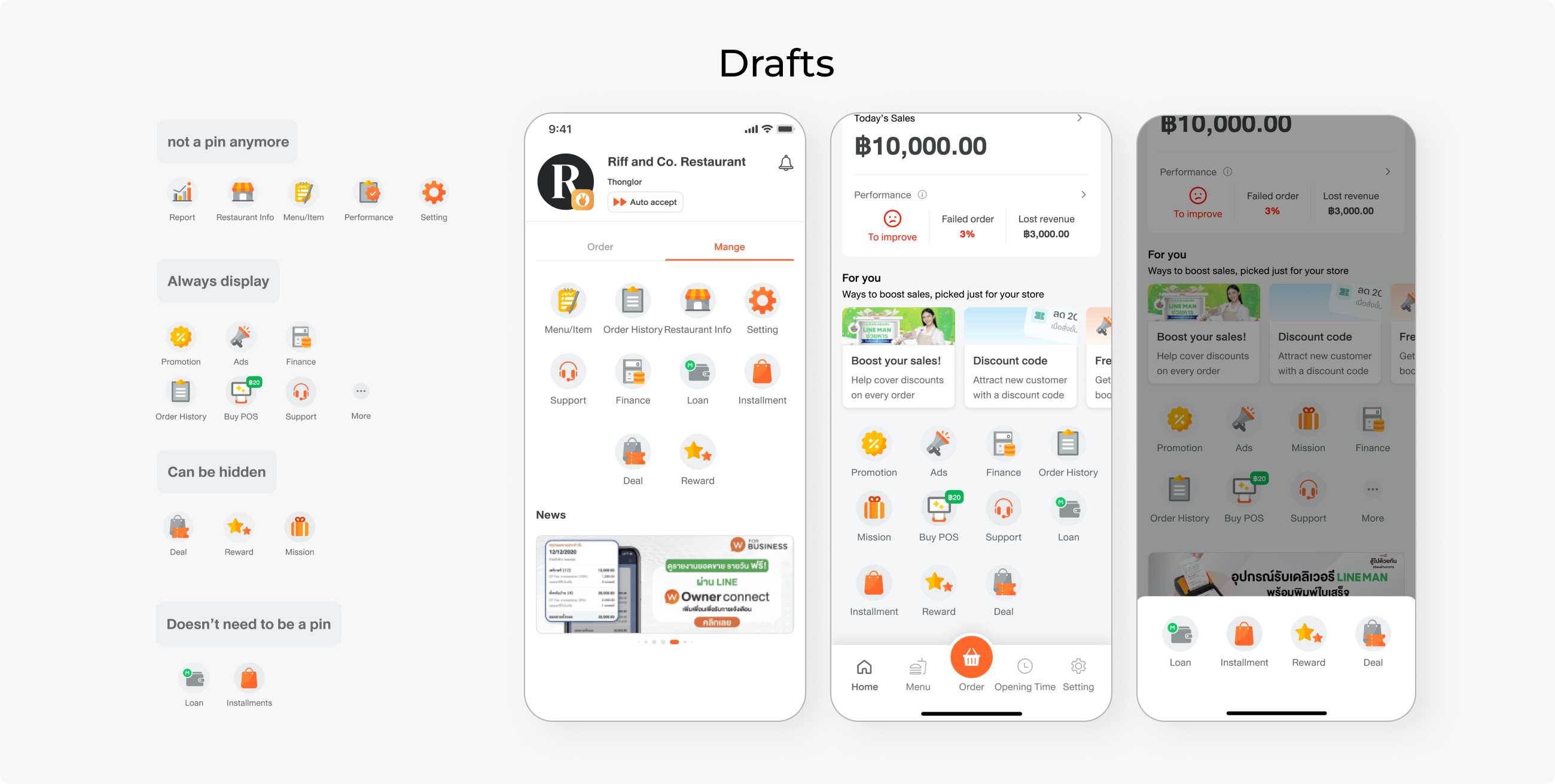
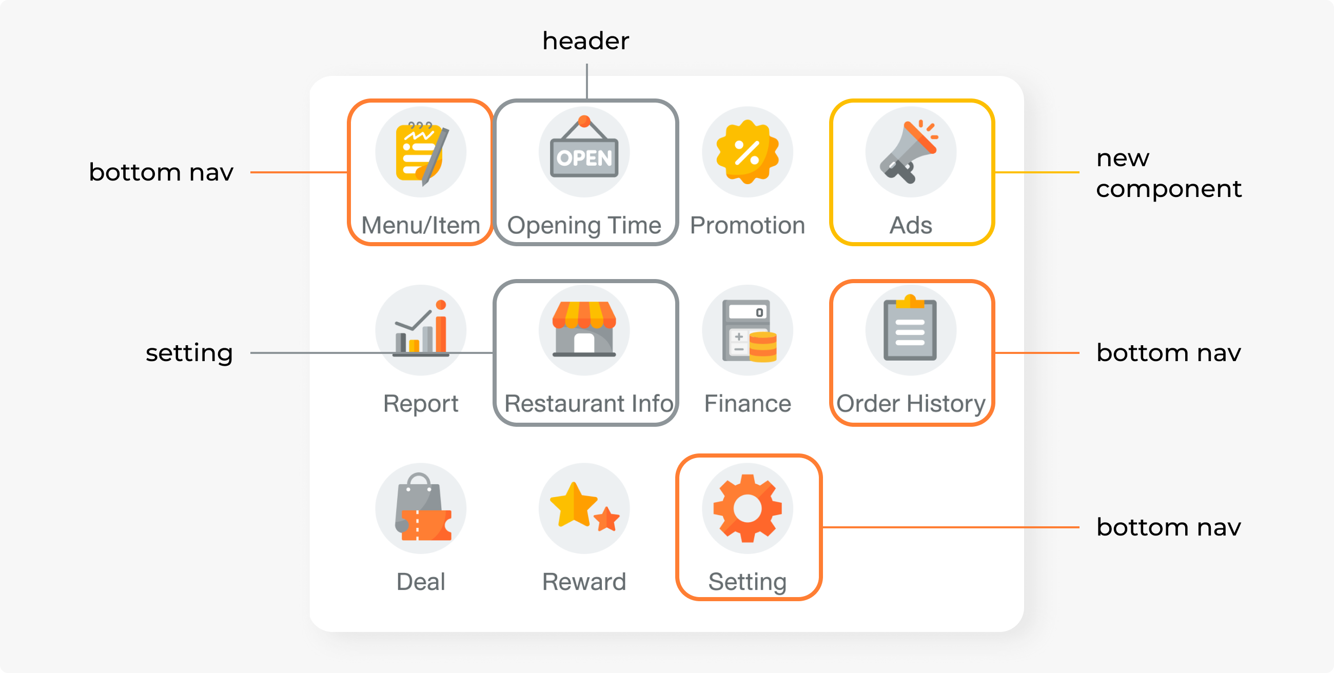
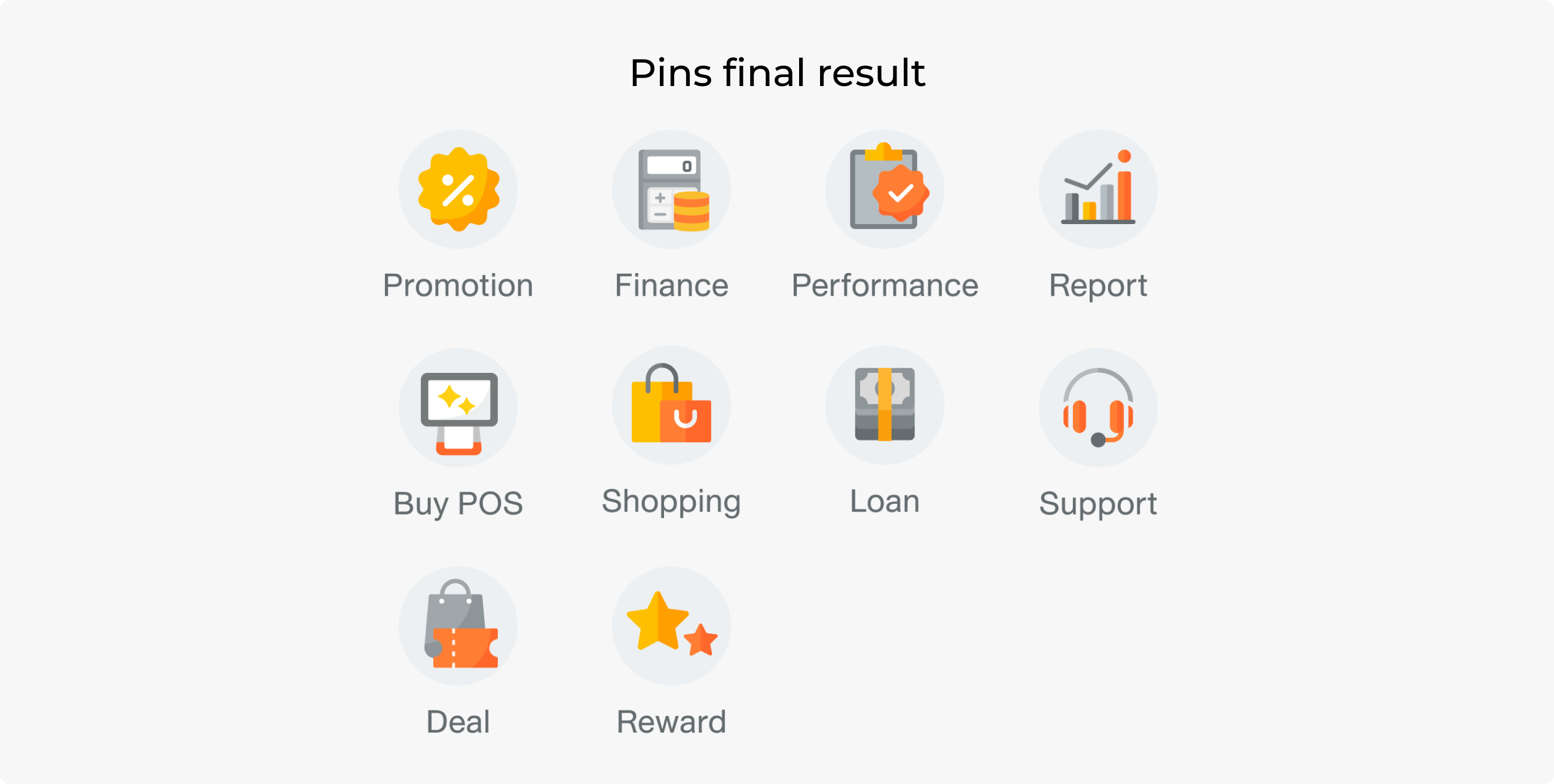
This is how pins were reorganised. Some were turned into the bottom nav bar, while some became a new component with higher priority. Less-clicked pins like “Opening Time” and “Restaurant Info” were moved somewhere else to reduce hierarchy.
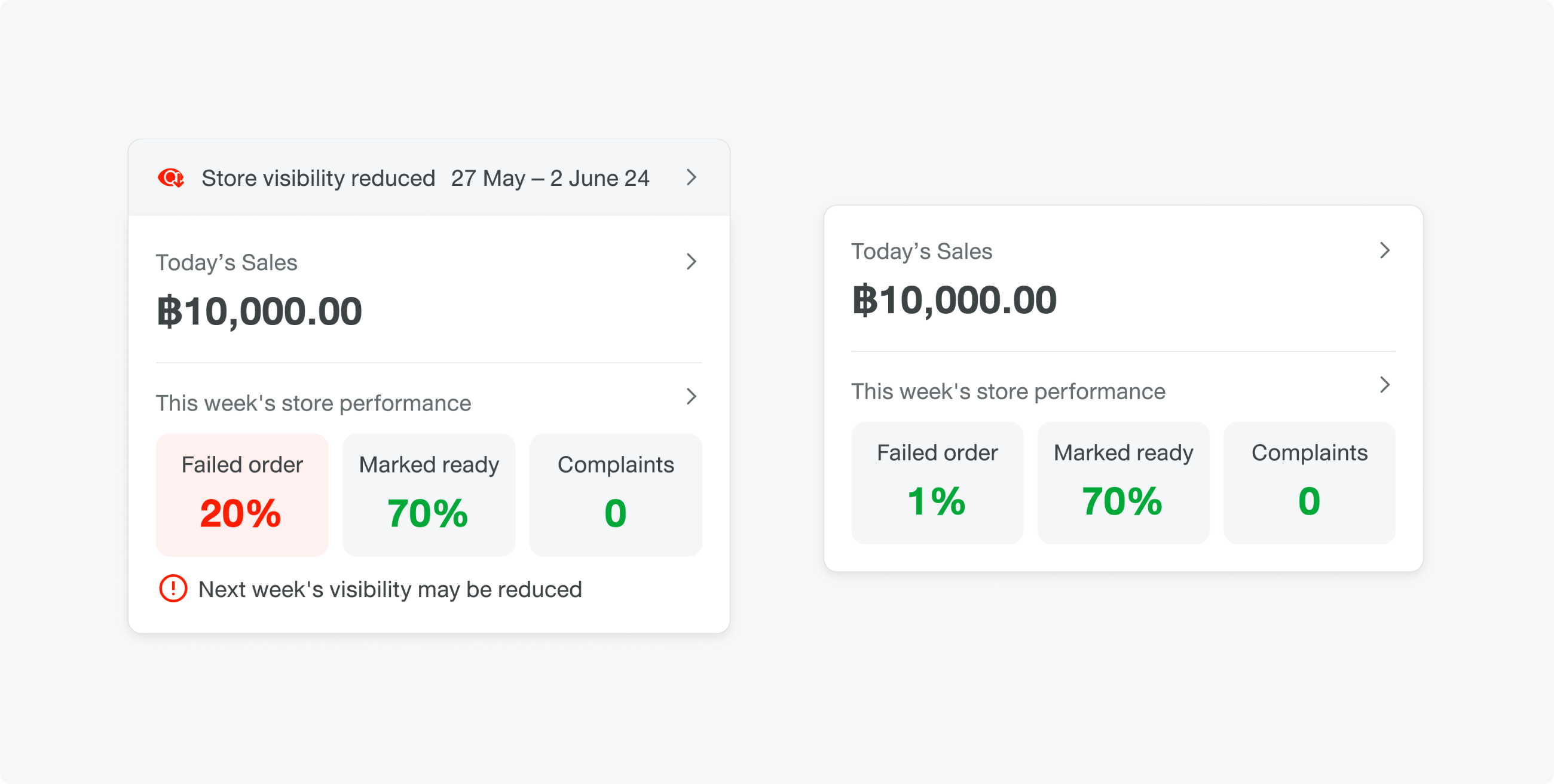
There are two data types we want merchants to see: the sales, which affect them financially, and their operation rating (cancellation rate, claim rate, and appeal cases). We believe that making their income and rating explicitly visible will lead to higher effort and awareness.
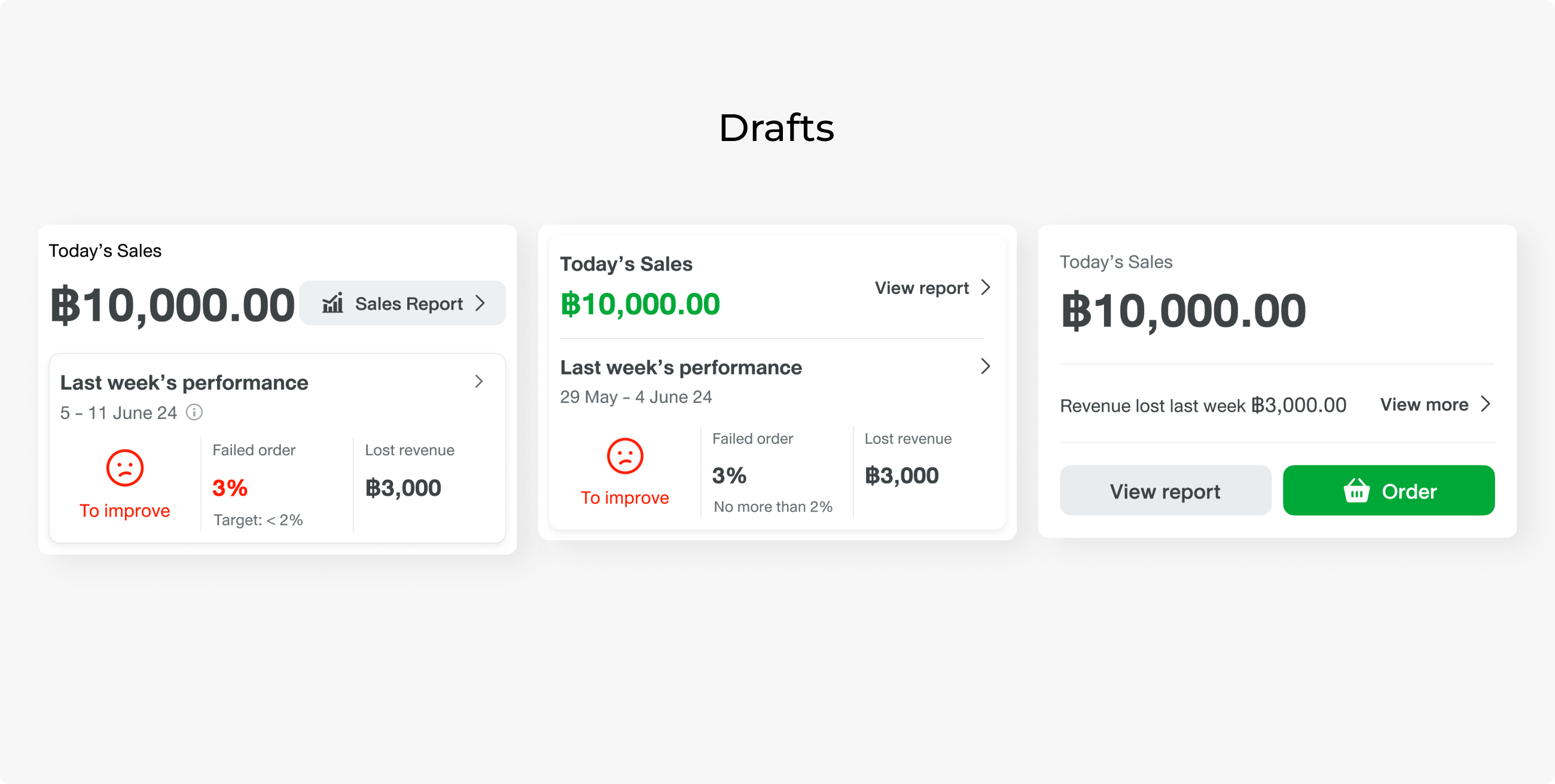
The business team had made a decision that we needed to show the performance score, the number of failed orders, and lost revenue, so we went with the three-section panel design.
Looking at data to reorganise items
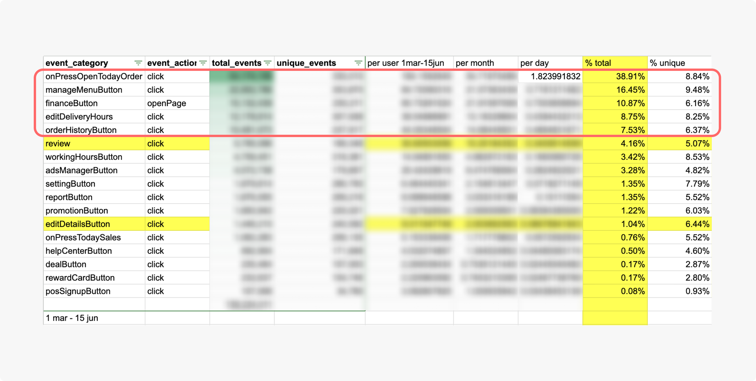
This table shows how frequently each button is clicked during the day. It turned out that users click “Order” far less than we had expected. Our assumption was that merchants click this button once to open the order page and leave it all day. This was why we thought moving this button and reducing the size would not have much impact.
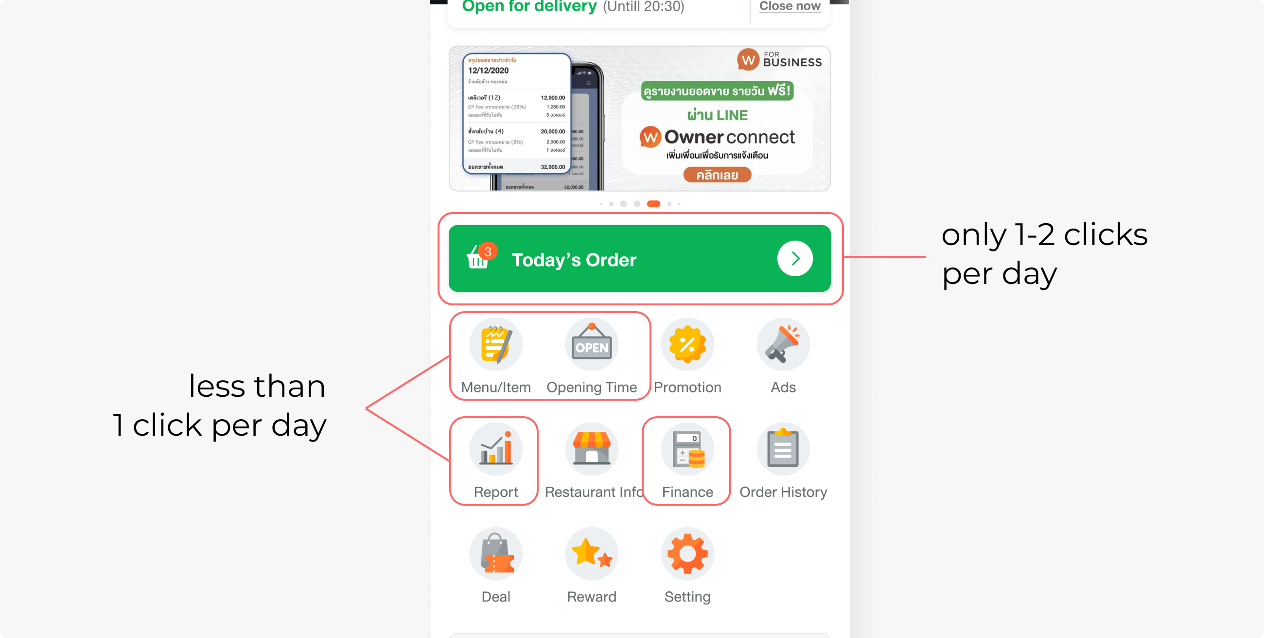
Currently, the merchants are familiar with tapping on the big green button to view incoming orders. As “Order” is an operation button, the merchants must click it. Moving the button might make them unfamiliar at first, but they will adapt eventually.
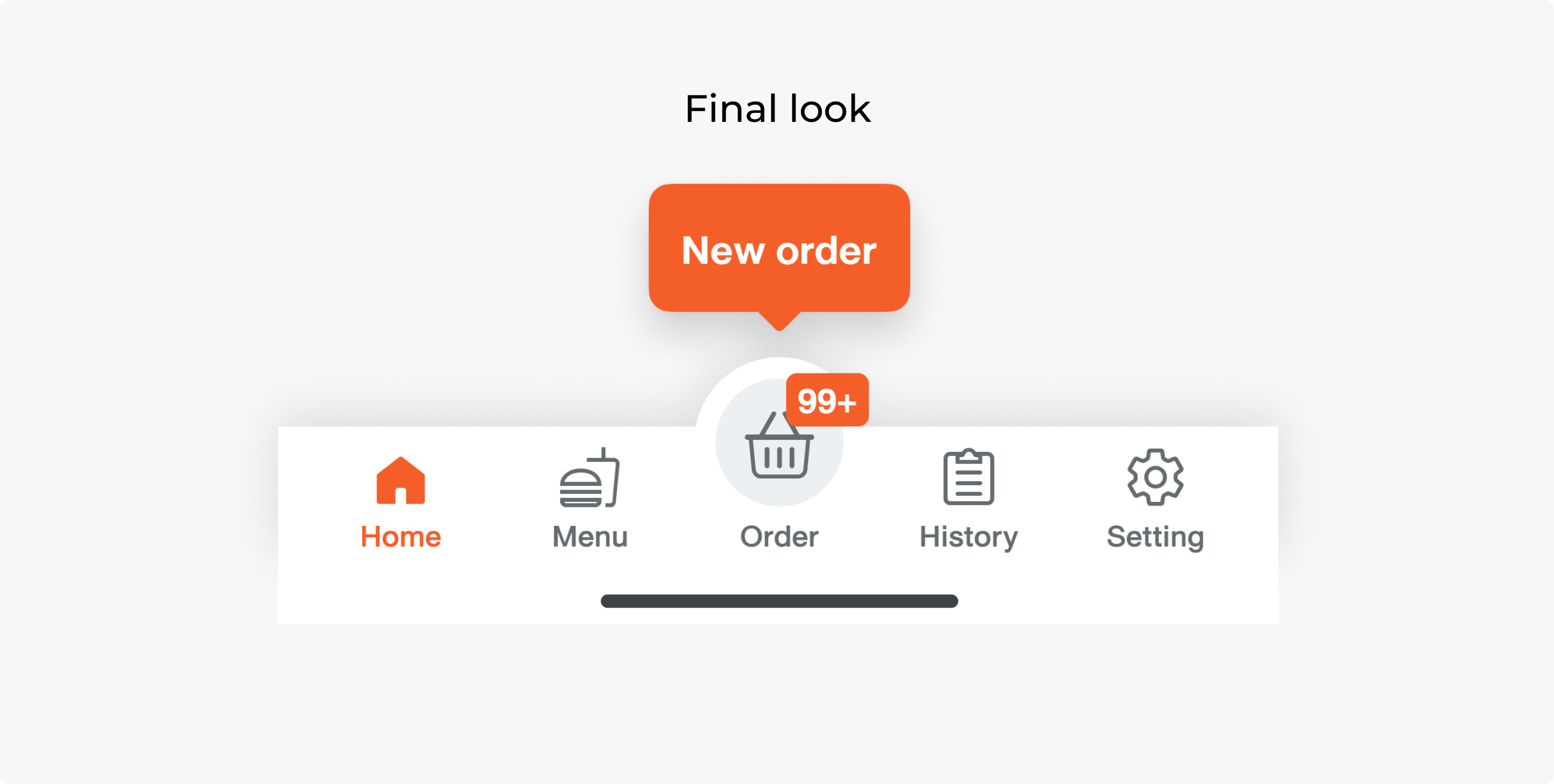
We moved the commonly clicked buttons to the bottom bar, including Home, Menu, History, and Settings, with the Order button as the main button in the center to retain its dominance.
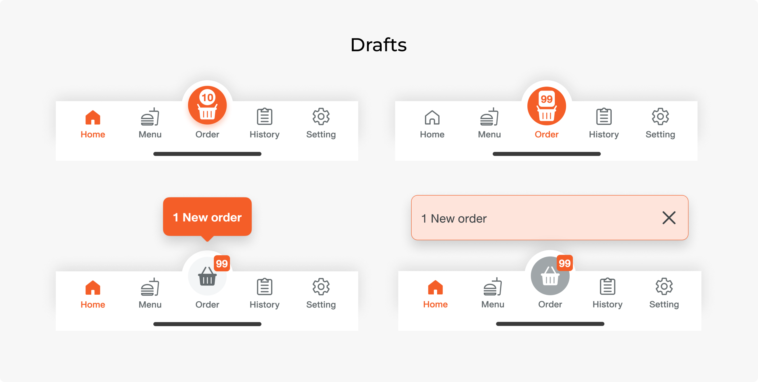
We tried various design choices and ended up with the grey order button. We wanted the order number to be easy to scan. There is a tooltip component for first-time users to ensure users notice the new order placement.
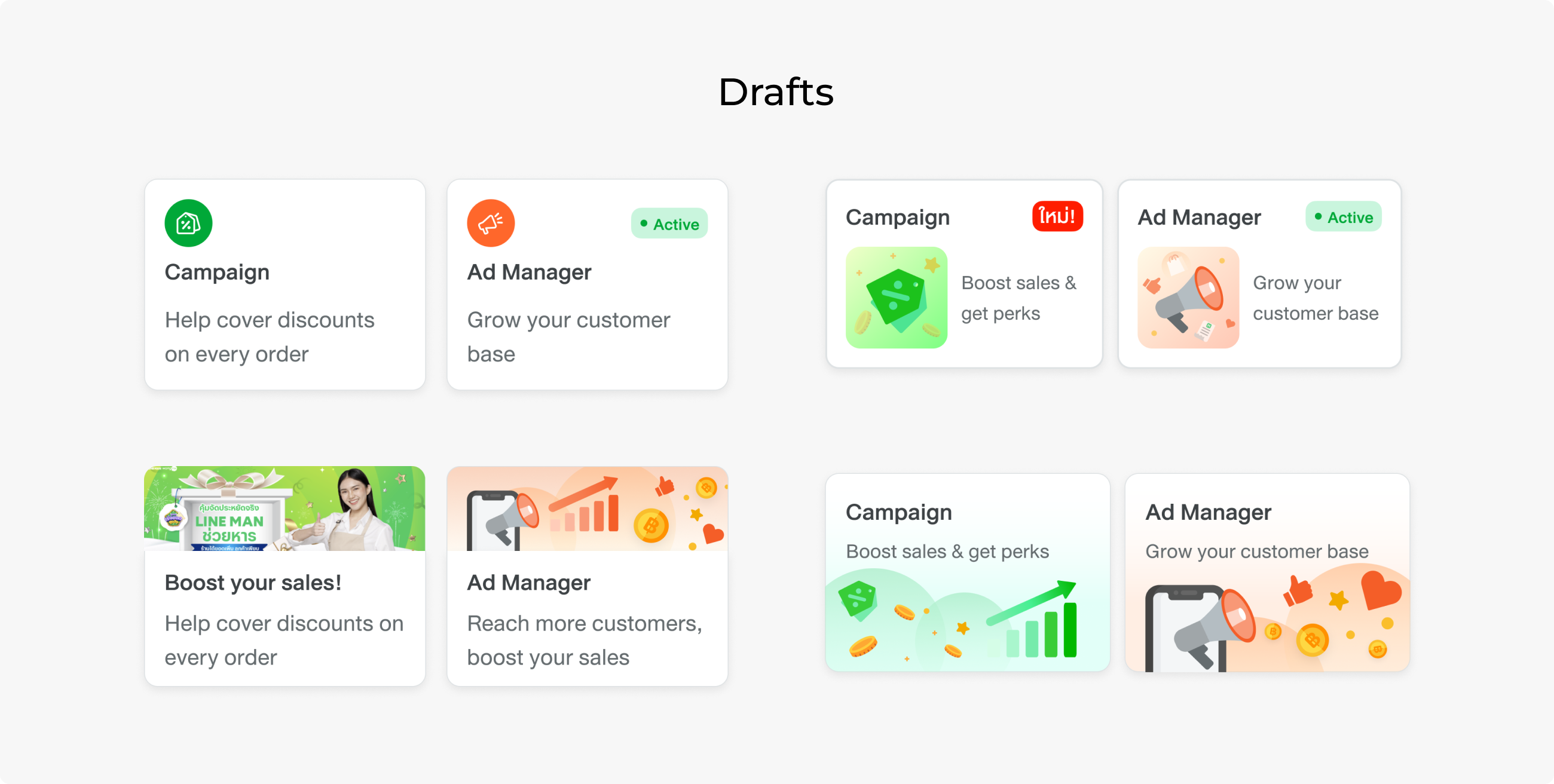
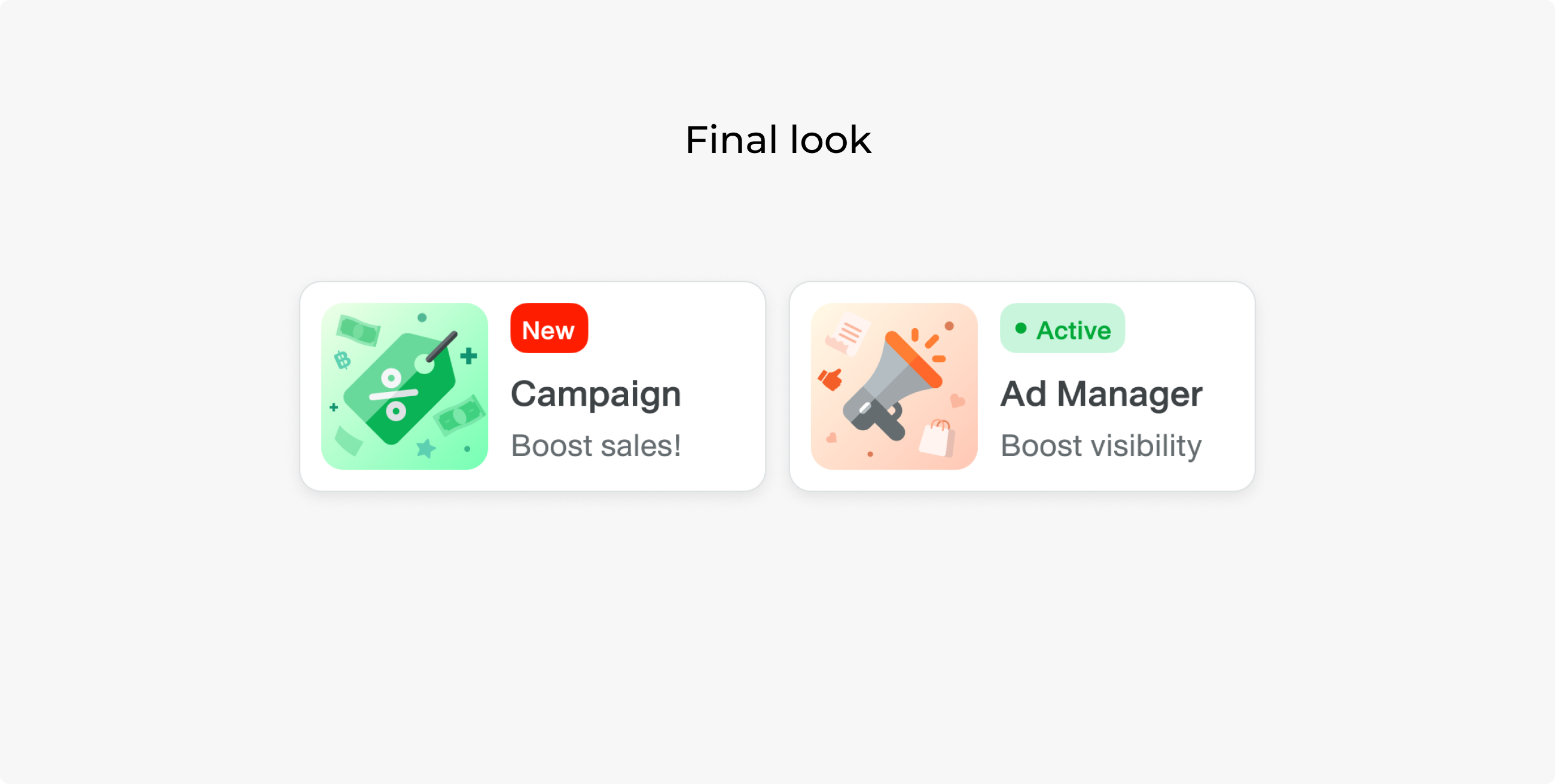
We wanted to highlight Ads and Campaigns. A Campaign is a marketing tool that provides a co-subsidising discount, which is the most effective tool for boosting sales, and Ads is a tool that helps the company gain revenue.
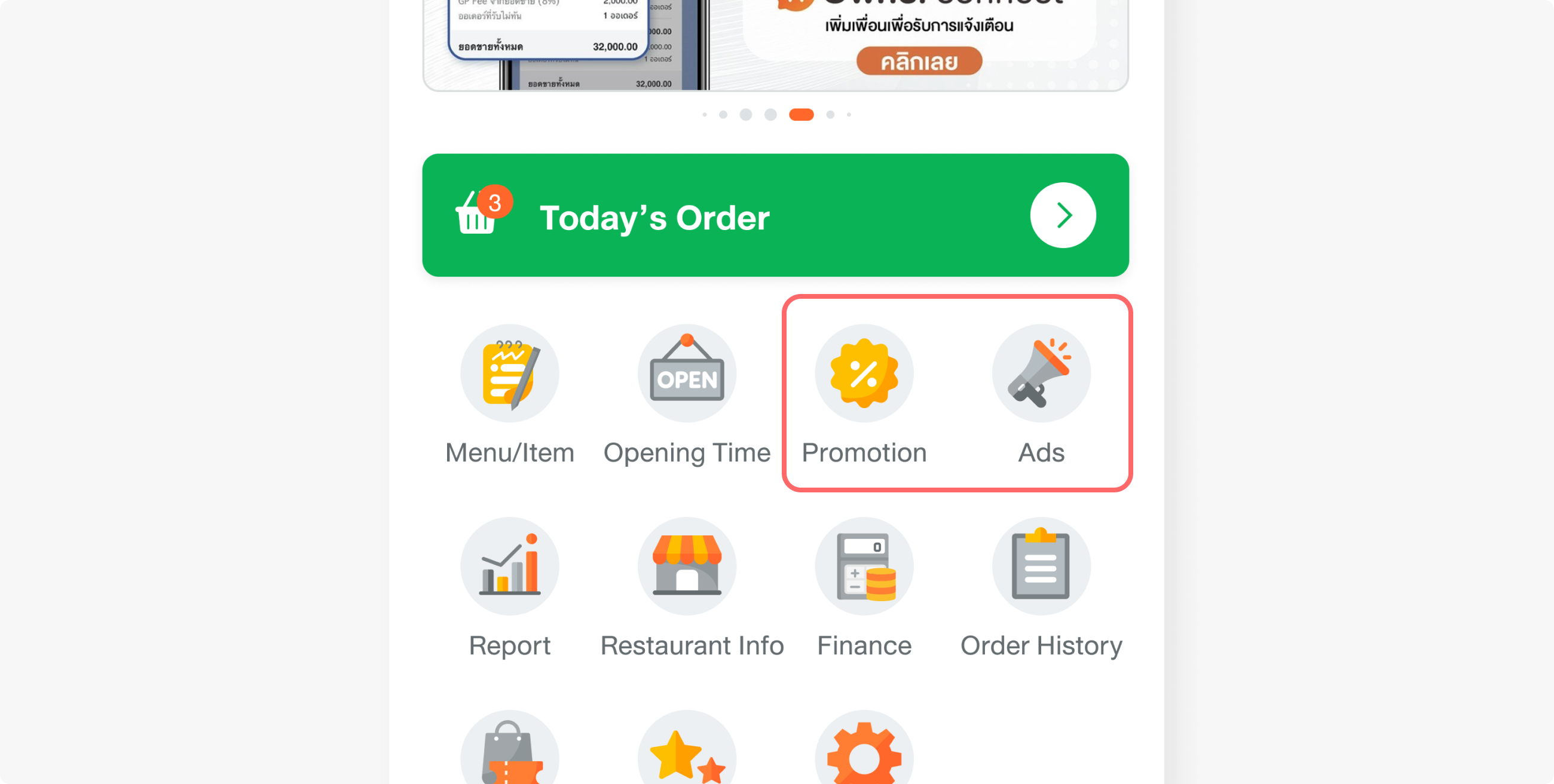
The issue is that the Campaign is inside the promotion pin, which contradicts its importance. We decided to move the Campaign outside and kept the promotion as a pin, since merchants can earn much more with the Campaign than with other promo types.
DELIVER
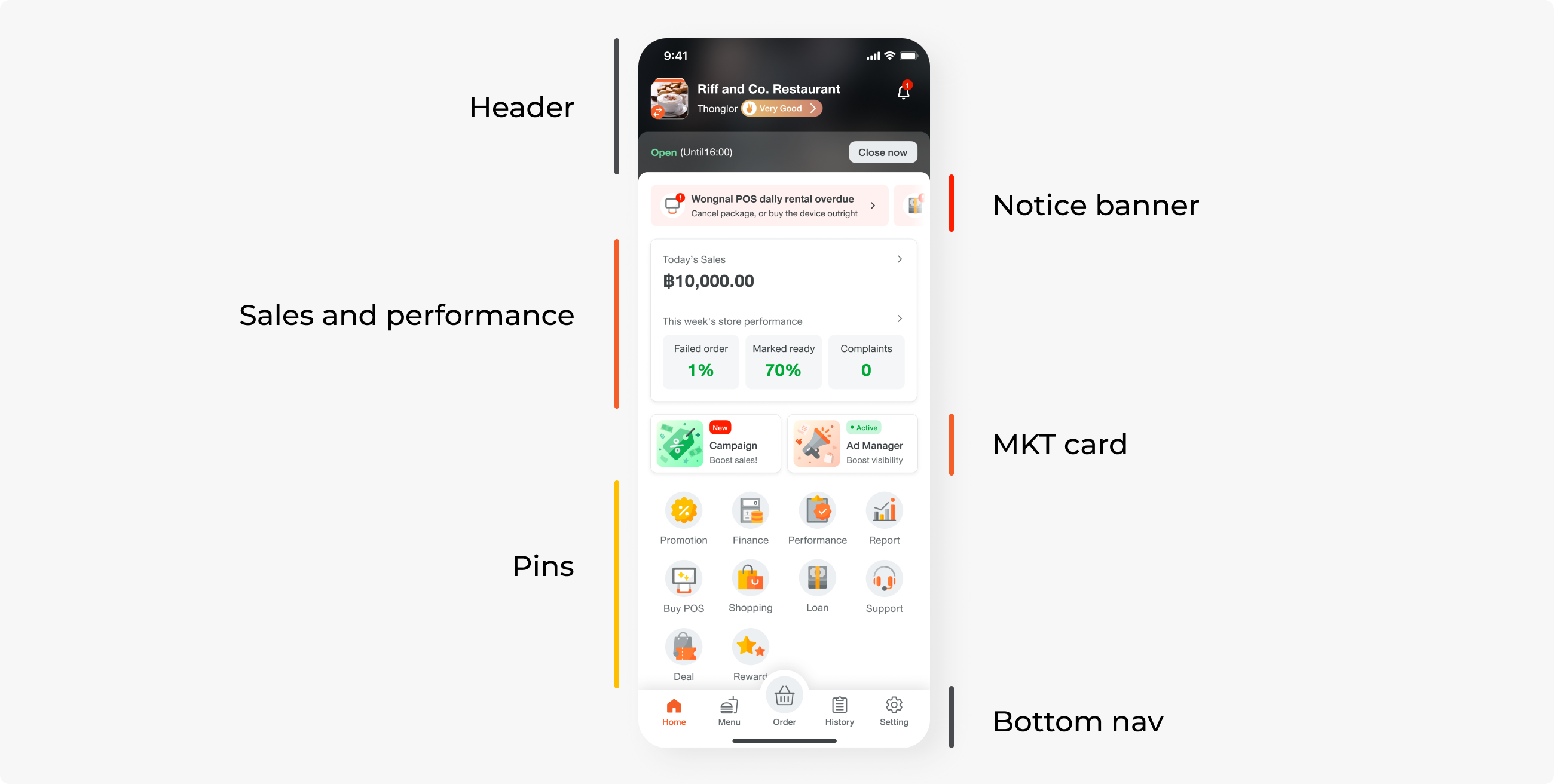
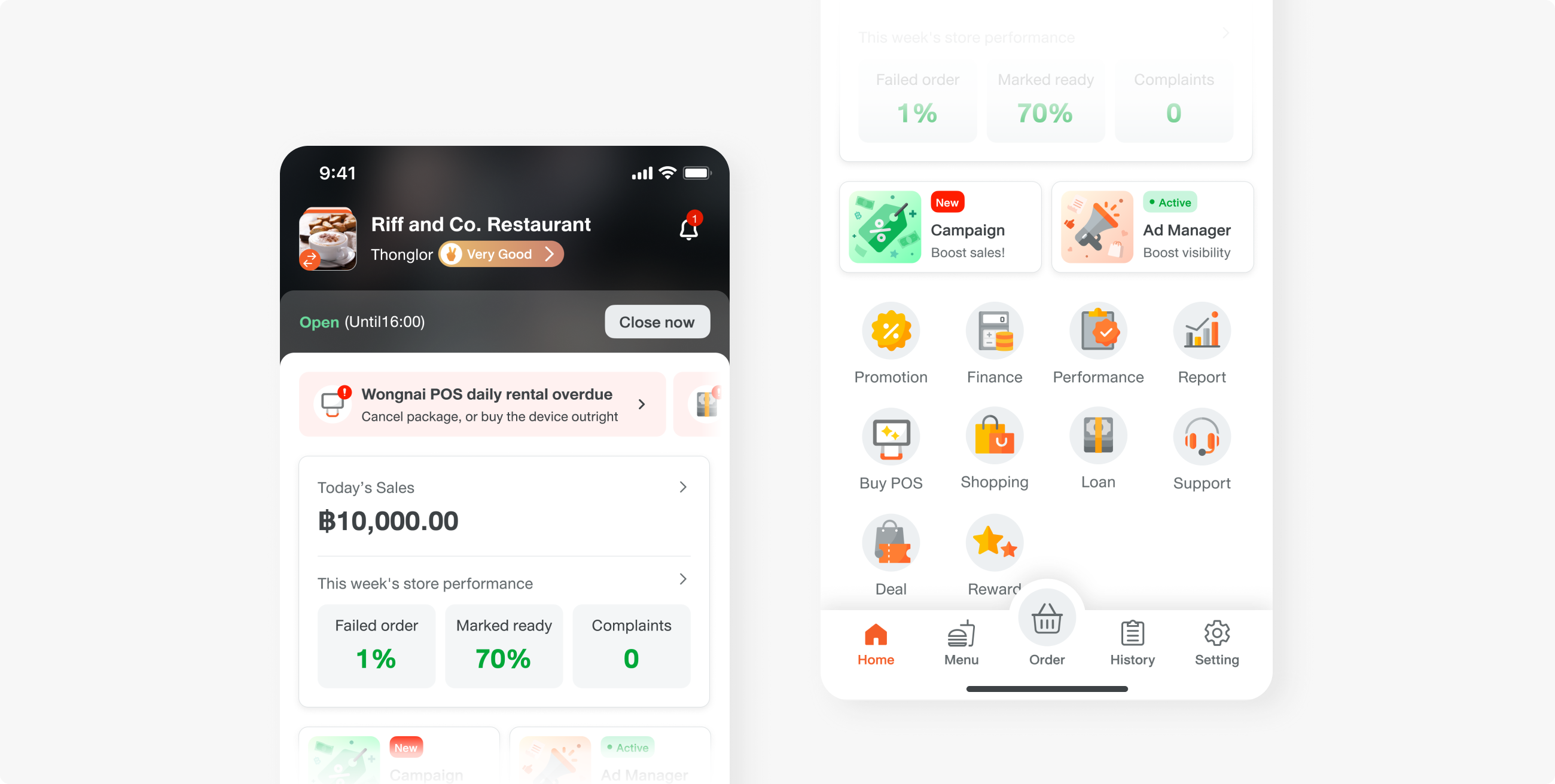
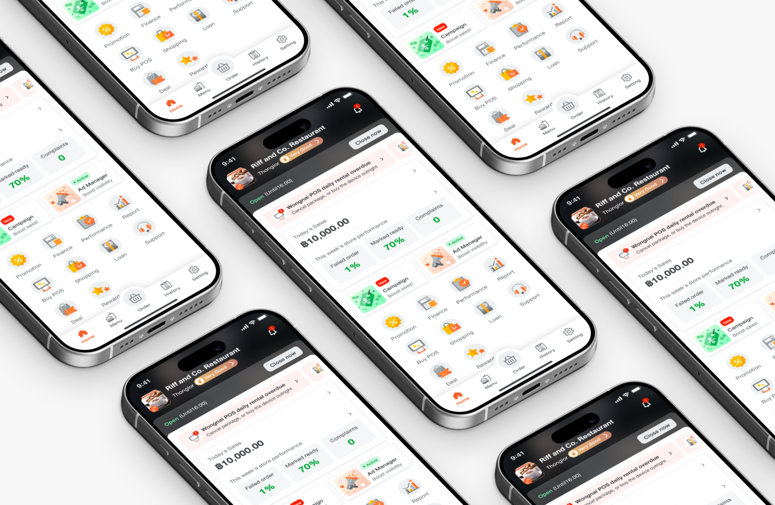
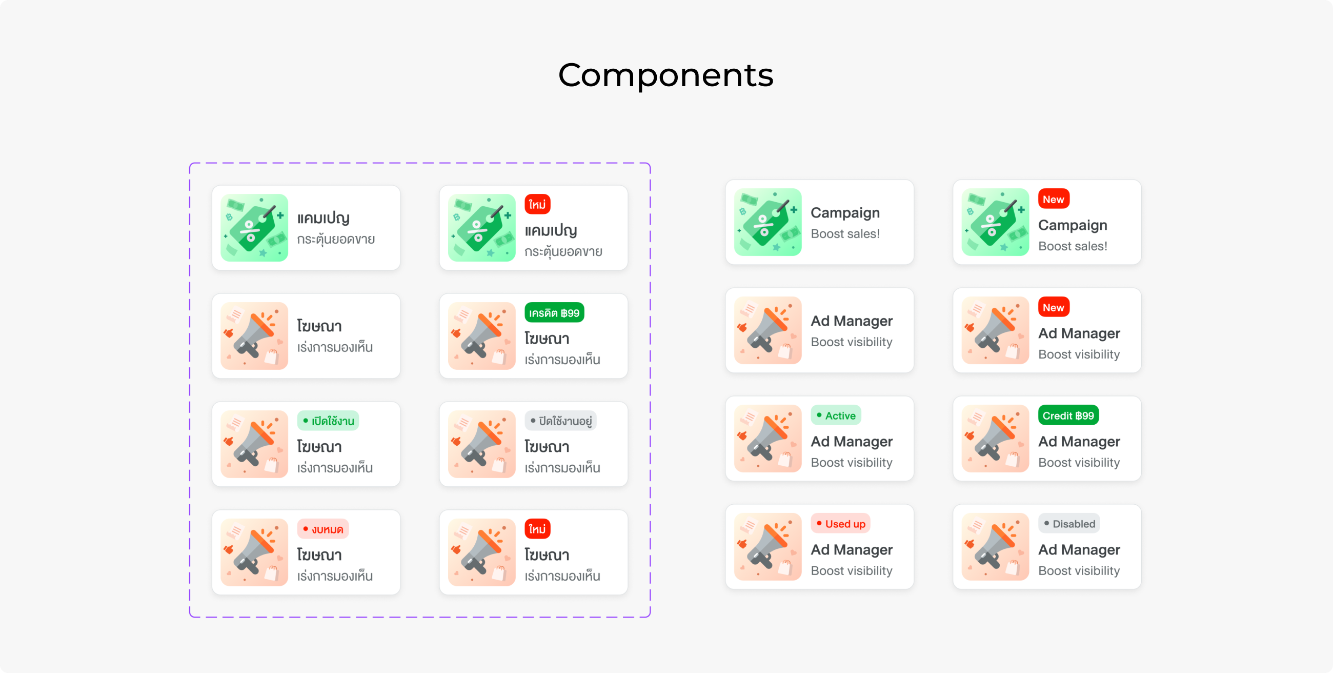
Here is the final look of the home page. Performance stays at the top, followed by marketing sections. These are all the states of the entry point, as Ads need a visible status for credit consumption.
Since it is likely that stakeholders will request placement in the future, we created guidelines for components and placement usage on the home page to ensure elements will not become clustered again.
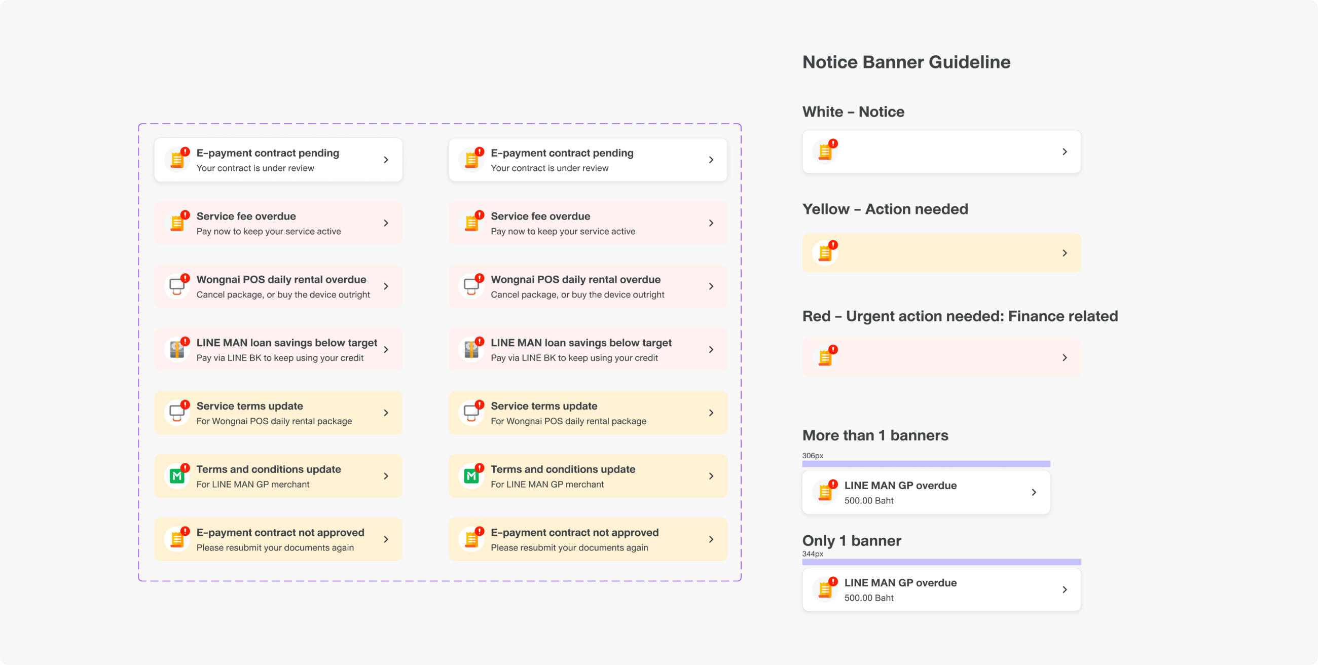
I established a guideline for important notices, which should be action-needed tasks only. Colours are used to label the importance of the tasks; for example, red indicates a financial impact task, like an overdue balance, while yellow means there is a new document users must acknowledge or sign.
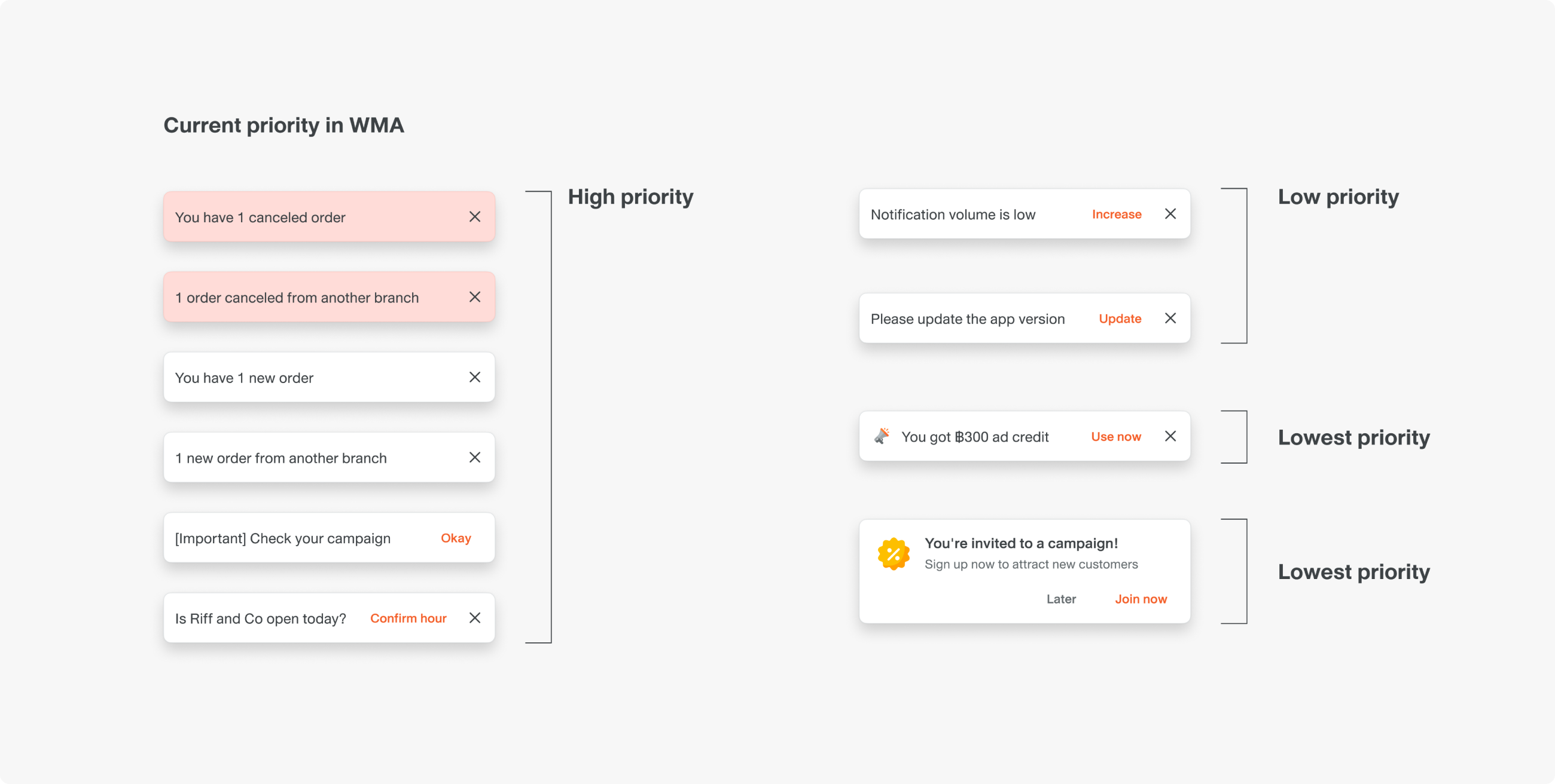
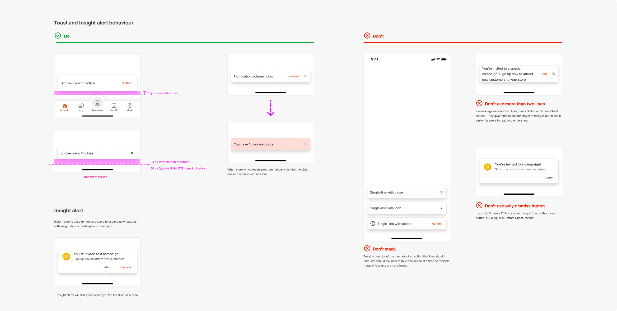
My team created a toast guideline that sets the priority of each type of message and shows how the toast component should be used, as well as what should not be done.
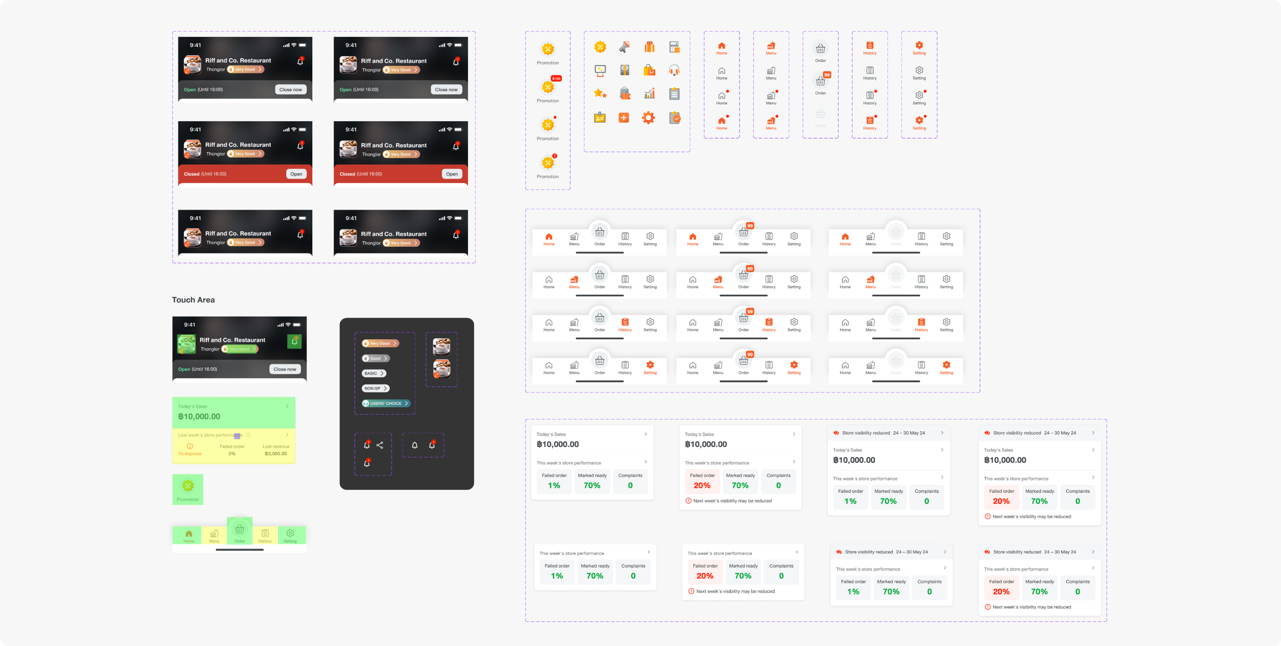
I created a master flow that includes all states on the Home page, showing the navigation to all pages, and dedicated sections for component guidelines. This will help both engineers and other designers with Figma file navigation and clarity in component usage.
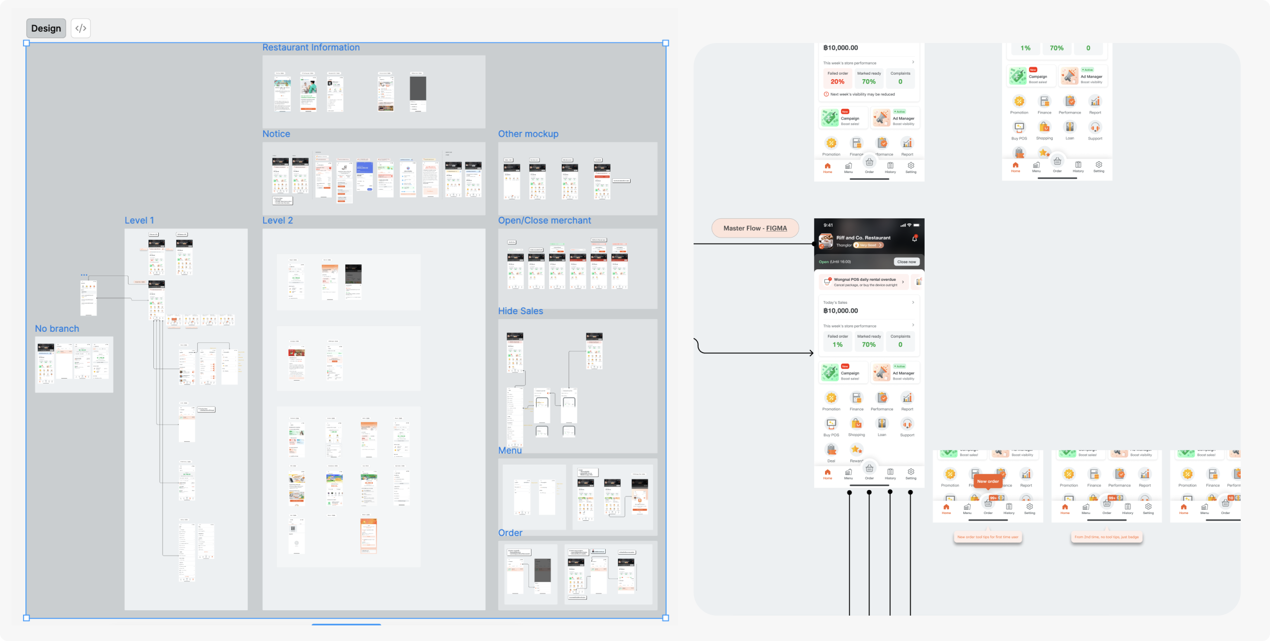
The most challenging part was that the business team saw the home page as free space to advertise their campaign, which may result in overwhelming visuals, so we had to create a strict guideline for placement usage.
Another challenge was that the stakeholders wanted updates regularly. Sometimes we had to show unfinished designs, leading to a misperception of the final outcome. I have learned that non-designer colleagues may not understand how a wireframe can develop into a final interface, and it is our job to explain it to them.
After the new version launched, 1,000+ merchants improved their performance metrics. The number of merchants participating in the campaign also increased. 2,000+ merchants joined the campaign weekly.